Client
General Directorate of Identity and Foreigners Affairs – Dubai (GDRFA Dubai)
Sector
Government / Public Services / Community Programs
Scope of Work
- Brand Identity Rebranding
- Arabic Logotype Design
- Color System Development
- Visual Language & Brand Guidelines
- Card Design & Core Brand Applications
Project Overview
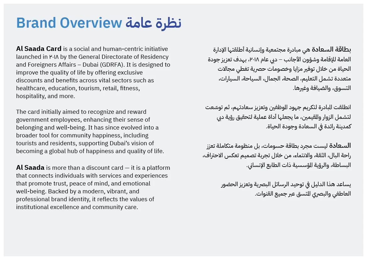
al Saada is a government-led social program by the General Directorate of Identity and Foreigners Affairs – Dubai, aimed at enhancing quality of life by offering services, benefits, and privileges to citizens, residents, and tourists.
The project focused on refining and elevating the existing brand identity, not replacing it. The objective was to strengthen clarity, balance, and long-term usability while preserving recognition and institutional presence.
Client Brief
The client requested a refreshed brand identity that would:
- Maintain familiarity with the existing brand
- Strengthen the Arabic-first identity
- Present a more balanced and contemporary visual system
- Work consistently across digital and physical touchpoints
- Scale confidently as a long-term government initiative
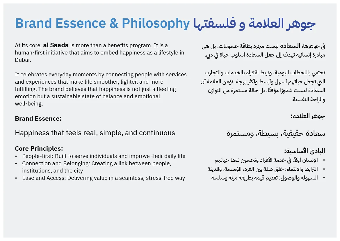
Happiness was defined not as visual excitement, but as calm, reassurance, and continuity.
Core Challenge
The main challenge was creating a brand that balances:
- Government authority
- Human warmth
- Cultural authenticity
- Modern digital requirements
The identity needed to feel official without rigidity, and welcoming without informality.
Logo Concept & Strategy
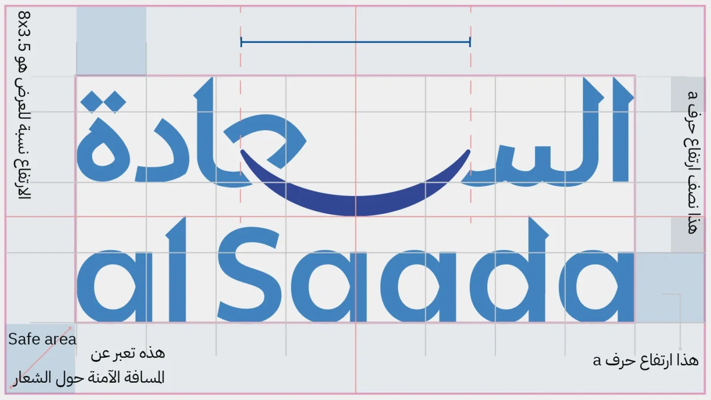
Arabic-First Logotype
The logo was redesigned as a custom Arabic typographic mark, drawn manually and built on the principles of Naskh script, refined for clarity and modern use.
The English logotype was custom-adjusted to visually align with the Arabic form in proportion, rhythm, and weight.
The Smile as a Structural Element
A key conceptual decision was integrating the smile directly into the structure of the logo:
- Positioned precisely at the visual center
-
Balancing Arabic and English elements
-
Expressing happiness as harmony and composure
The smile is structural, not decorative.
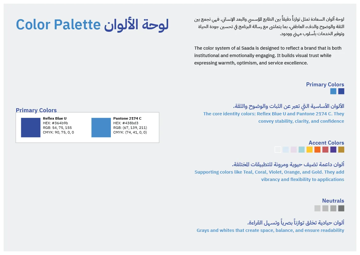
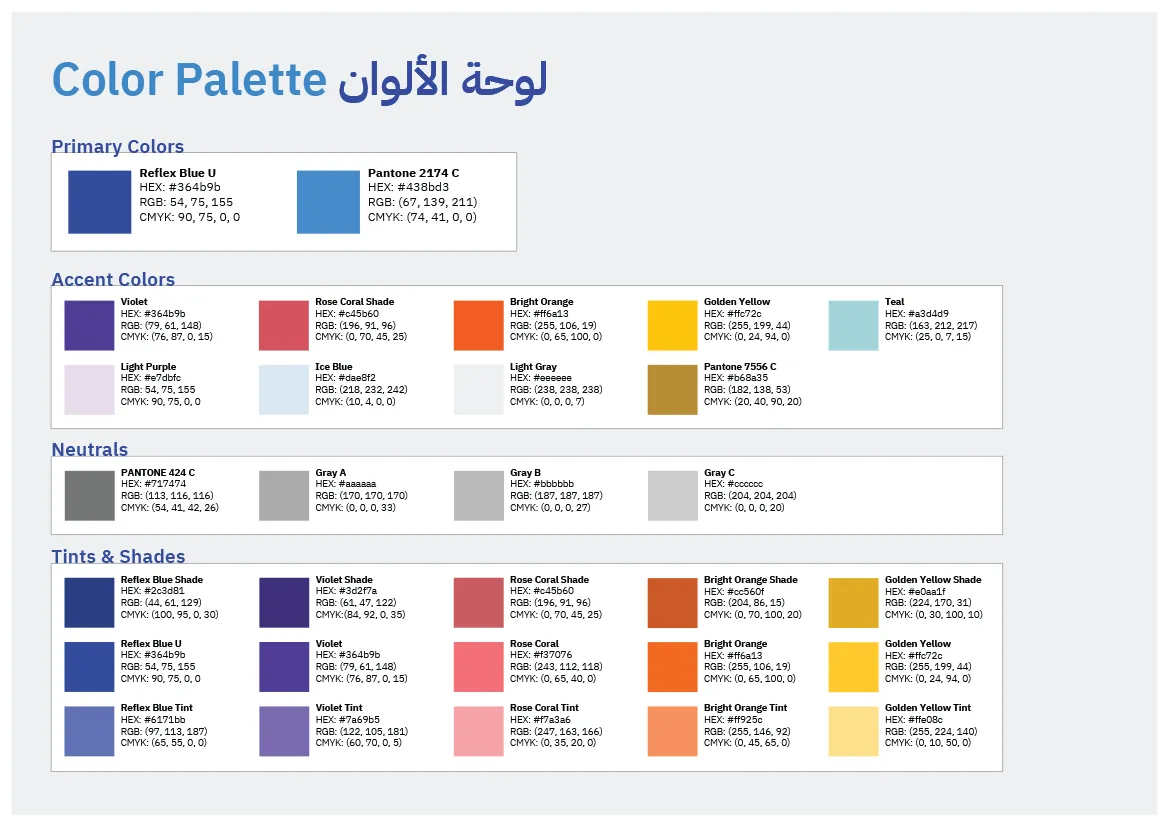
Color System
Primary Colors
Two blues form the foundation of the identity:
-
Dark Blue: calm authority and stability
-
Light Blue: openness and accessibility
Together, they communicate happiness as reassurance and balance.
Accent & Supporting Colors
-
A refined gold tone was retained from the parent authority’s identity
-
Supporting colors were introduced to enable flexibility across applications while maintaining cohesion
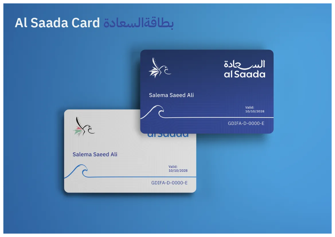
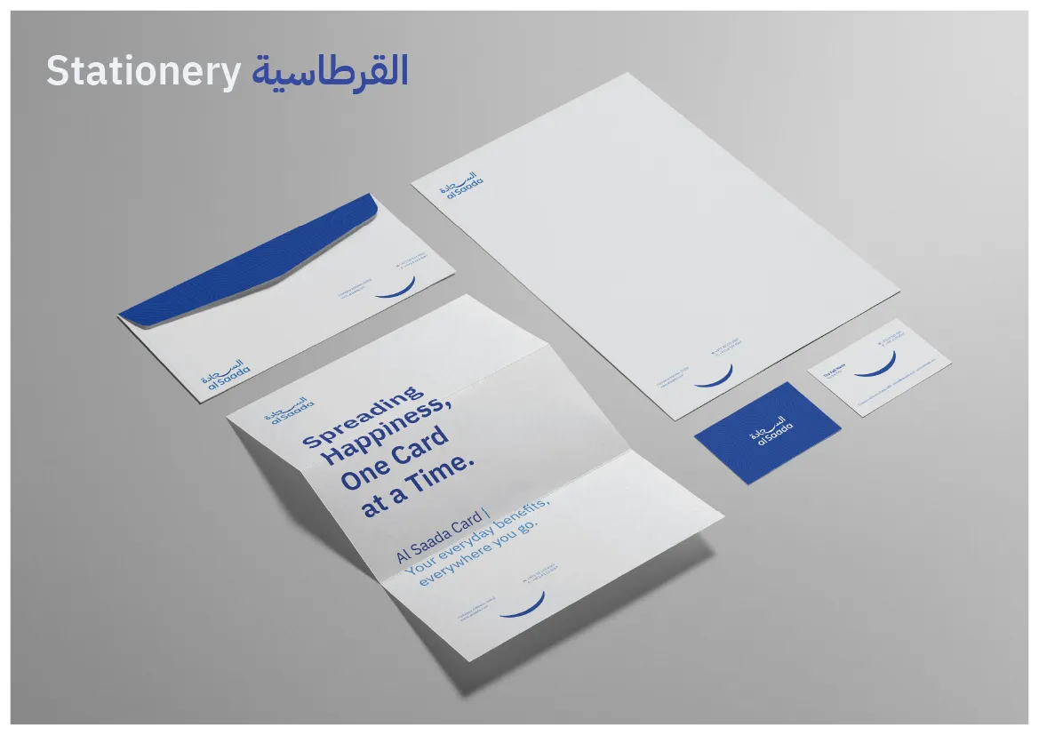
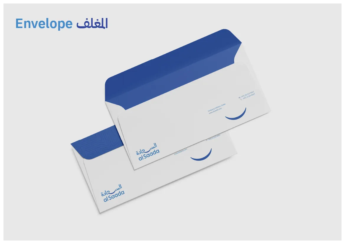
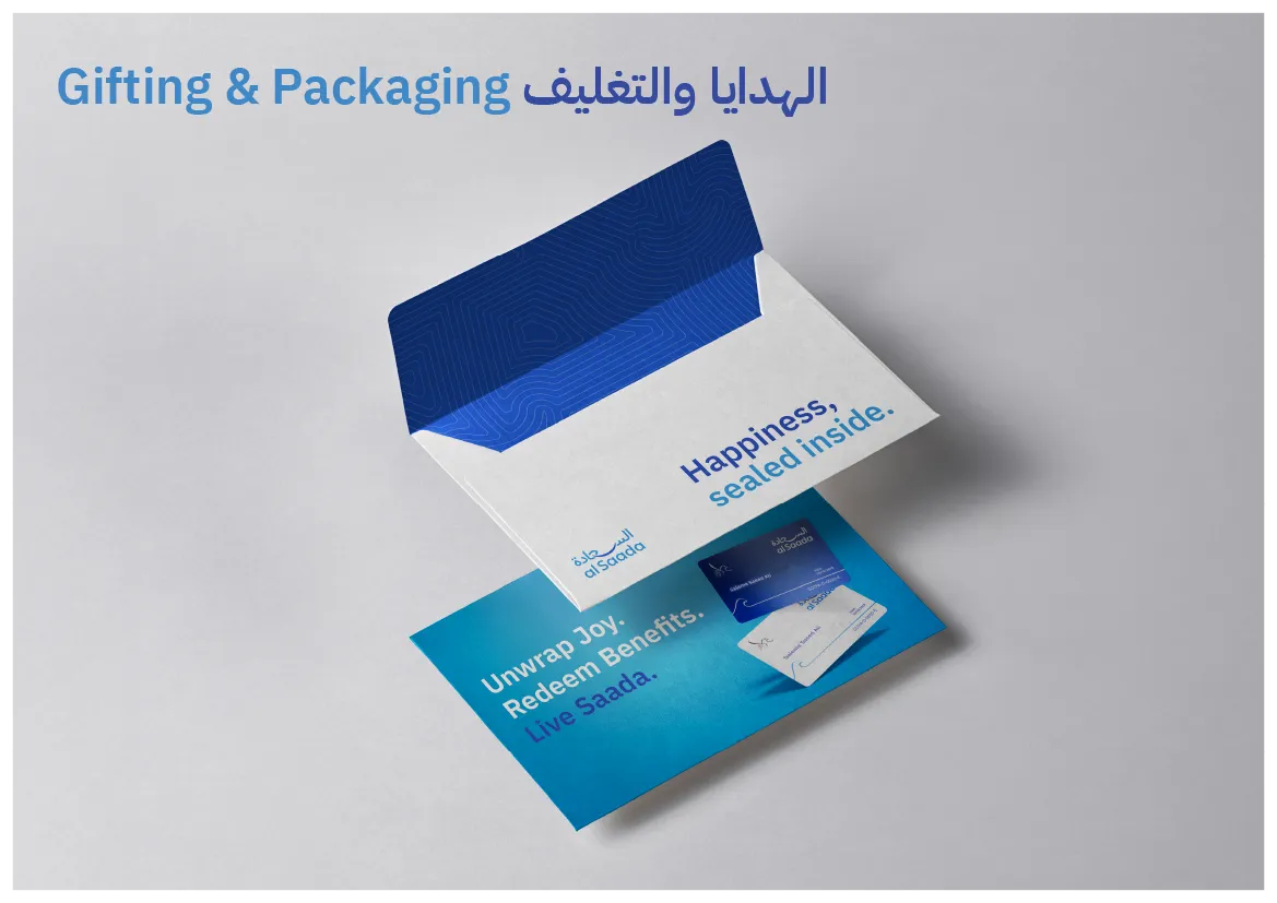
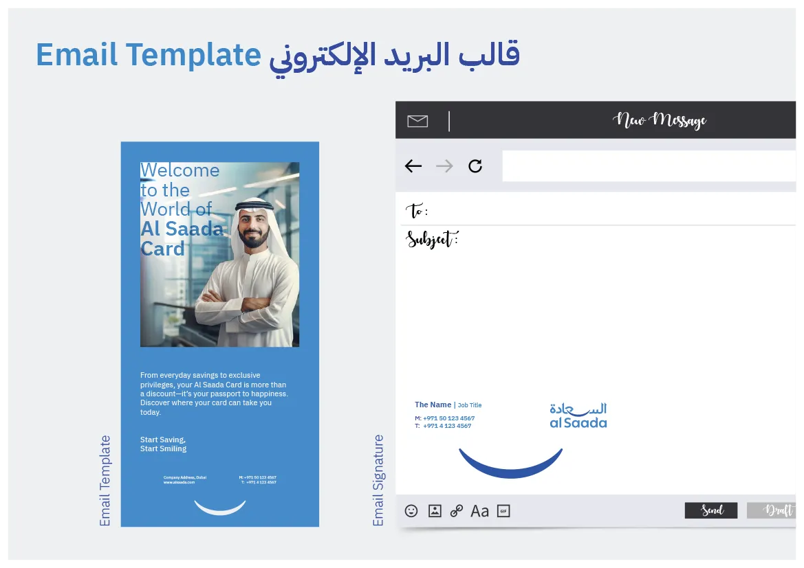
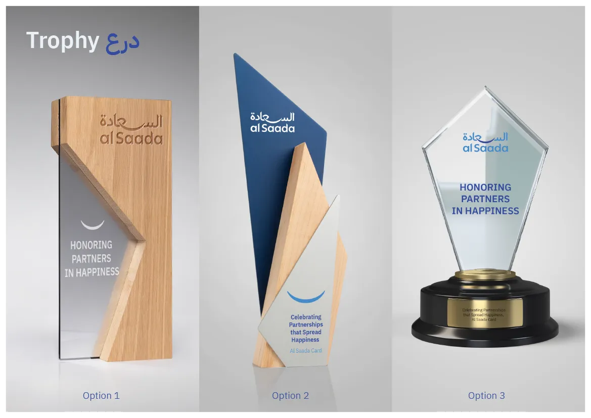
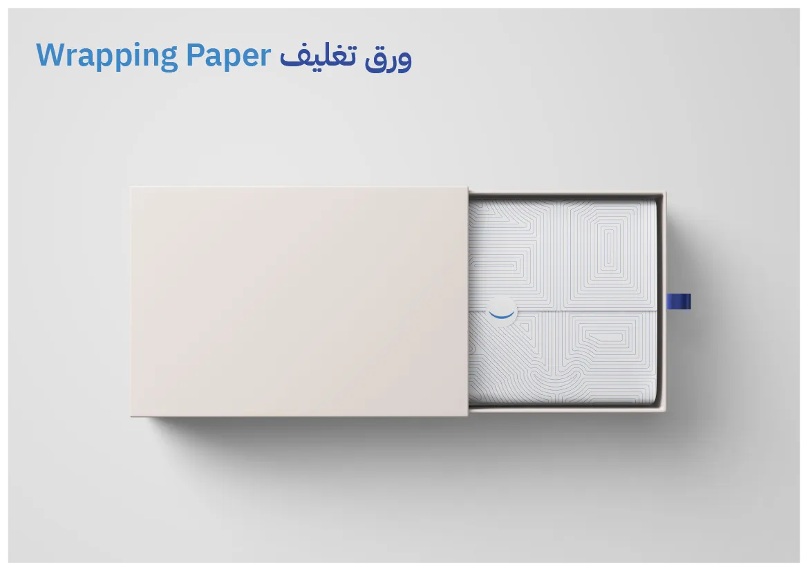
Brand Applications
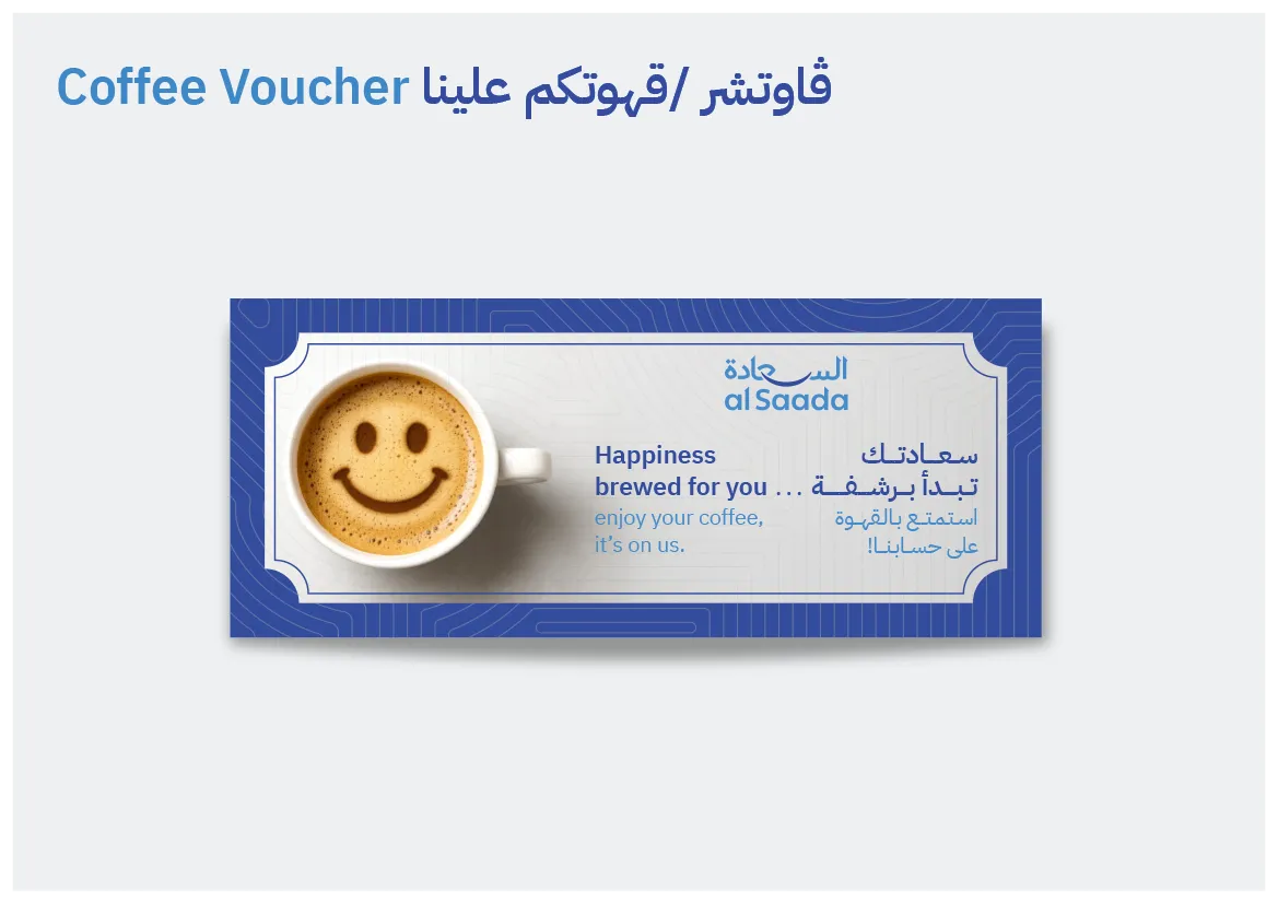
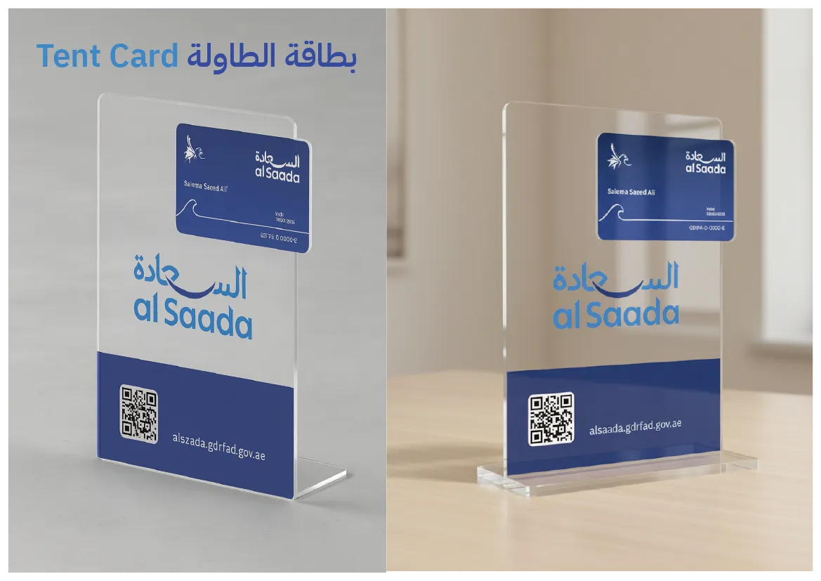
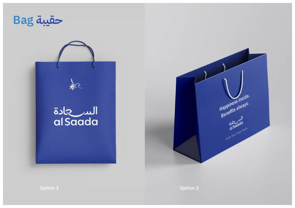
The rebranded identity was applied across key touchpoints, including:
-
Logo system and usage rules
-
Brand color palette
-
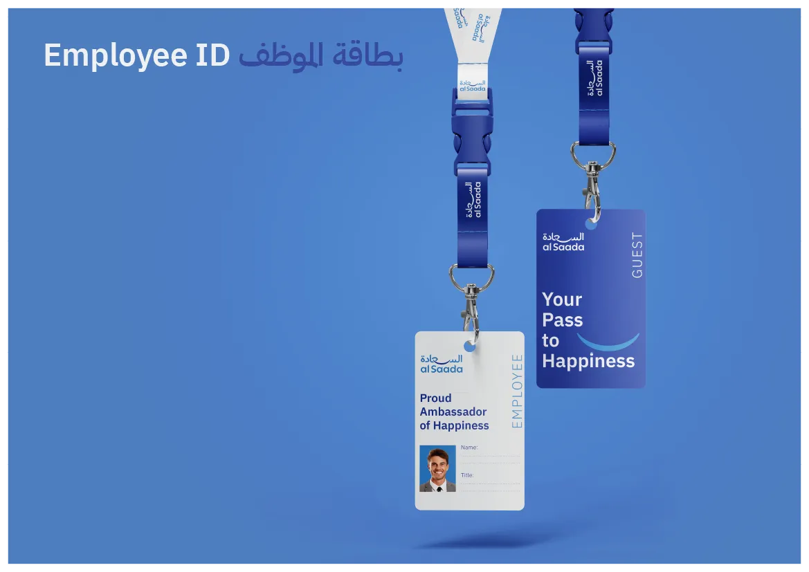
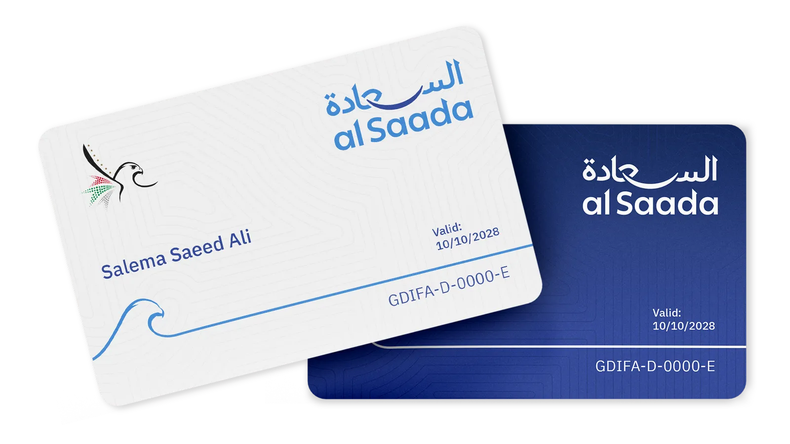
Card design (light and dark versions)
-
Partner stickers and signage
-
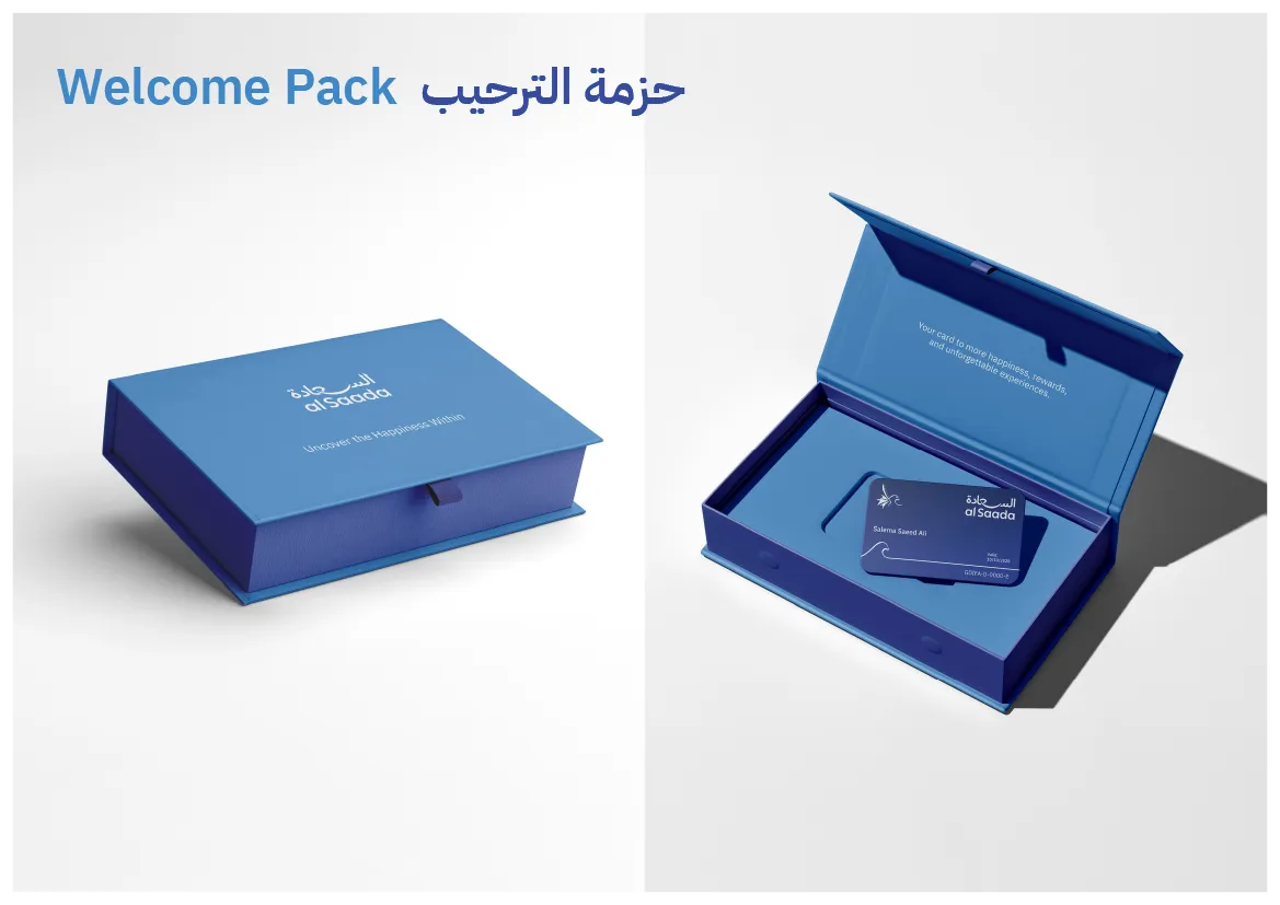
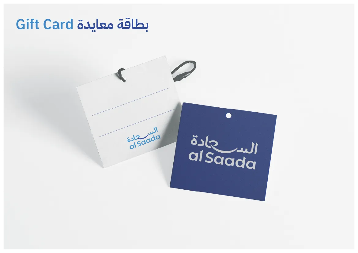
Gift packaging and shopping bags
-
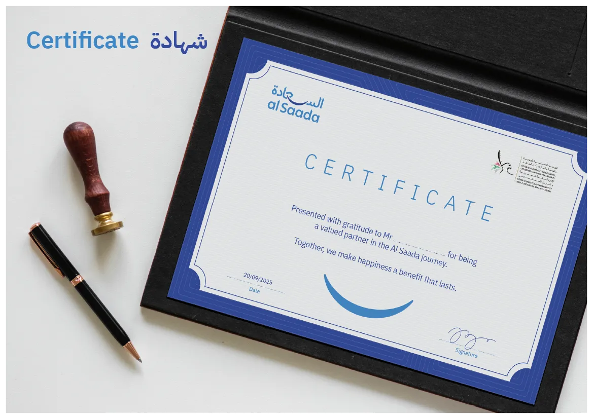
Certificates and recognition items
-
Core printed and digital materials
Final Outcome
The rebranding of al Saada resulted in a more mature, cohesive, and future-ready identity that:
-
Strengthens Arabic typographic presence
-
Communicates happiness through balance and calm
-
Maintains institutional credibility
-
Scales confidently across platforms and applications
Role
Creative Director & Arabic Branding Expert
Brand strategy, Arabic logotype design, visual system development, and brand application.