
Selected work · UAE and regional markets

Strategic Arabic Branding Case Studies

Five case studies showing how brand strategy, Arabic typography, visual identity, and cultural context come together across institutional, government, consumer, hospitality, and publishing projects.

This collection presents selected work by Nihad Taisir Nadam, a Dubai-based Creative Director and Arabic branding expert with more than 25 years of experience. Each project is presented through the same practical lens: context, challenge, role, response, and outcome.

Portrait of Nihad Taisir Nadam, Creative Director and Arabic branding expert in the UAE

Case Study 01 · Institutional Branding

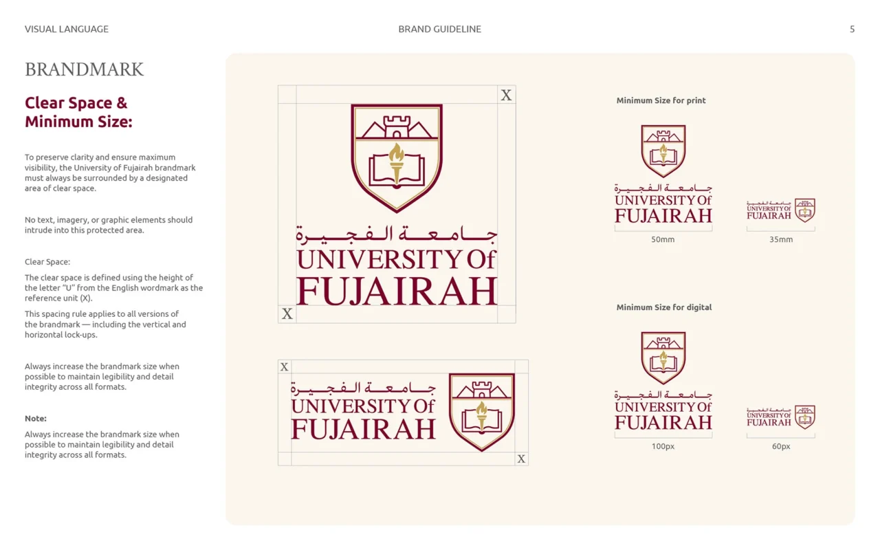
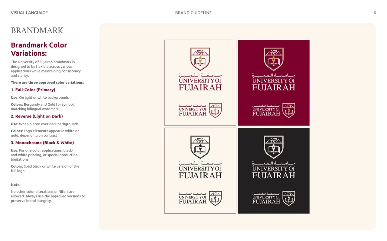
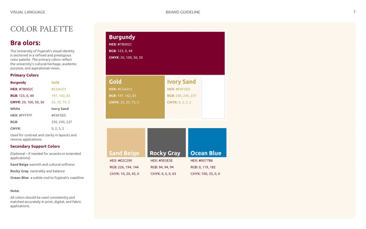
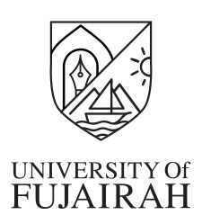
University of Fujairah: Visual Identity Exploration for a New Academic Era

Client
University of Fujairah, UAE
Scope
Brand development and visual identity concept proposal

Context and challenge

Following the merger of Fujairah University and the University of Science and Technology under the University of Fujairah name, the institution required a unified identity direction. The work needed to balance academic authority, Fujairah’s regional character, Arabic cultural references, and the requirements of a contemporary bilingual institution.

My role and response

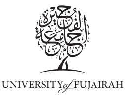
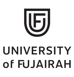
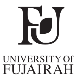
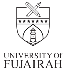
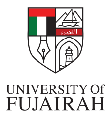
I led the visual identity exploration from research and concept development through logo construction, bilingual typography, illustration, and a supporting icon system. Five directions tested different relationships between academic symbolism, Fujairah’s landscape and architecture, Arabic calligraphy, and digital progress.

Outcome

A shield-led direction was selected for refinement during the process. The proposal was not adopted as the university’s final identity; it is documented here as a transparent study of strategic exploration, visual reasoning, and the development of a complete institutional design direction.

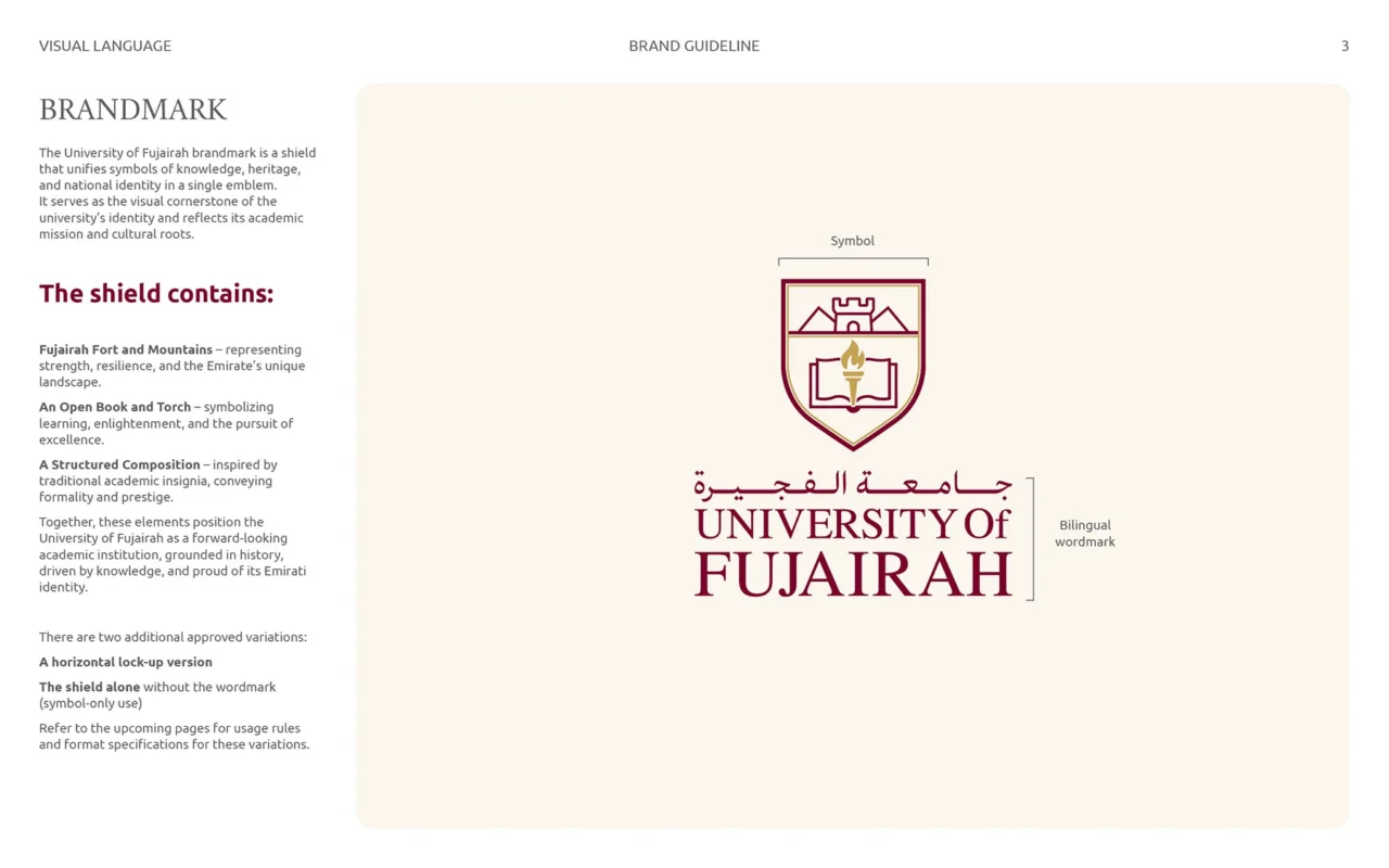
Explore the full University of Fujairah case study

Case Study 02 · Government Rebranding

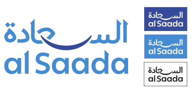
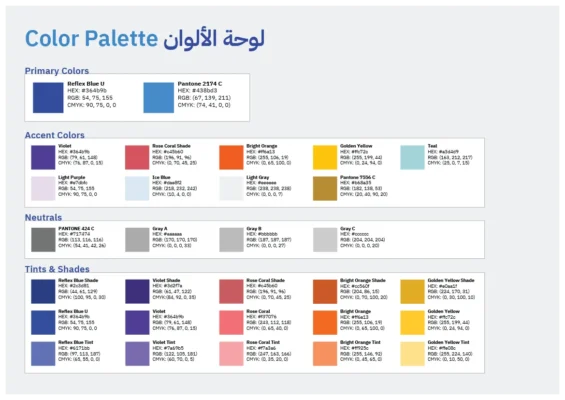
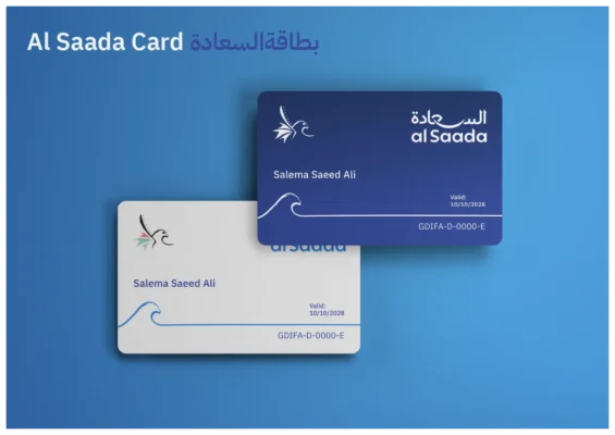
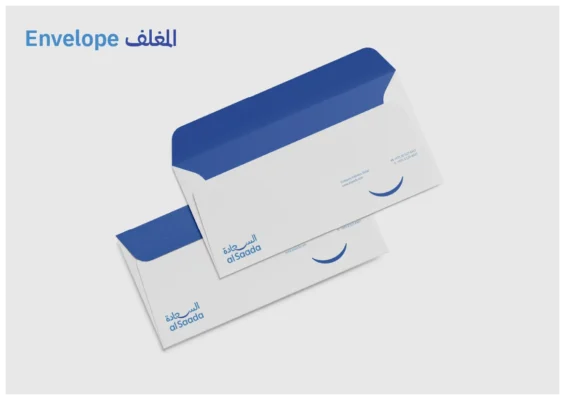
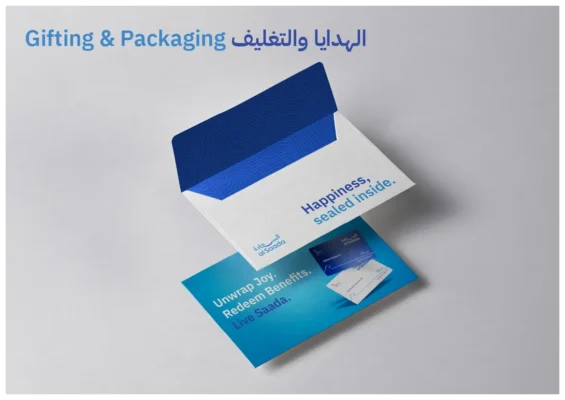
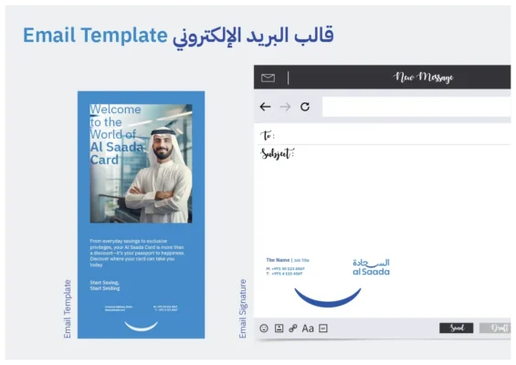
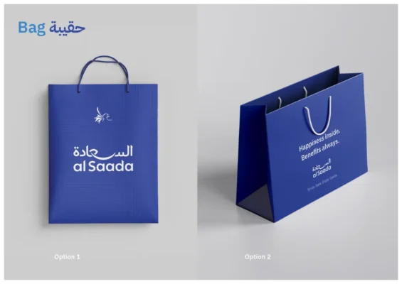
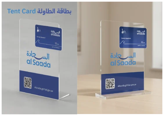
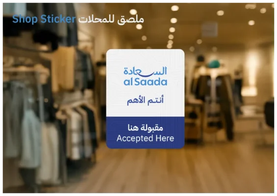
al Saada: Refining a Government-Led Brand Without Losing Recognition

Client
General Directorate of Identity and Foreigners Affairs – Dubai
Scope
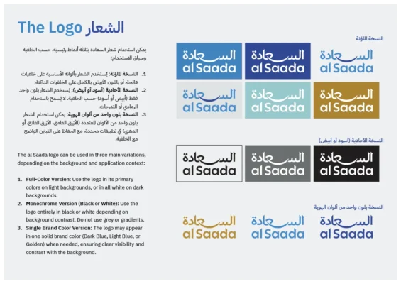
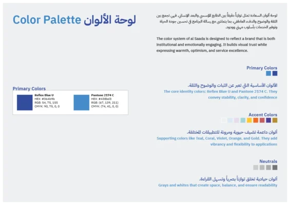
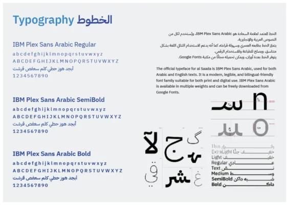
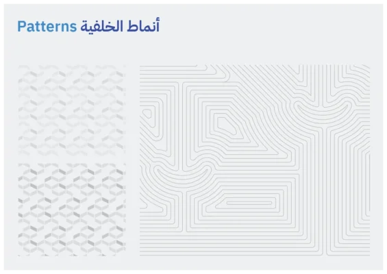
Arabic logotype, color system, visual language, guidelines, and core applications

Context and challenge

al Saada is a public-service program created by GDRFA Dubai. Its identity needed to become clearer, more balanced, and more adaptable while preserving the familiarity and institutional credibility already associated with the program.

My role and response

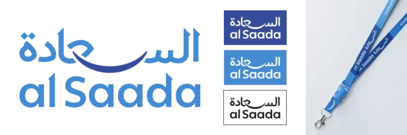
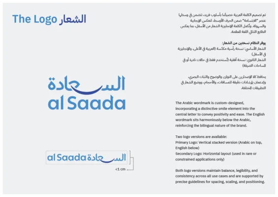
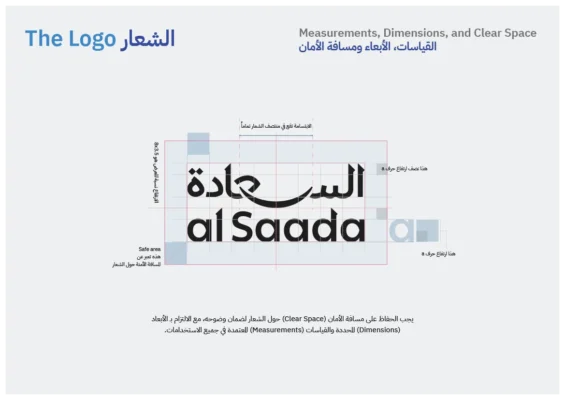
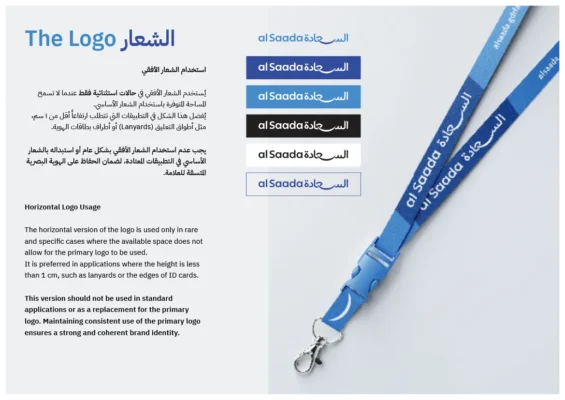
I led the creative direction, strategic alignment, Arabic logotype redesign, color system, and visual identity refinement. The Arabic mark was redrawn from Naskh principles, the English form was adjusted to align with it, and the existing smile was retained as a structural element rather than a decorative device. Two blues established calm authority and accessibility, supported by controlled accent colors.

Outcome

The result is a more mature Arabic-first identity that maintains public recognition while working more consistently across printed, environmental, and digital applications.

Explore the complete al Saada rebranding case study

Al Sada new Logo Design by Nihad Taisir

Case Study 03 · Brand Repositioning

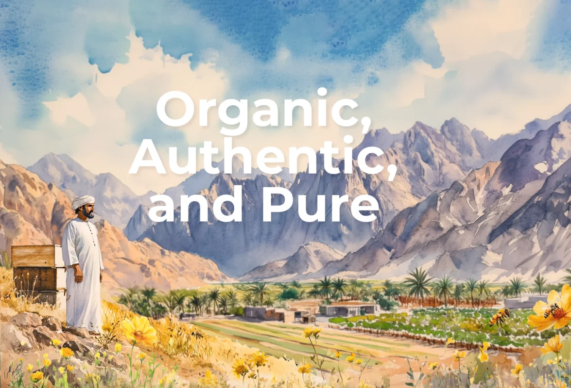
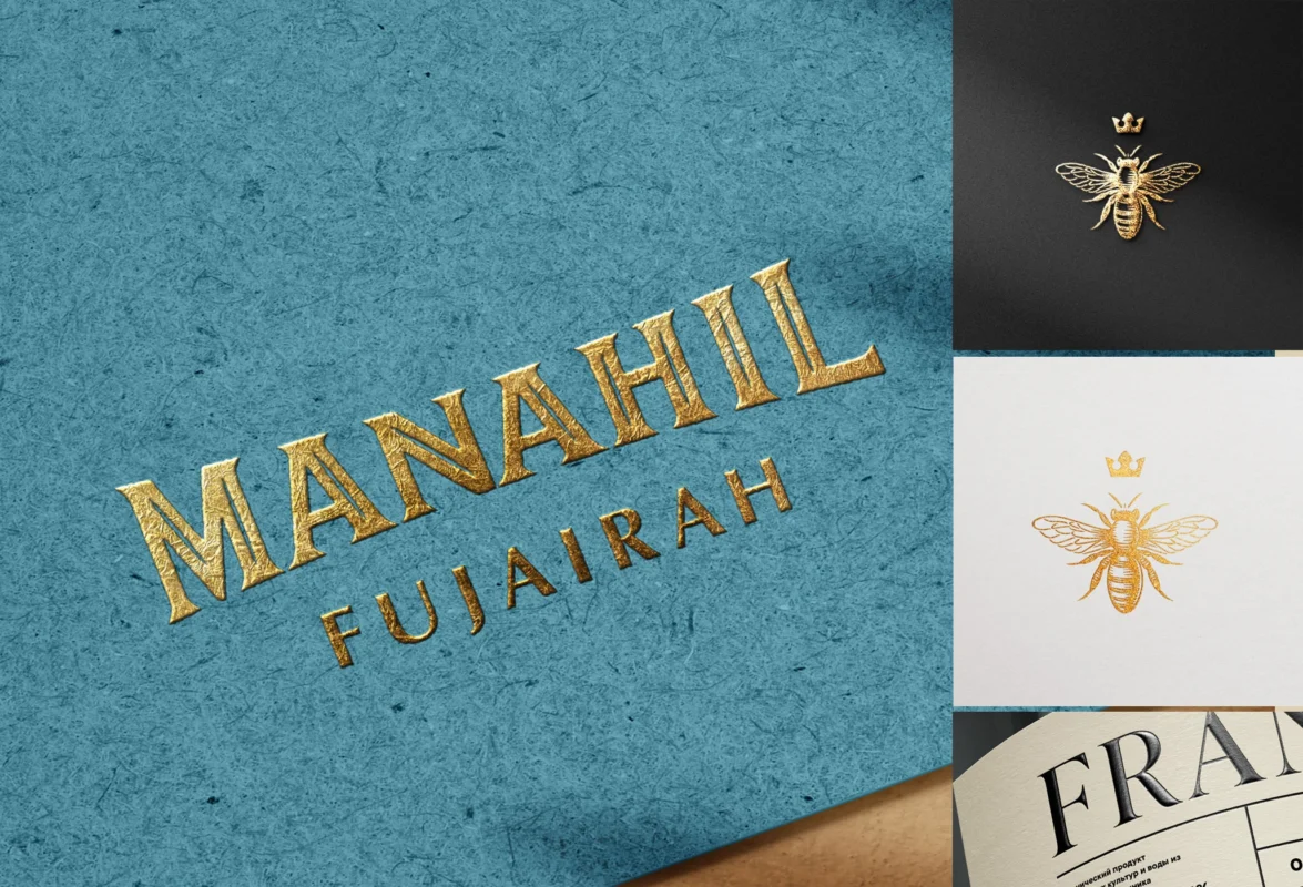
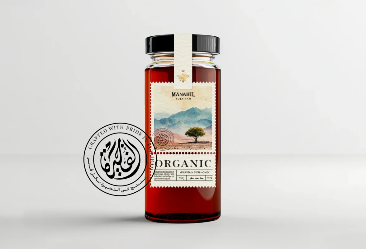
Manahil Honey: Reframing a Premium Product from Fujairah

Client
Manahil, organic honey producer in Fujairah
Scope
Brand strategy and visual concept proposal

Context and challenge

Manahil produces organic honey harvested in Fujairah, but its existing brand and packaging did not communicate the product’s origin, care, or premium positioning with sufficient clarity. The central problem was a gap between product quality and perceived value.

My role and response

As brand repositioning consultant and Creative Director, I proposed shifting the narrative from a conventional local product toward a boutique organic brand rooted in place, purity, and craftsmanship. The visual direction was designed to support premium retail presentation and clearer differentiation.
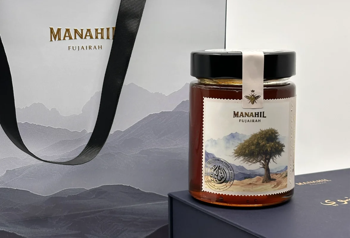
Outcome

The strategy established a coherent direction for positioning, packaging, and future communication. Because it has not yet been fully implemented, this case is presented as a strategic proposal rather than a claim of measured market impact.
Case Study 04 · Brand and Business System

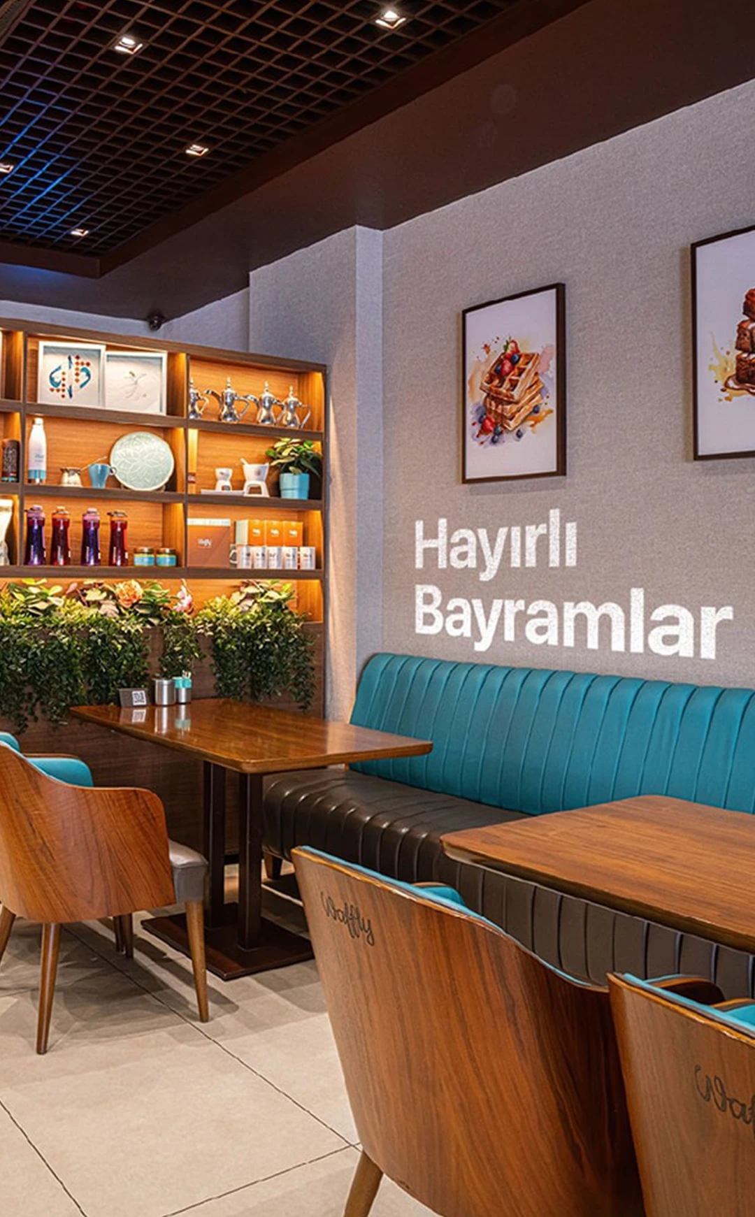
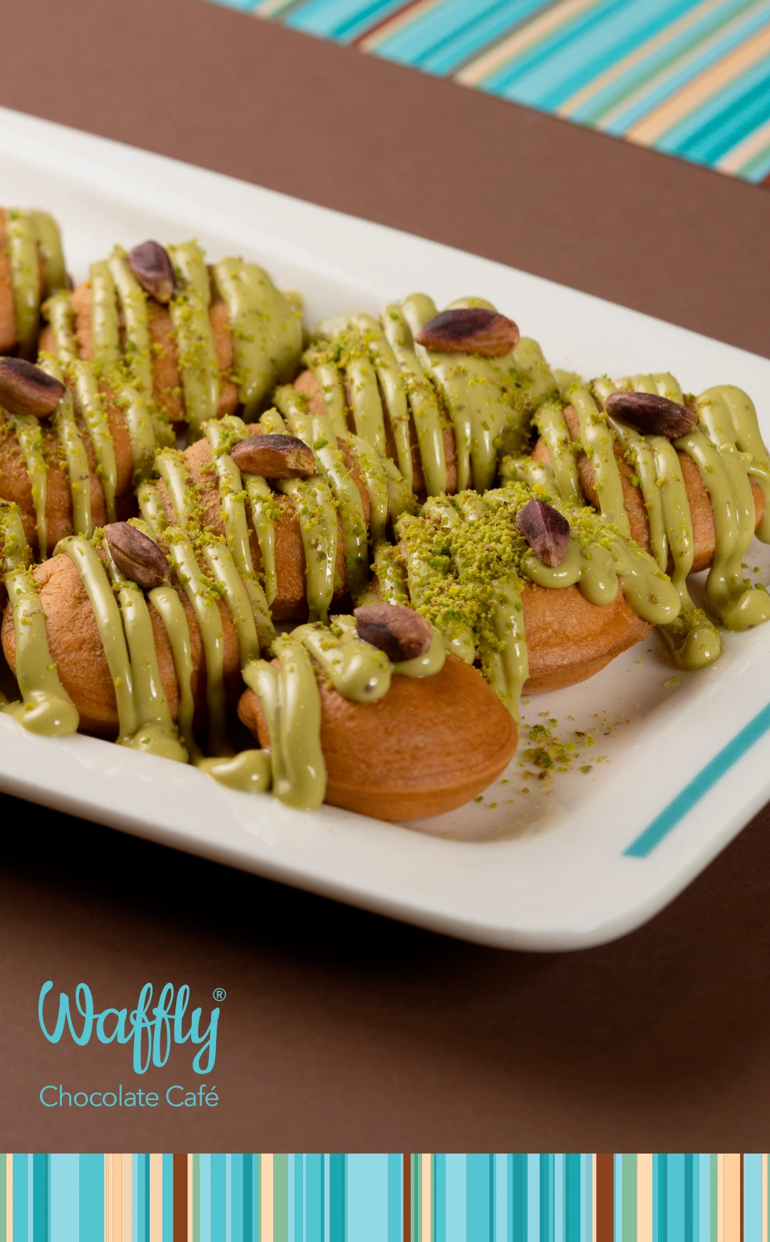
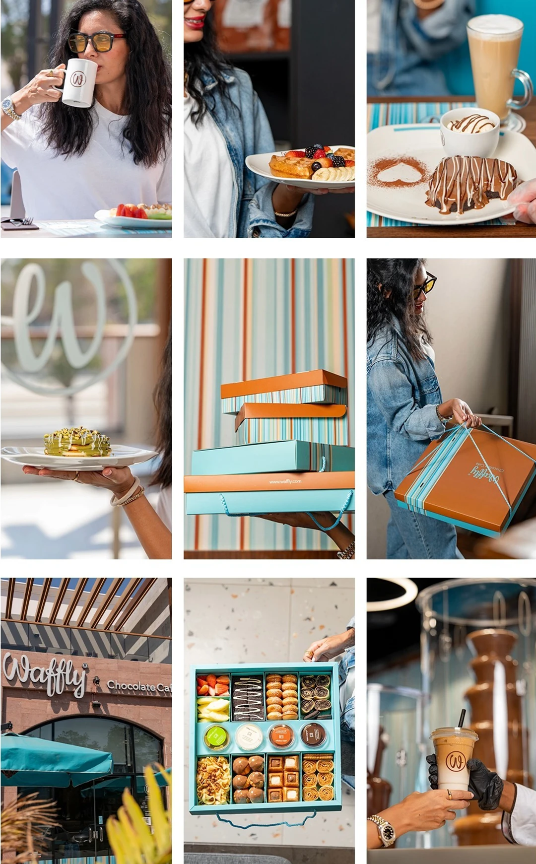
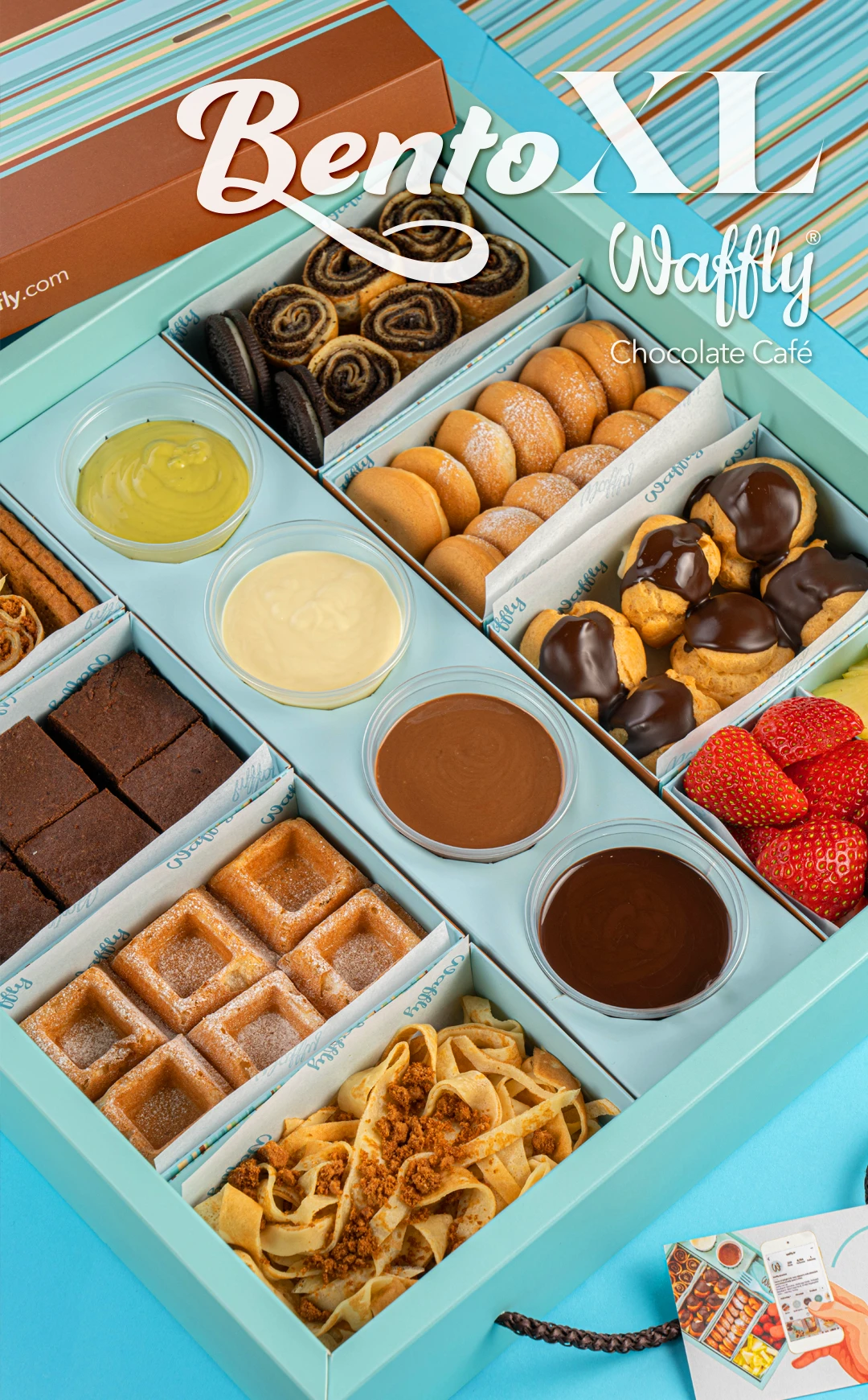
Waffly Café: Building a Cross-Regional Brand from the Ground Up

Client
Waffly, a chocolate café concept developed across Turkey, Sudan, and Gulf markets
Scope
Naming, positioning, visual identity, marketing blueprint, and franchise system

Context and challenge

The task was to create a new café brand capable of entering competitive food markets while remaining coherent and repeatable across different cultural and operational contexts. It required more than a logo: the name, positioning, service idea, identity, and business-facing guidelines had to work as one system.

My role and response

I created the name Waffly and developed the brand narrative, visual identity, tone of voice, marketing framework, and service experience. Working with the leadership team, I also developed a franchise manual covering the main visual and customer-facing touchpoints.

Outcome

The identity and operating framework gave the concept a recognizable, adaptable foundation for expansion across culturally different markets and multiple branches.

View the Waffly brand project

Case Study 05 · Publishing Identity

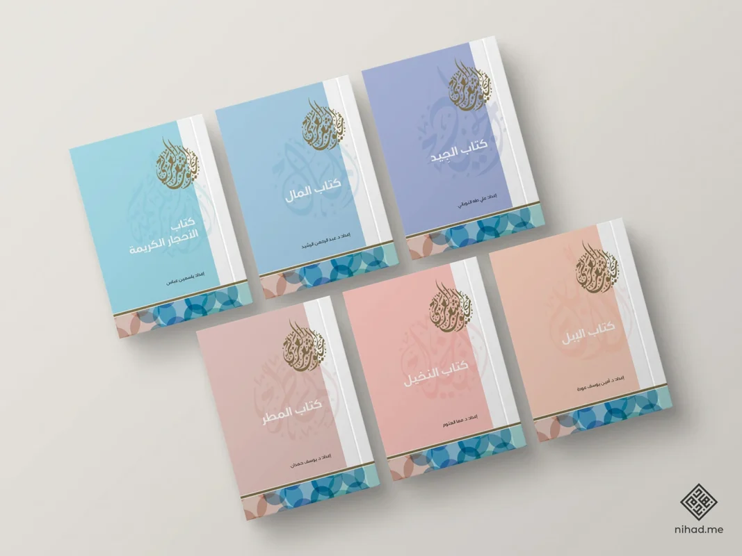
The Eyes of Arabic Poetry: Designing a 100-Volume Cultural Series

Client
Abu Dhabi Arabic Language Centre, part of DCT Abu Dhabi
Scope
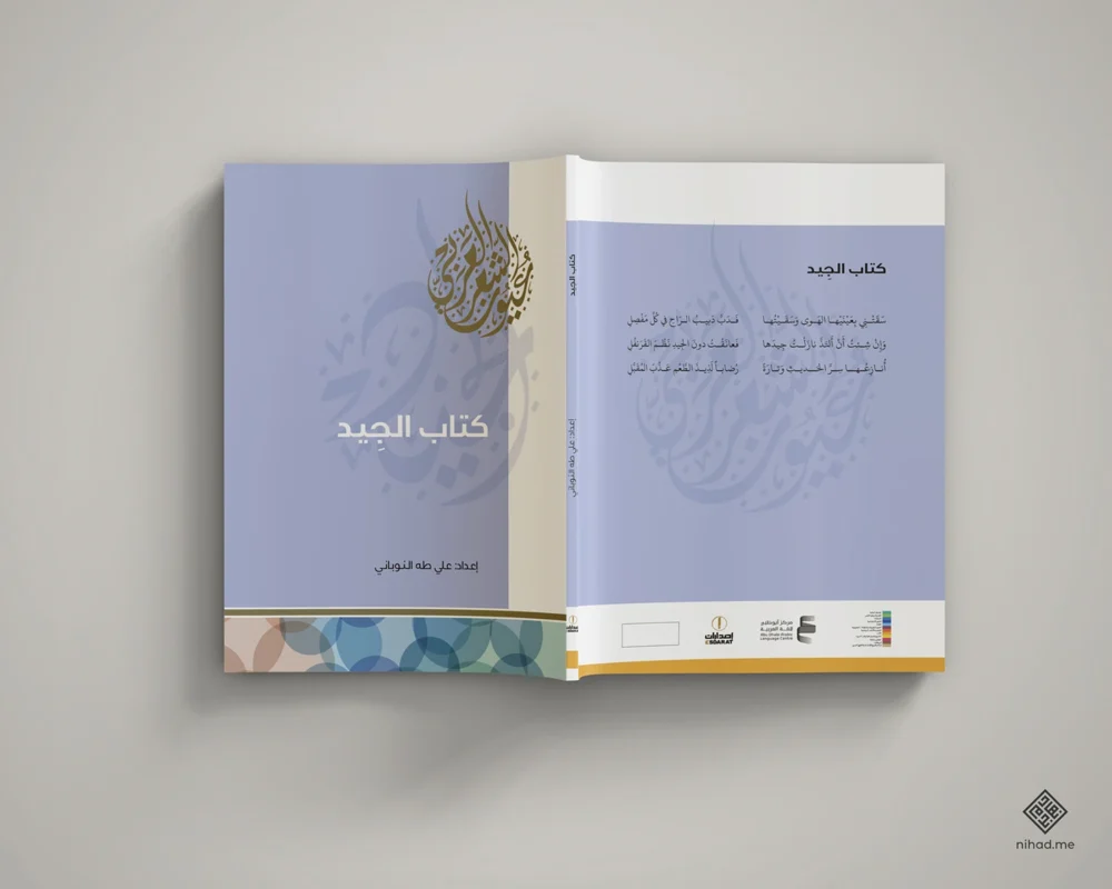
Series identity, cover system, Arabic typography, and interior design

Context and challenge

This 100-volume collection required a unified design system capable of holding many individual poetry themes together. It needed to respect classical Arabic literary heritage while remaining legible, contemporary, and recognizable as a complete institutional series.

My role and response

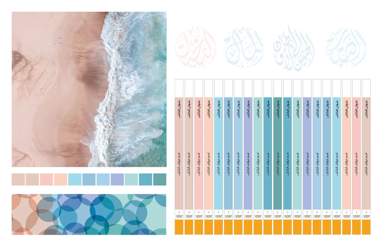
I developed the series concept, Arabic typographic direction, covers, and interior layout system. The visual language drew on the meeting of desert sand and water. Individual color tones created variety across the set, while Diwani and Jali Diwani calligraphy gave the series a consistent cultural and typographic identity.

Outcome

The completed system gave the collection a coherent visual identity across 100 titles, balancing unity at series level with distinction for each volume.

Explore Arabic editorial and book design work

The working principle

Arabic identity is a strategic system, not a translated layer.

Across these projects, the same principle applies: Arabic language, letterform, cultural context, market position, and practical implementation must be considered together from the beginning.

For the methodology behind this approach, see my practice-led reference on Arabic–English bilingual identity and logo design.

  1. 01Read the cultural and institutional context.
  2. 02Translate strategy into a coherent Arabic and bilingual visual system.
  3. 03Build the system to work across real applications and markets.

Arabic Branding & Calligraphy

Ready to Build Your Brand?

Let’s collaborate to create a brand that is not just seen, but truly understood by your audience.