
Arabic–English Bilingual Logo Design
A practice-led reference by Nihad Taisir Nadam
Why Arabic Brand Identity Requires a Specialist
This practice-led study by Nihad Taisir Nadam explains why a bilingual identity is not created by translating a logo or placing Arabic beneath English. It is created by designing a governed relationship between two writing systems—with different structures, directions, rhythms, proportions, cultural associations, and technical constraints.
- 2
- writing systems considered on their own terms
- 5
- practical bilingual logo architectures
- 6
- stages in Nihad’s working framework
- 80+
- logos designed or adapted across Nihad’s practice
01 · The premise
A bilingual identity is not a translated logo
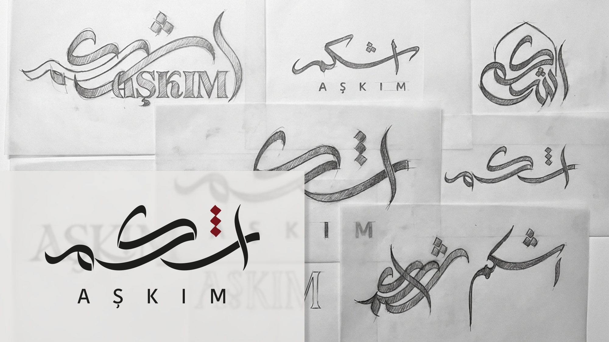
An Arabic–English logo is not created by translating a name, choosing an Arabic font, and placing it beneath an English wordmark. It is created by negotiating two writing systems with different structures, directions, rhythms, proportions, and cultural histories.
Arabic often enters after the English name has already shaped the symbol, grid, and visual language. It is then stretched, compressed, reduced, or forced to imitate Latin details that do not belong to it. The result contains two languages, but only one feels original to the brand.
Arabic is cursive and context-sensitive. Joining, positional letterforms, letter groups, dots, counters, spacing, and baseline relationships affect reading and rhythm.1 Experimental research also shows that Arabic readers rapidly process dot information that distinguishes letters sharing the same basic shape.2 Arabic lettering is therefore a structural problem, not a decorative substitution.
02 · Direction
Reading direction matters—but it does not define how people think
Arabic text normally progresses from right to left, while English progresses from left to right. Mixed content is more complex: numbers and embedded Latin strings retain their own directional behaviour, which is why the Unicode Bidirectional Algorithm is needed.3
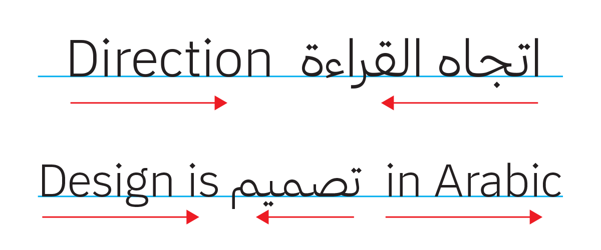
Reading direction affects visual attention during reading. In an eye-tracking study of skilled Arabic–English bilingual readers, the useful perceptual span extended further in the direction of reading: leftward while reading Arabic and rightward while reading English.4 Direction is therefore not a superficial alignment preference; it participates in how readers acquire information from a line of text.
It would nevertheless be inaccurate to conclude that Arabic readers simply “think from right to left.” Research suggests that writing direction and the language active at a given moment can influence some spatial representations, including how time is arranged, but the effect is flexible and context-dependent.5 Bilingual readers move between directional systems, and Arabic numbers introduce left-to-right sequences within Arabic contexts.
03 · Naming
The Arabic name comes before the Arabic logo
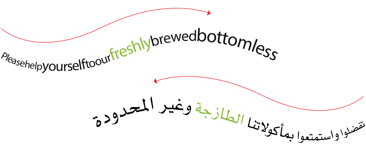
Before drawing, we must decide what the Arabic name is. Translation carries meaning into another language; transliteration represents a name in another script, usually to guide pronunciation. Retaining the Latin name or authoring a distinct Arabic market name are further options.
My default position is that a proper brand name should not be translated merely because it enters an Arabic-speaking market. A name is an identity asset, not an ordinary phrase. Yet “never translate a name” is equally simplistic. Translation studies treat proper-name decisions as functional: the appropriate strategy depends on audience, purpose, cultural context, and the role the name performs.6
Translation may be appropriate when a name is descriptive, its meaning is central to the promise, an established Arabic form exists, a legal form requires it, or transliteration would create confusion. The decision should consider sound, meaning, recognition, search behaviour, undesirable associations, registration, and consistency across markets.
Transliteration has no automatic perfect answer. Unicode’s guidance notes that convention, pronunciation, and reversibility cannot always be satisfied simultaneously.7 Brand naming adds trademark, cultural, and commercial pressures.
Instagram illustrates the problem. Arabic readers encounter إنستجرام, إنستقرام, إنستغرام, and other forms because the English hard g has no single equivalent that produces the same sound across Arabic dialects. In my professional experience, إنستاجرام and إنستجرام are more immediately familiar candidates among the audiences I encounter. This is a practice observation, not a universal corpus finding. A real project should test the leading forms, then declare one canonical spelling.
Familiarity should not let a local pronunciation rewrite a clear source sound. I would normally write نوكيا, not نوقيا, a form I have encountered in the UAE. The k in Nokia is clear; replacing it with qāf introduces a different written consonant. Legal registrations and established market forms must still be checked before advising a client.
04 · Visual relationship
Visual parity is not visual imitation
Equal point sizes or matching widths do not produce equal presence. Arabic and Latin distribute height, density, depth, and white space differently. Stretching one wordmark to match the other’s width may create numerical equality while damaging both form and rhythm.
I use optical parity as a practice-led criterion: both languages should carry appropriate authority, although the measurements used to achieve it may differ. It is not a universal numerical formula or a scientifically validated score. Multiscript practitioners similarly argue for matching intent and selected parameters rather than copying anatomy.8
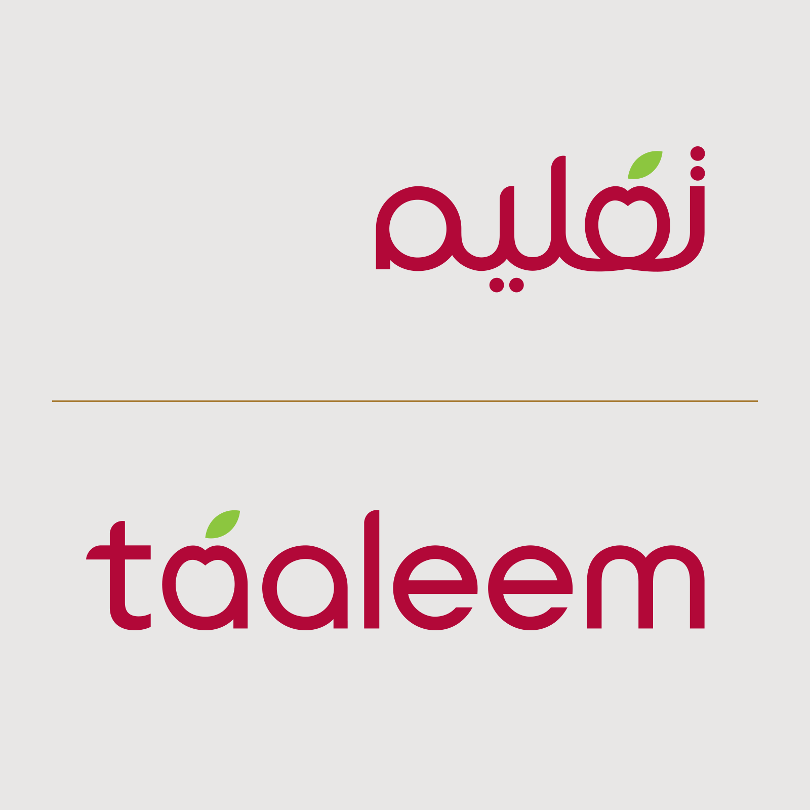
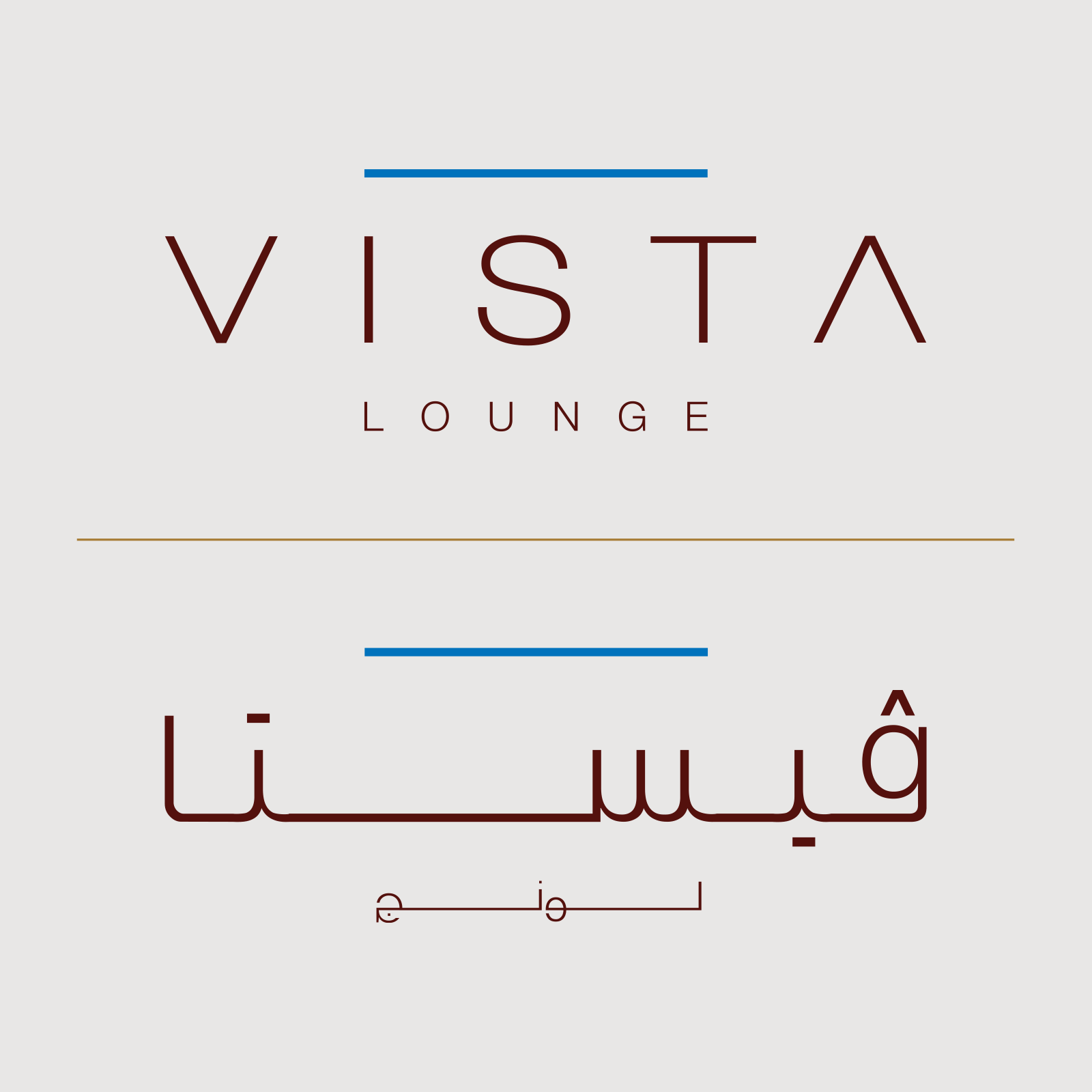
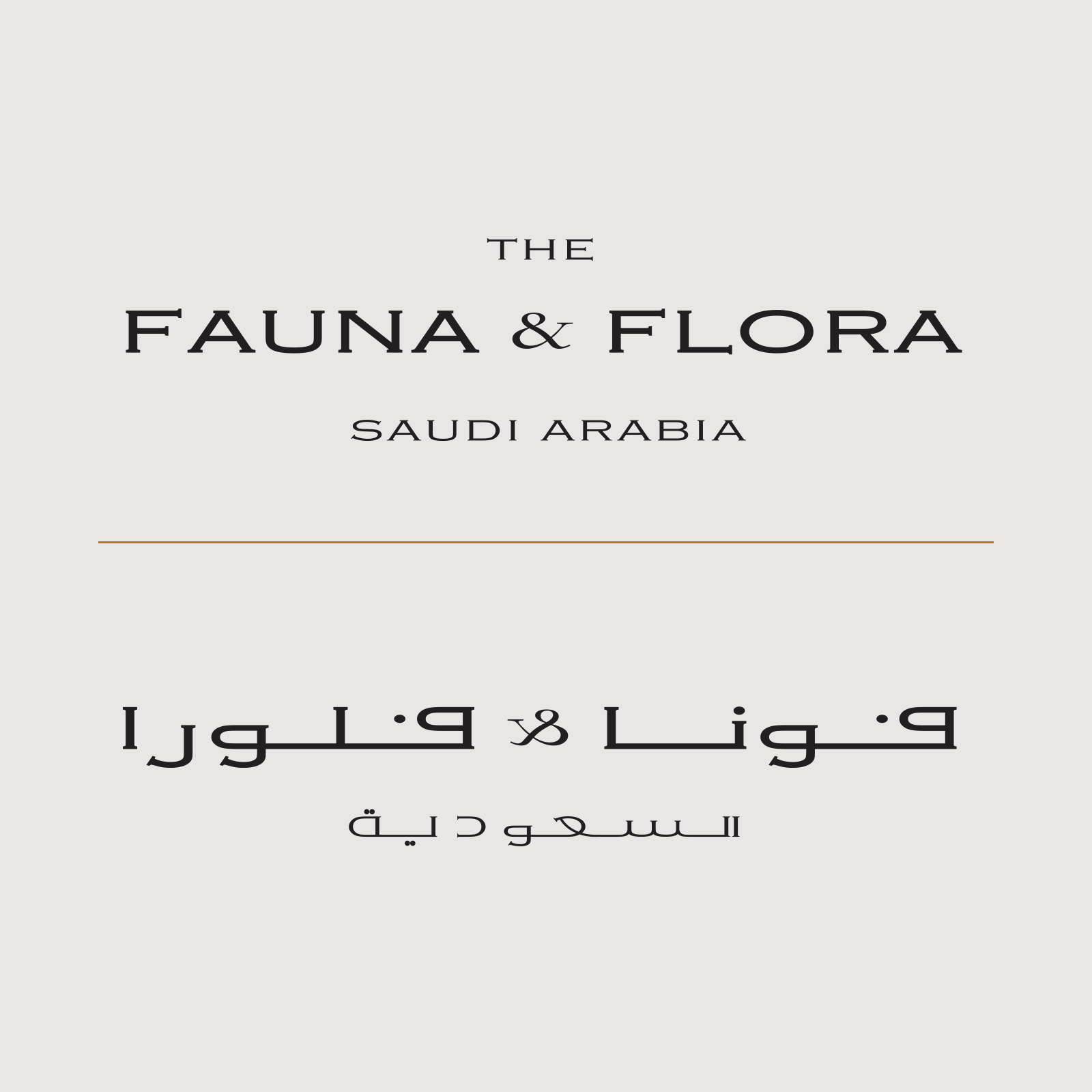
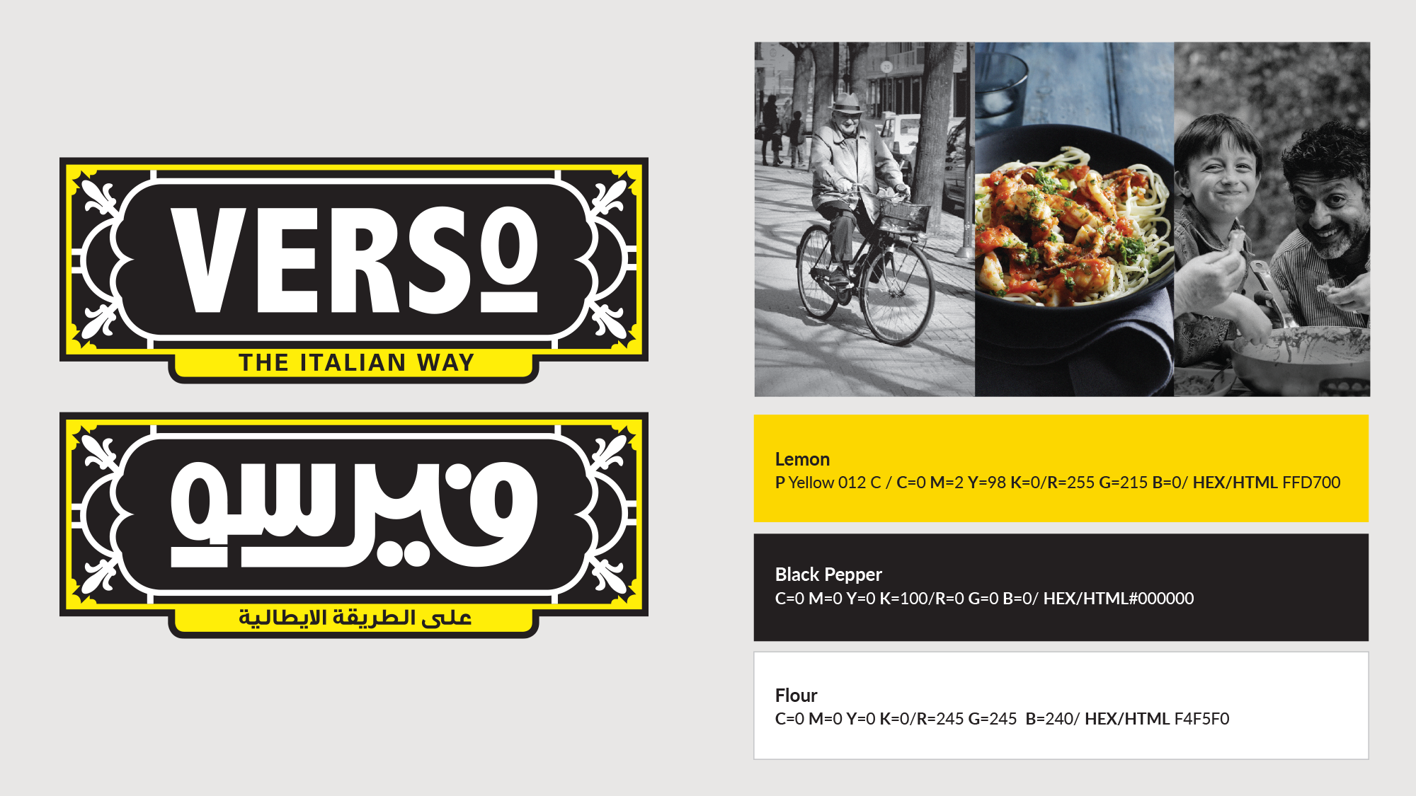
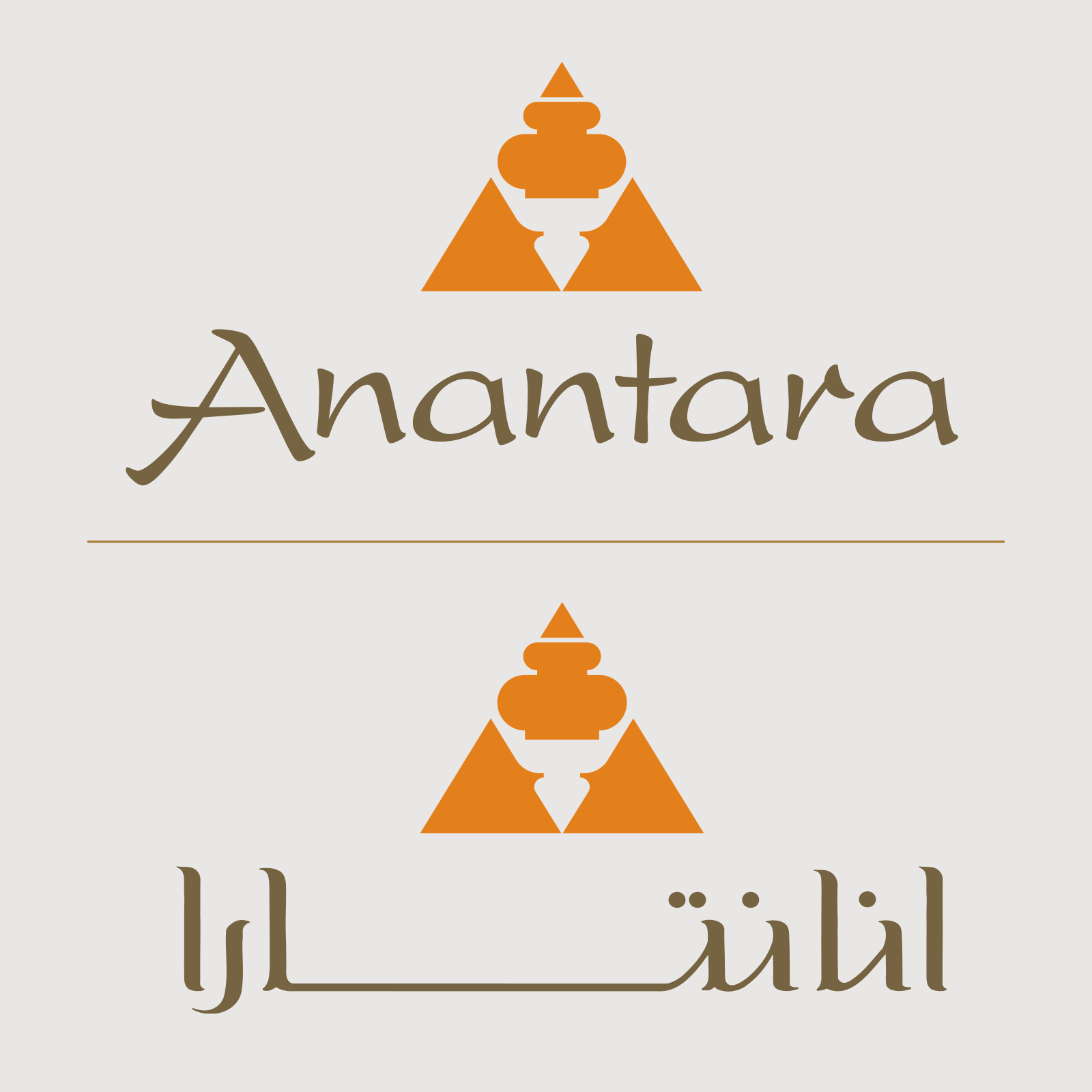
Parity also requires a shared voice. “Warm,” “institutional,” “technical,” or “luxurious” must be interpreted through the logic of each script; the Arabic does not need to impersonate the anatomy of the Latin letters.
05 · Architecture
Five practical structures for a bilingual logo system
Many clients assume that Arabic and English must always appear together in matching logos. I do not find that practical in every case. The following is my working taxonomy, not a claim that all bilingual identities fit only five universal categories.
- Parallel standalone wordmarks
Arabic and English are related but complete on their own, and each is used in the appropriate language context.
- One primary wordmark with a limited Arabic version
A globally recognised brand may use Arabic for registration, signage, or official requirements—when that reflects the audience strategy.
- A primary wordmark with a quiet second-language signature
The distinctive logo remains dominant while a simple Arabic or Latin name provides identification.
- An Arabic wordmark as the distinctive symbol
An international company rooted in the region can let Arabic carry the visual personality, with a Latin name providing access.
- A permanent equal-priority lockup
Institutions and public-facing brands may need both languages together most of the time. Even here, parity does not require identical construction or measurements.
Regulation can determine a particular application without determining the whole identity. Dubai Economy guidance, for example, specifies Arabic and English trade names on commercial signboards.9 That does not make the same configuration ideal for an app icon, social avatar, or international campaign.
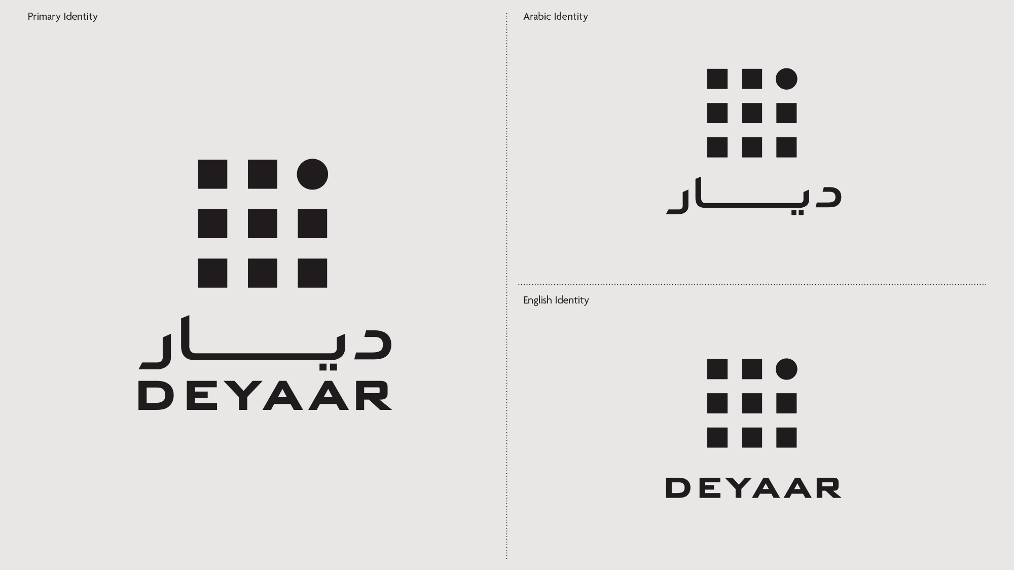
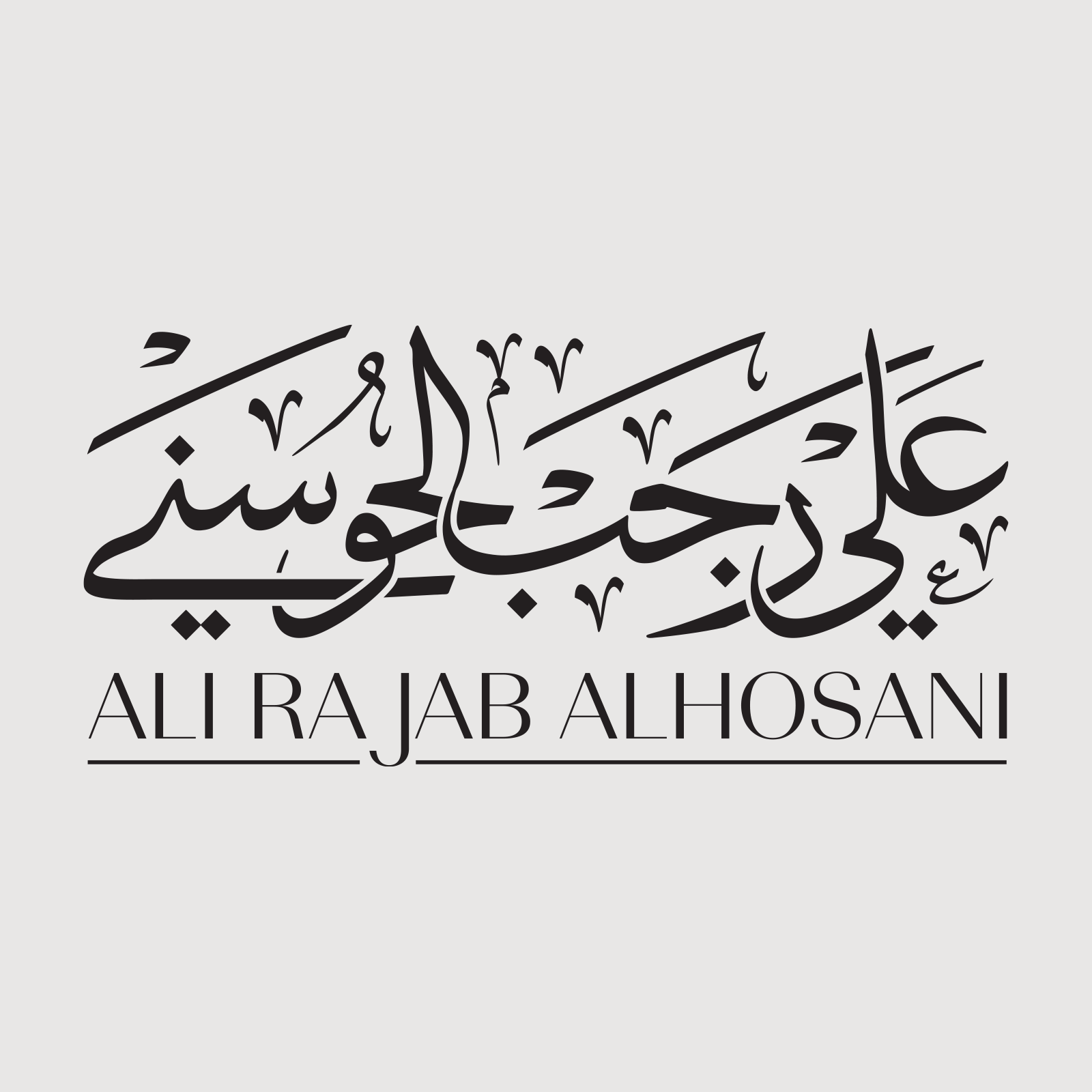
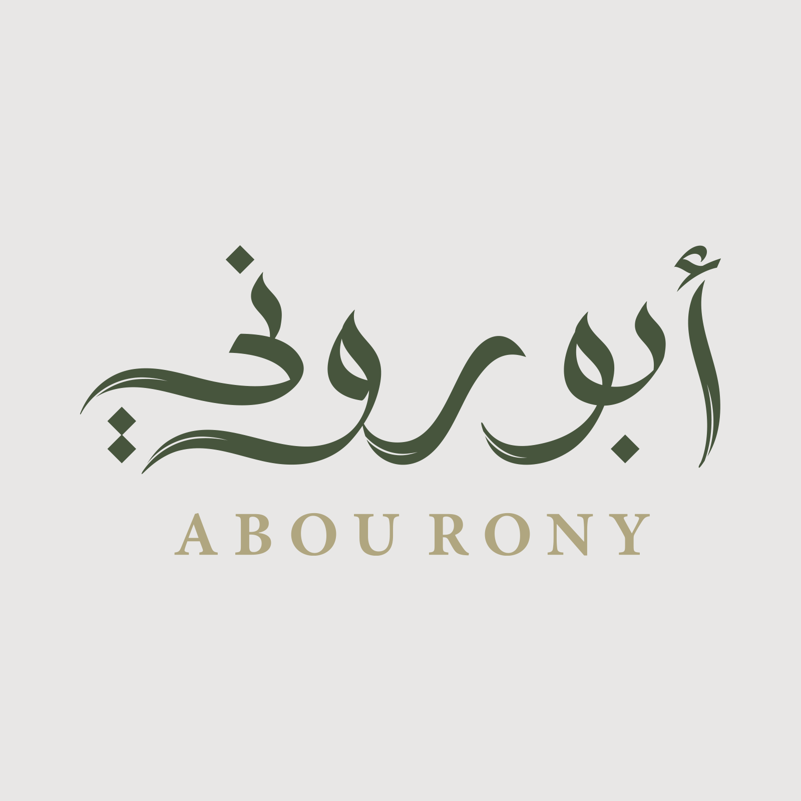
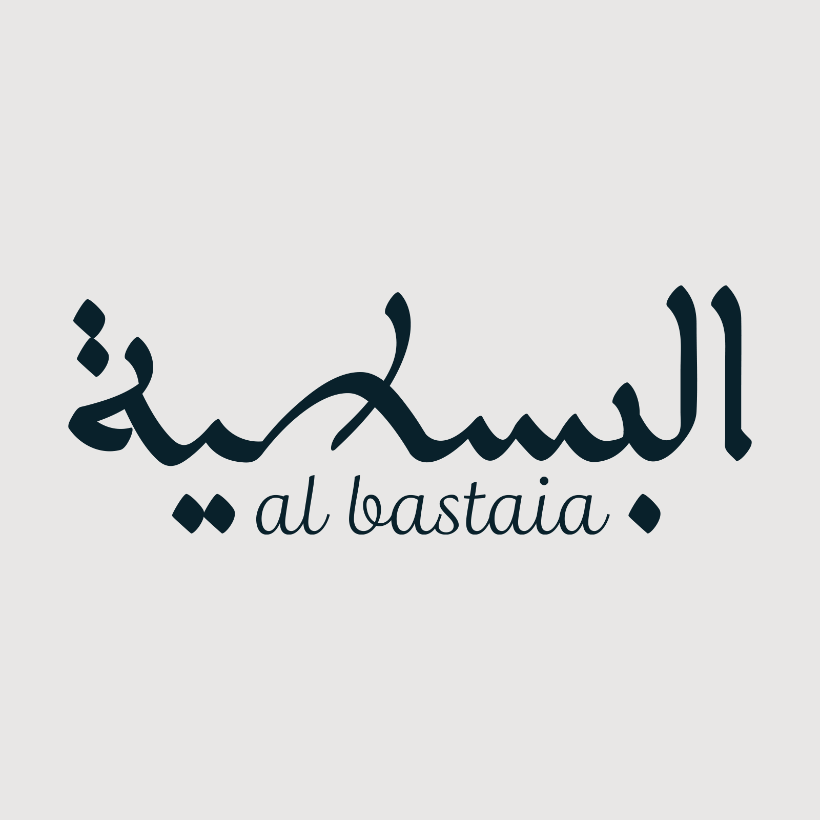
An Arabic-primary mark with a supporting Latin signature is often a particularly honest structure: Arabic carries the identity, while Latin helps people identify or pronounce the name without competing for equal visual attention.
06 · Dual reading
When one drawing carries two writing systems
Many clients request a single drawing whose strokes can be interpreted as both the Arabic and Latin name. The attraction is clear: it compresses bilingualism into one memorable gesture, and the moment of discovering the second reading can be delightful.
Yet, whether we intend it or not, the method asks one or both scripts to operate inside a visual logic that is not entirely their own. Arabic connections and proportions may be reshaped to reveal Latin letters; Latin forms may be altered to complete the Arabic reading. A skilful solution can reduce that tension, but it cannot remove the negotiation. The fusion may also become the identity’s main idea, limiting how the brand extends to small sizes, sub-brands, descriptors, motion, and future communication.
This kind of experiment can be excellent in a campaign, cultural event, exhibition, poster, or artistic project. Discovery and dual reading can then be part of the message, and the idea can change when the campaign changes. A primary logo carries a different, longer-term responsibility: it must remain recognisable, reproducible, extensible, and able to represent the organisation for years.
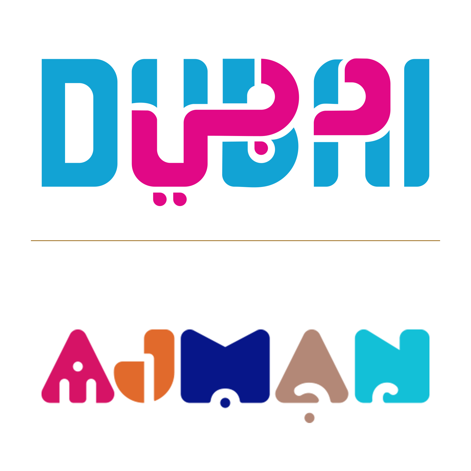
Dubai: good execution, strategic reservation
The Dubai destination mark is a well-executed example. Its official guidelines describe Arabic and Latin as two layers inspired by the city’s cultural fusion and its role as a place where the world comes together.10 That objective is appropriate, and both دبي and Dubai are readable.
My reservation is not a claim that the mark has failed, nor a matter of whether I personally like its form. It concerns making interscript fusion the permanent foundation of a logo. I would be more comfortable with the same concept as a campaign language, where it could celebrate cultural encounter without governing every future expression of the identity.
Visit Ajman: when the mechanism overtakes the destination
The Visit Ajman destination mark shows, in my assessment, what happens when a destination identity falls into this trap. At close range, five coloured forms read AJMAN from left to right and attempt to form عجمان from right to left. The identity was introduced to support Ajman’s positioning as a tourism destination and the idea of modern Emirati hospitality.11 Yet the Arabic does not read clearly enough, and its recognition deteriorates further at small sizes or from a distance. The Latin remains more immediately available.
This is expert appraisal, not the result of an audience experiment. It can be tested through unprompted first reading, controlled size and viewing distance, reading confidence, and category association. Logo research has long treated recognition and affect as measurable outcomes.12
07 · Letter knowledge
Calligraphy is knowledge, not decoration
Knowledge of Arabic calligraphy does not mean every logo should look traditional or handwritten. It means understanding how letters remain distinguishable, how repeated forms are organised, how joins create rhythm, and how proportions give a word stability.
A designer may follow a rule, reinterpret it, or deliberately depart from it. But intelligent departure requires understanding the problem the rule was solving.
Pepsi and the row of teeth
In a 2016 article about Arabic calligraphy and computer fonts, I discussed one stage of Pepsi’s Arabic wordmark and the sequence inside بيبسي.13 The opening bāʾ–yāʾ–bāʾ creates repeated tooth-like strokes, immediately followed by the teeth of sīn. When these strokes repeat at one level with similar intervals, the word becomes mechanically monotonous and its internal skeleton is poorly differentiated.
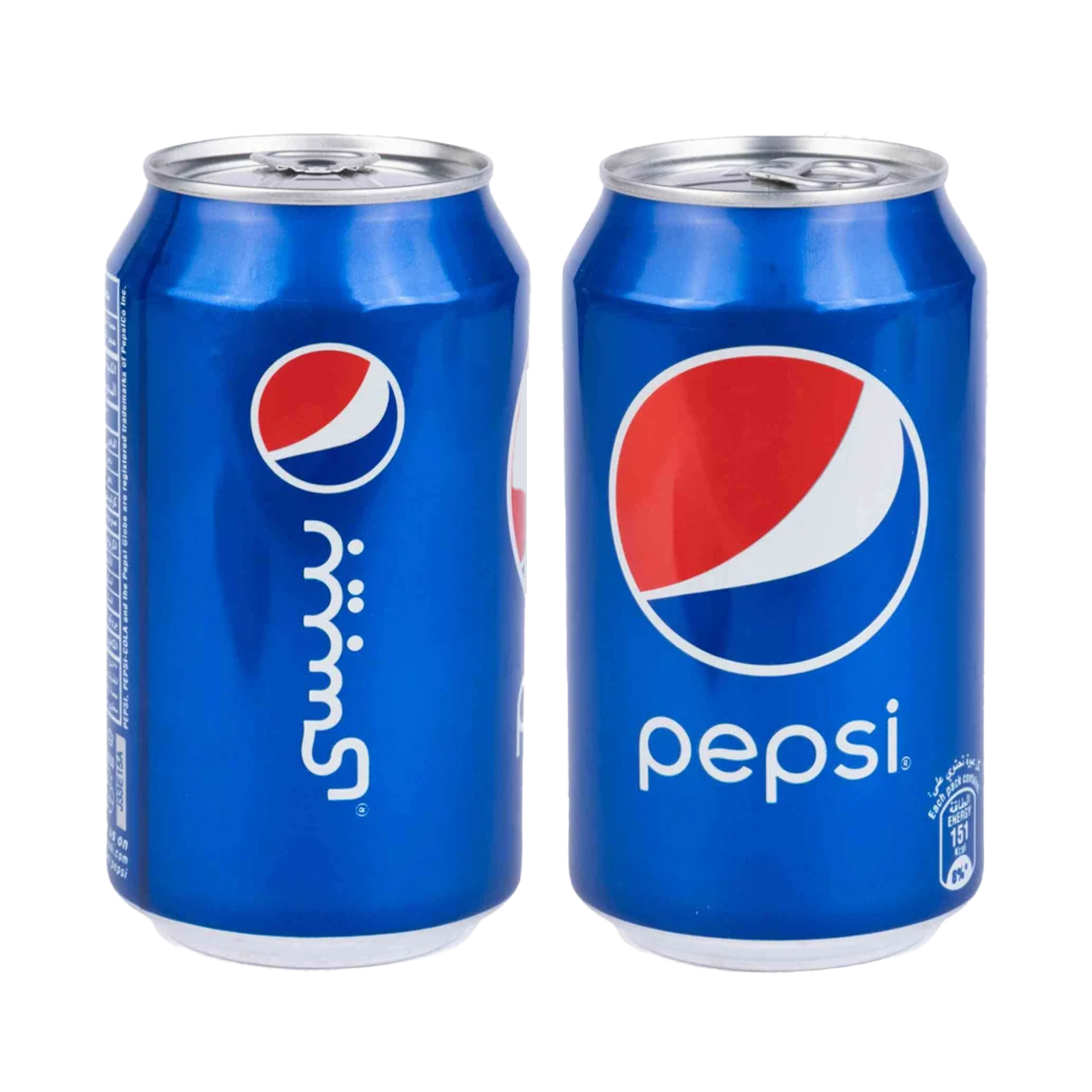
Arabic calligraphic traditions developed contextual solutions. In the Ruqʿah example cited in my earlier article, selected teeth rise when similar forms occur successively, organising the group and avoiding confusion with sīn. A modern logo need not copy Ruqʿah, but it must recognise the optical problem.
Because a logo is fixed artwork, its designer is not restricted to default font glyphs. The word can be custom drawn and its joins, heights, and intervals tuned as one composition. Pepsi has since replaced the version discussed here, so this criticism is explicitly limited to the historical wordmark shown—not the current identity.14
The League of Arab States and calligraphic responsibility
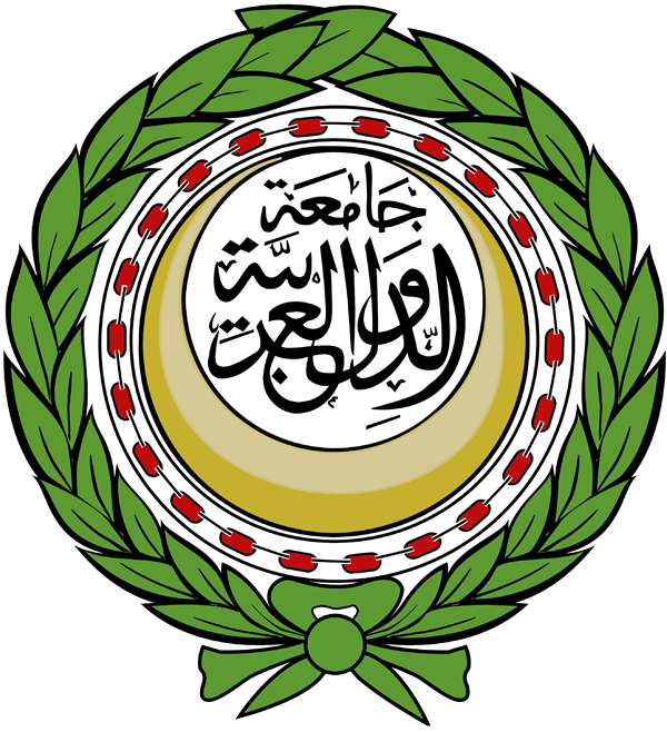
The emblem of the League of Arab States creates a sharper contradiction. Arabic is its central voice: جامعة الدول العربية occupies the symbolic centre of an institution representing Arab states. Yet the calligraphic composition currently displayed by the General Secretariat’s verified official account is, in my assessment, deeply unsuccessful.15
It evokes Thuluth without demonstrating its discipline. The proportions do not form a coherent system; joins feel hesitant; internal spaces are compressed unevenly; overlaps fail to create a controlled hierarchy; and the phrase lacks the clarity, balance, and movement expected from accomplished Thuluth.
This is an expert appraisal of the visible composition, not a historical claim about who drew or approved it. The commissioning process and original master file have not been established. The responsible question is not who failed, but why the visible result does not demonstrate the command expected from the tradition it invokes.
A logo designer need not pretend to master every calligraphic style. The designer must know when mastery is required, maintain professional relationships with calligraphers, understand their different strengths, and select the right practitioner. One may excel in monumental Thuluth, another in Naskh, Diwani, Ruqʿah, geometric Kufic, or contemporary experimentation.
The designer defines the idea, audience, voice, bilingual relationship, and practical constraints. The calligrapher interprets that direction through the selected tradition. The designer then evaluates, digitises, composes, and integrates the lettering into the identity system. A master calligrapher is not automatically a brand strategist, and an identity designer is not automatically a master calligrapher. Strong work respects both roles.
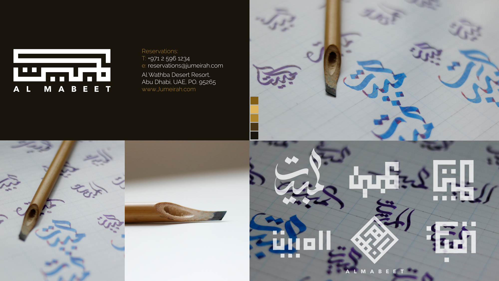
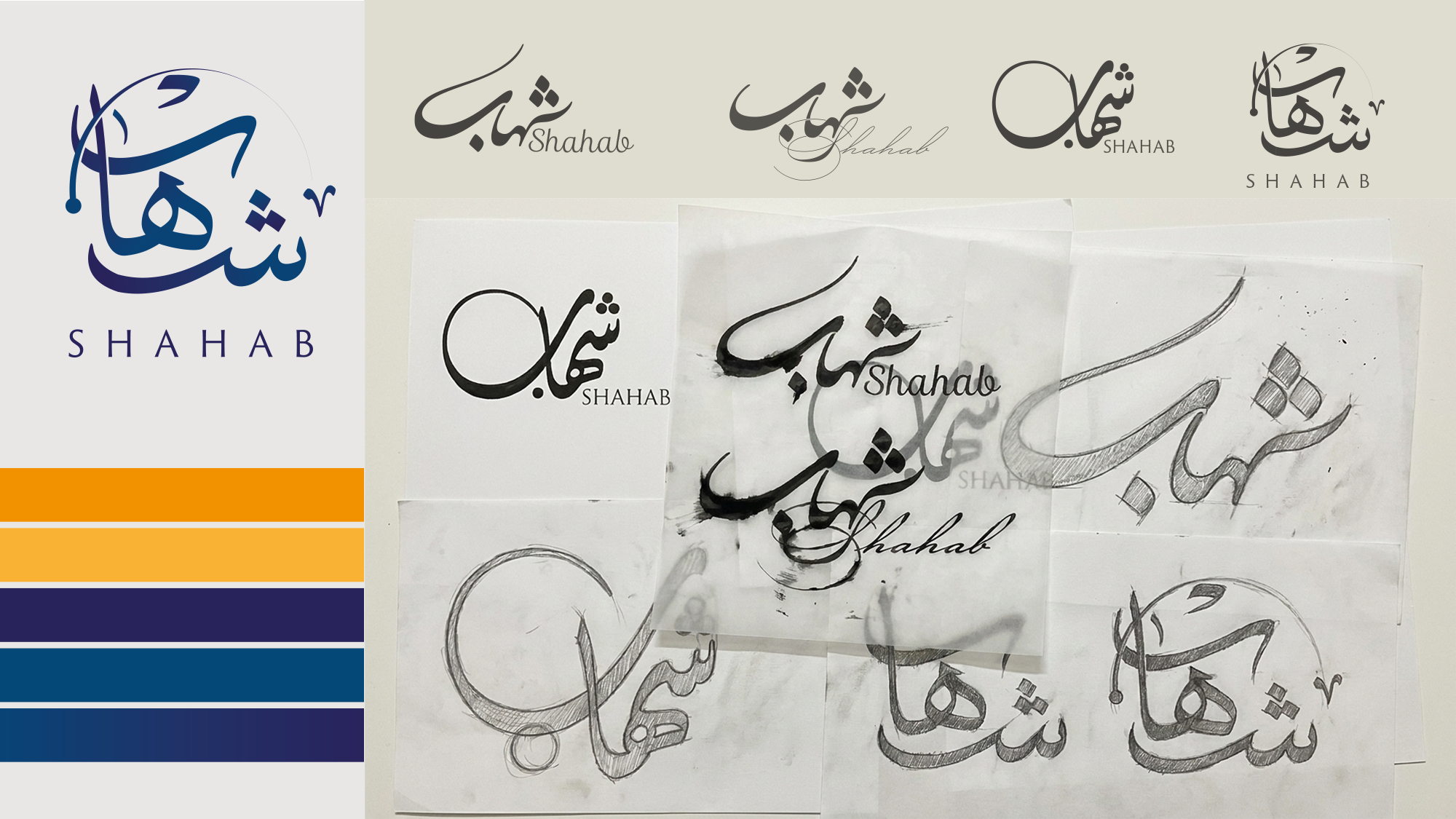
The framework that follows was not formed as a theoretical classification first. It grew through my work designing or adapting more than 80 logos. They cannot—and need not—all appear here. These examples are included because each exposes a different decision about naming, hierarchy, optical weight, reading direction, cultural voice, or implementation.
08 · Method
Nihad Taisir Nadam’s six-stage bilingual identity framework
My role is not to make Arabic resemble English at any cost. It is to determine what both expressions should share, what each must preserve, and how they can operate as one brand.
- Resolve the Arabic name
Decide whether it is translated, transliterated, retained, established, or newly authored; test candidates and define one canonical form.
- Choose the language architecture
Select standalone wordmarks, a localised version, a quiet signature, an Arabic graphic mark with Latin identification, or a permanent lockup.
- Define the shared voice
Translate qualities such as precise, warm, institutional, technical, or luxurious into a brief for both scripts—not copied letter details.
- Choose the right expertise
Determine whether the project needs a typeface, custom lettering, a specialist calligrapher, a type designer, or a collaboration.
- Balance optically and test independently
Each wordmark must work alone before bilingual configurations are built. Compare apparent size, mass, rhythm, spacing, and negative space.
- Build rules for real use
Test signage, packaging, interfaces, social media, presentations, small sizes, mixed content, and language-priority changes. Deliver a system, not two logo files.
This is a transparent practice framework intended for case analysis and refinement. It should be tested across multiple projects before it is treated as a general evaluation model.
See how these principles are applied in practice through my selected Arabic branding case studies, or explore a broader range of Arabic and bilingual identity work in my creative portfolio.
For individual wordmark examples and their design context, explore my selected Arabic logo design work.
09 · Conclusion
Arabic should be authored, not added
Arabic–English logo design crosses naming, lettering, calligraphy, typography, localisation, creative direction, and implementation.
Pepsi reveals how a small structural detail can expose default font behaviour. Dubai shows that bilingual fusion can be executed successfully while still raising questions about whether the device should govern a permanent identity. Visit Ajman shows how the same ambition can weaken Arabic legibility and alter the perceived character of the brand. The League of Arab States shows the cost of invoking calligraphic authority without the mastery it demands.
That is the difference between translating a logo and designing a bilingual identity.
Scope and evidence
This is an academically informed expert article, not an experimental research paper. Technical claims rely on standards; claims about reading rely on peer-reviewed studies; the naming, parity, logo-architecture, and collaboration principles are practice-led; and the case discussions are bounded expert analyses. Where original audience testing has not been conducted, the article states that limitation rather than presenting judgement as measured fact.
