
Government Brand Identity · Dubai

Al Saada:
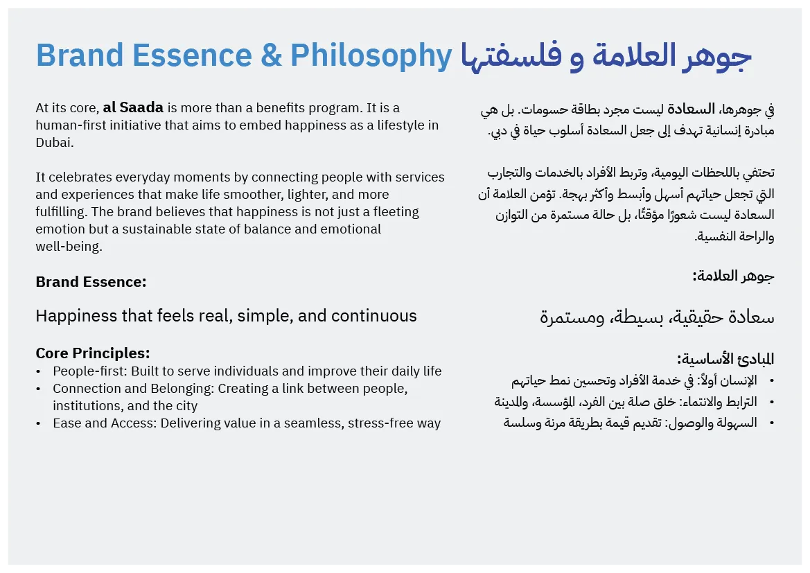
an Arabic-first identity shaped around calm

Al Saada needed to feel recognisably institutional and genuinely human. The refresh strengthened its Arabic typographic voice, clarified the bilingual relationship, and created a visual system that could move confidently from a membership card to public-facing applications.

Client
General Directorate of Identity and Foreigners Affairs – Dubai
Sector
Government · Public Services · Community Programme
Role
Creative direction, Arabic logotype, visual system, applications
View the visual system →

Al Saada refreshed bilingual brand identity and visual system

01 · Brief and challenge

A refresh, not a replacement

Project overview

Al Saada is a government-led benefits programme developed by GDRFA Dubai. The assignment focused on refining the existing identity rather than replacing it: preserve recognition, strengthen clarity, and create a more durable system for digital and physical touchpoints.

The brief called for a contemporary identity with a clear Arabic-first character and a balanced bilingual presence. Happiness was defined not as visual excitement, but as calm, reassurance, and continuity.

The central challenge

The identity had to hold four qualities in tension: government authority, human warmth, cultural authenticity, and modern digital usability.

Keep
Familiarity and institutional recognition
Improve
Arabic presence, balance, and reproduction
Enable
Consistent use across a growing programme

02 · Logo strategy

A smile engineered into the wordmark

Arabic-first logotype

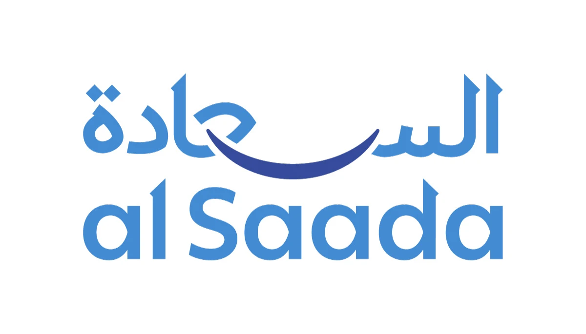
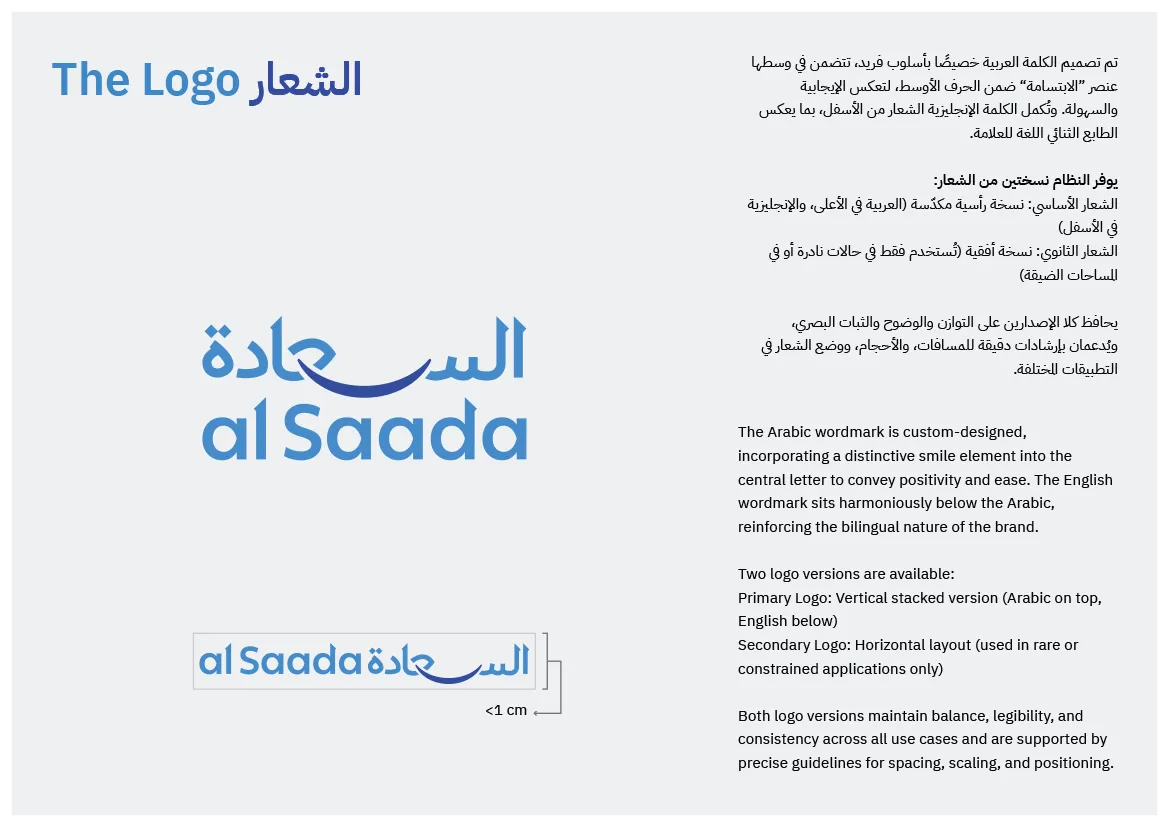
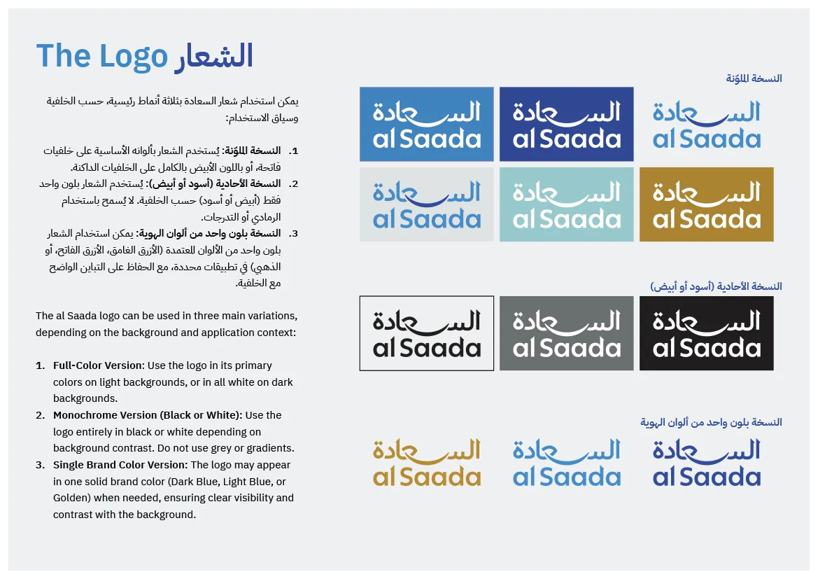
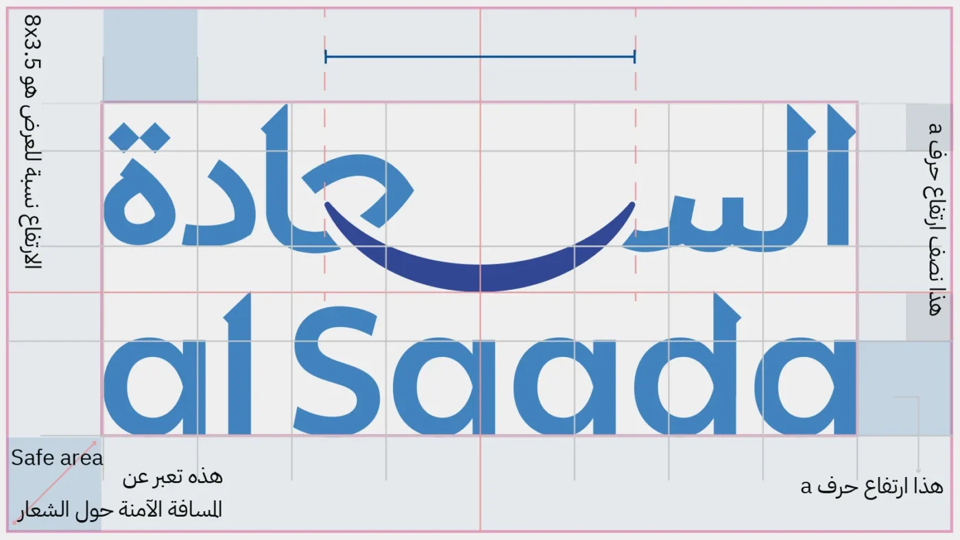
The refreshed mark was drawn as a custom Arabic logotype informed by Naskh proportions and refined for contemporary use. The English lettering was adjusted to align with the Arabic in weight, rhythm, and overall footprint.

The smile as structure

The smile sits at the visual centre of the mark, balancing the Arabic and English components. It is not an added decoration; it is the device that organises the composition and expresses happiness through harmony and composure.

Al Saada logo redesign

03 · Visual language

Authority, accessibility, and one controlled accent

Colour system

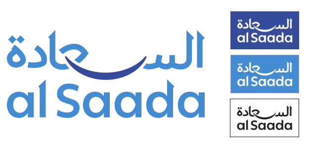
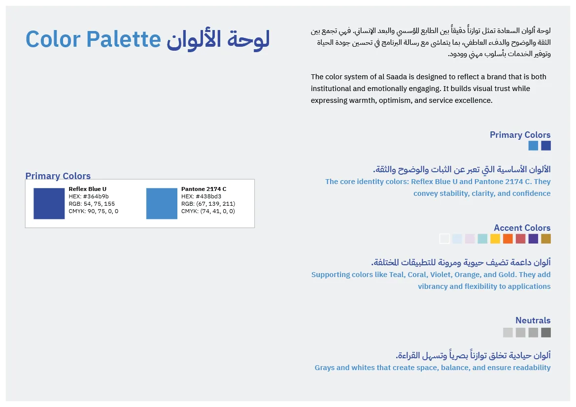
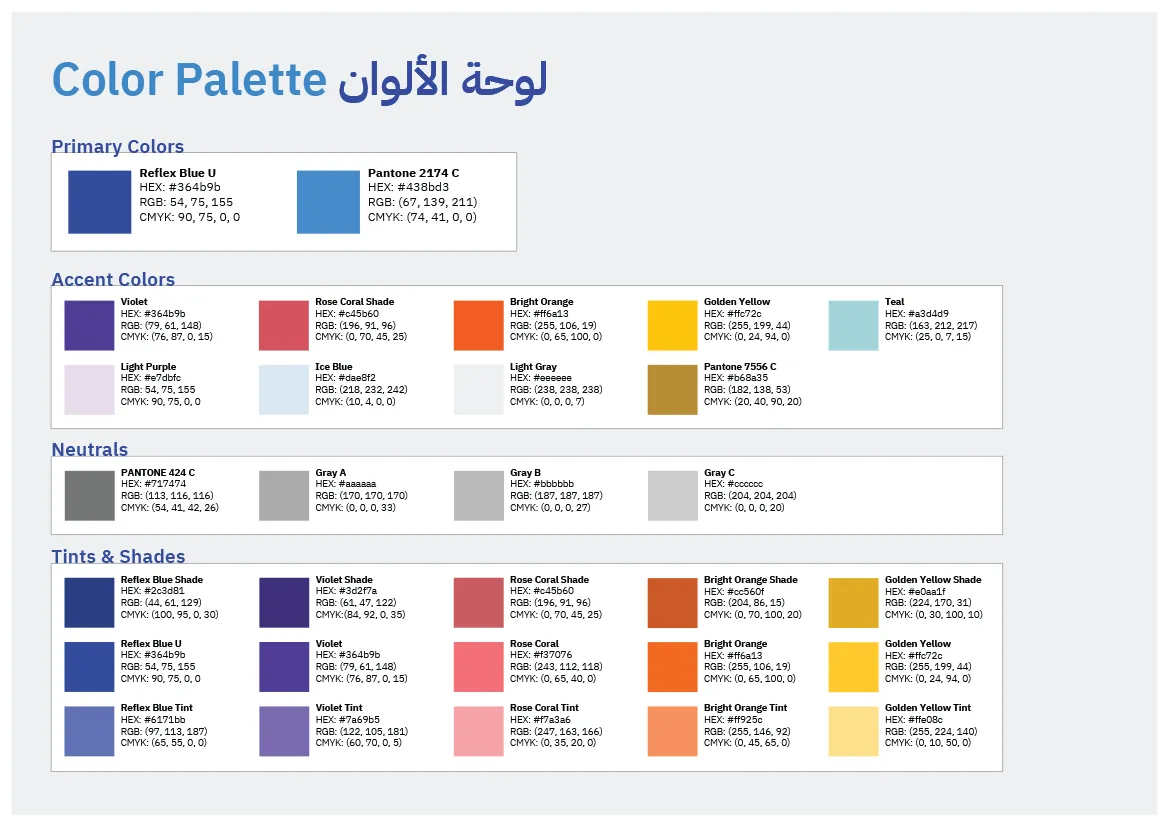
Dark blue provides institutional stability; light blue introduces openness and accessibility. A refined gold accent connects the programme to the parent authority while supporting colours allow the system to expand without losing coherence.

Designed for application

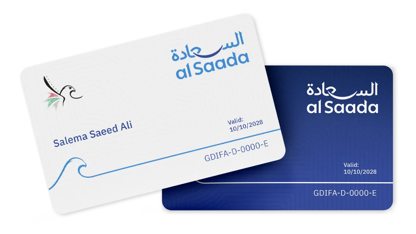
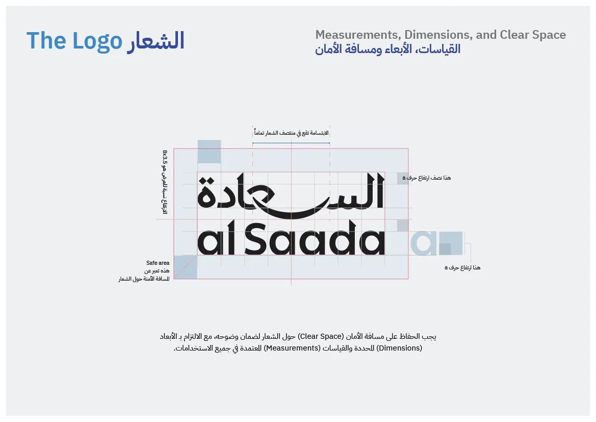
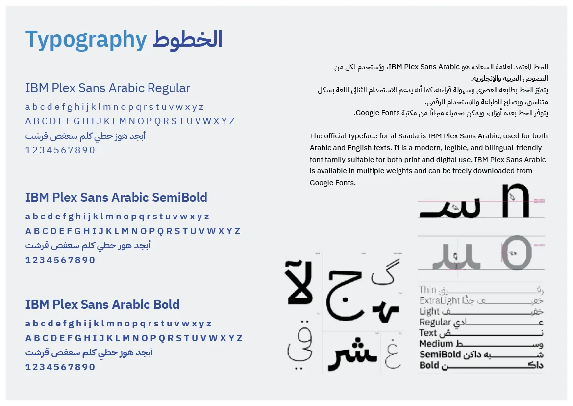
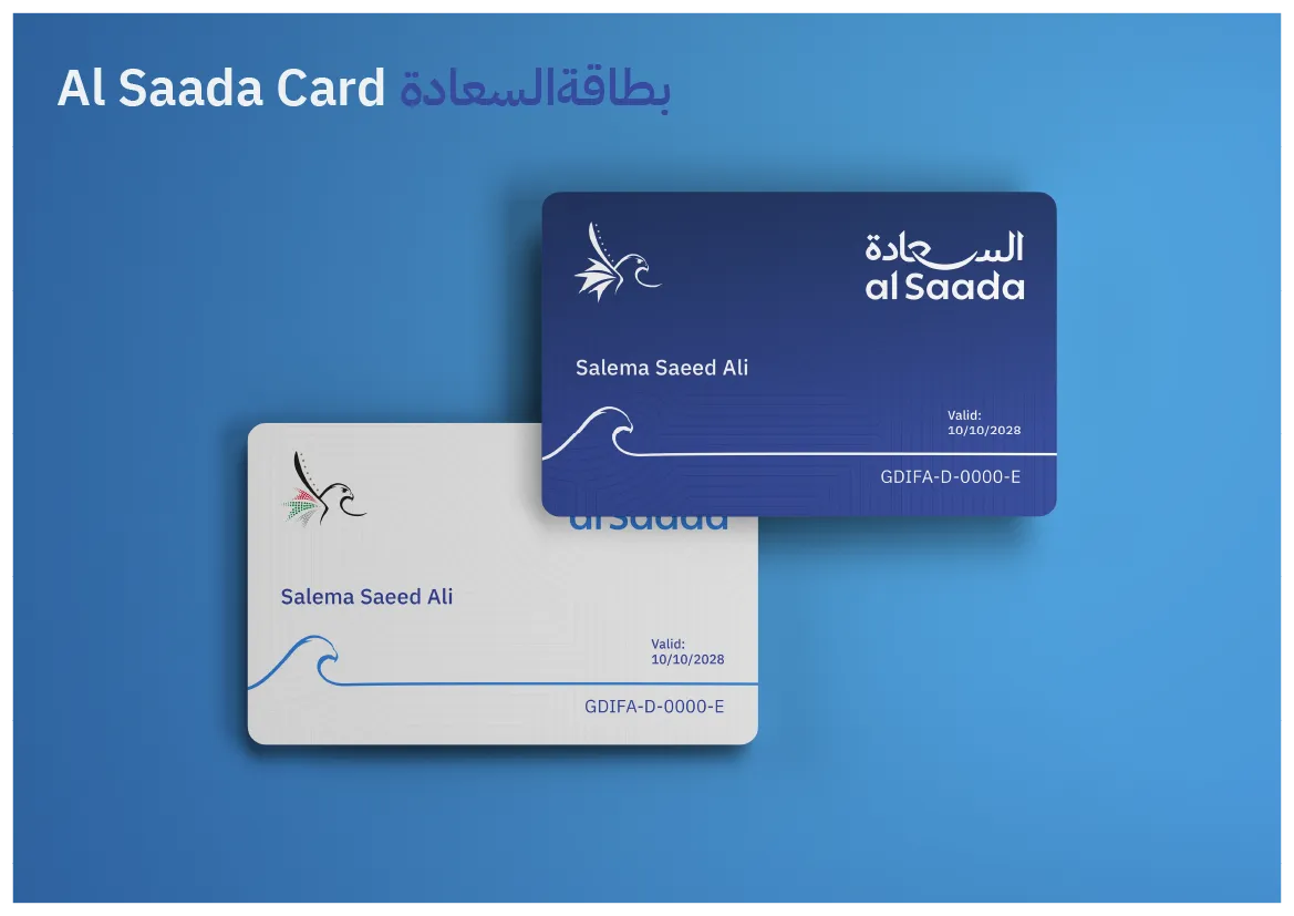
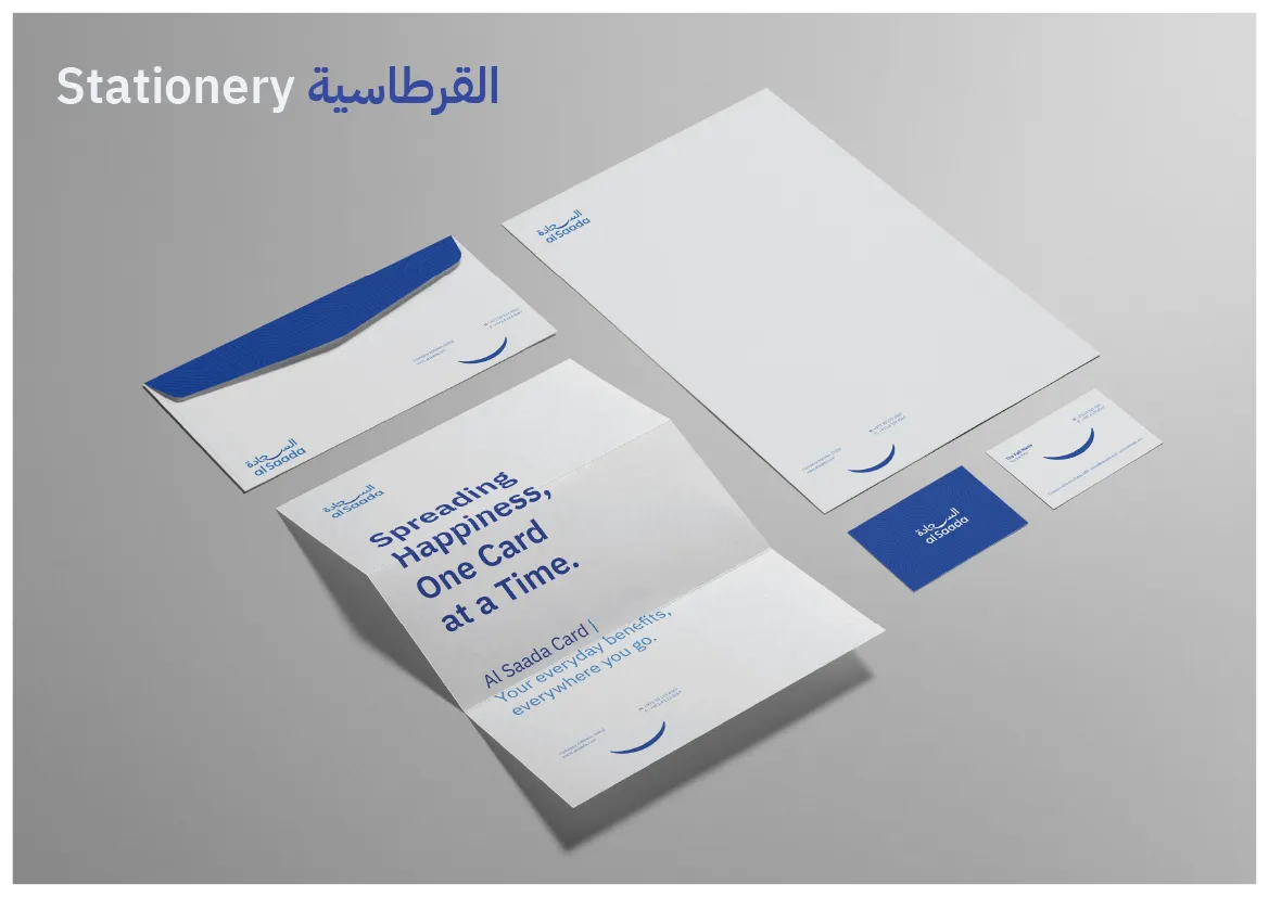
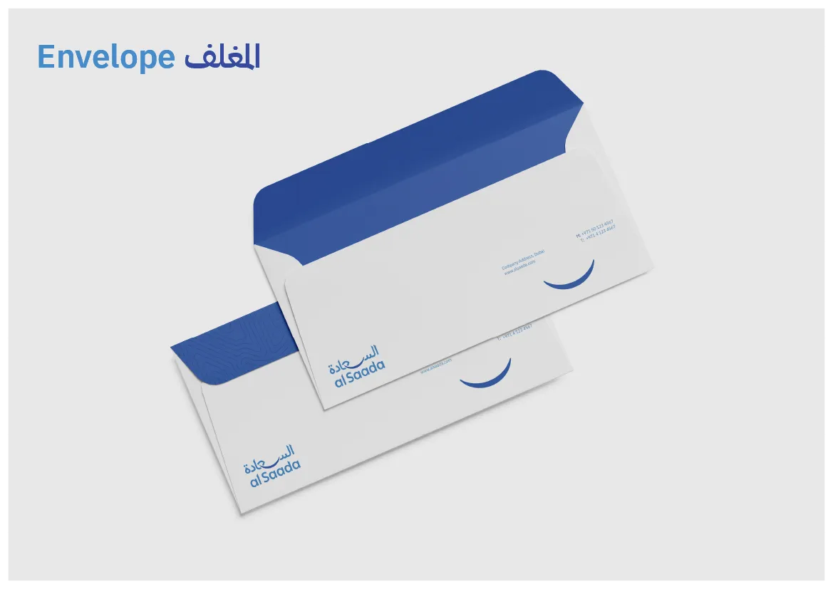
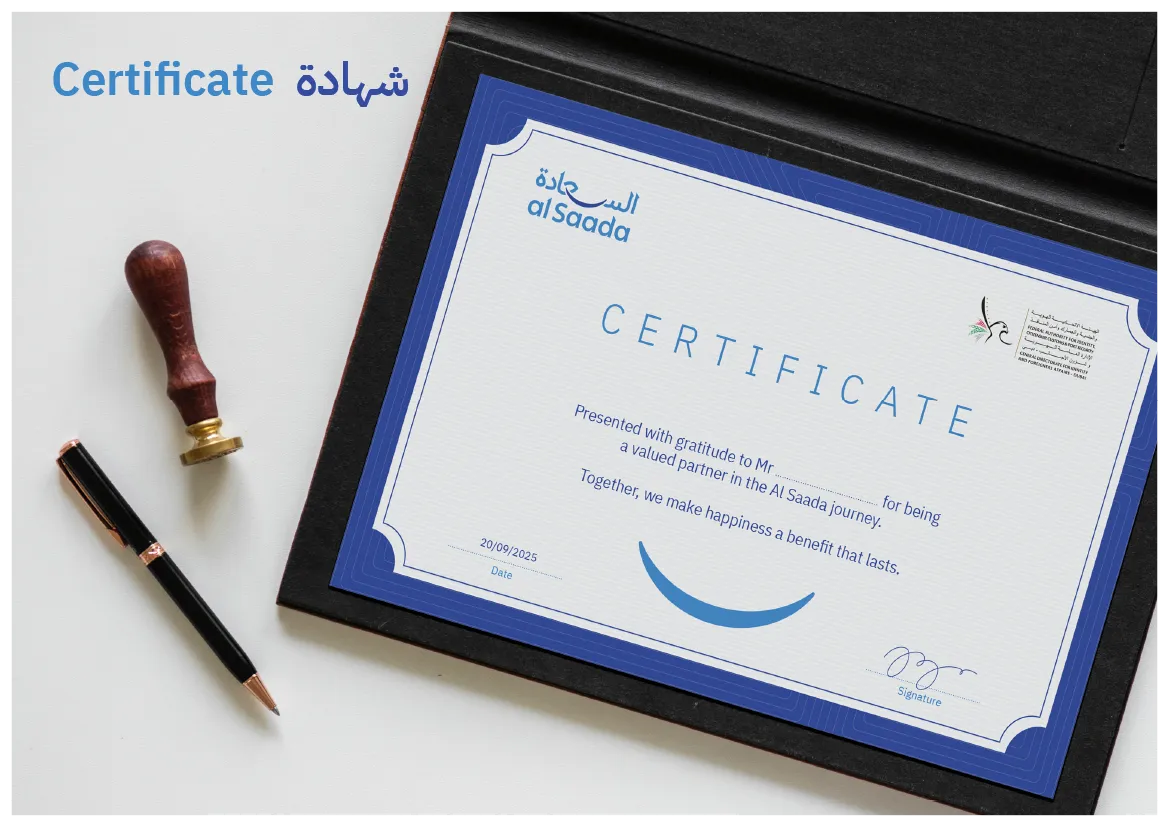
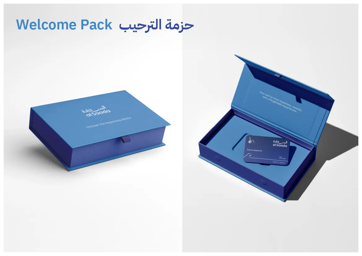
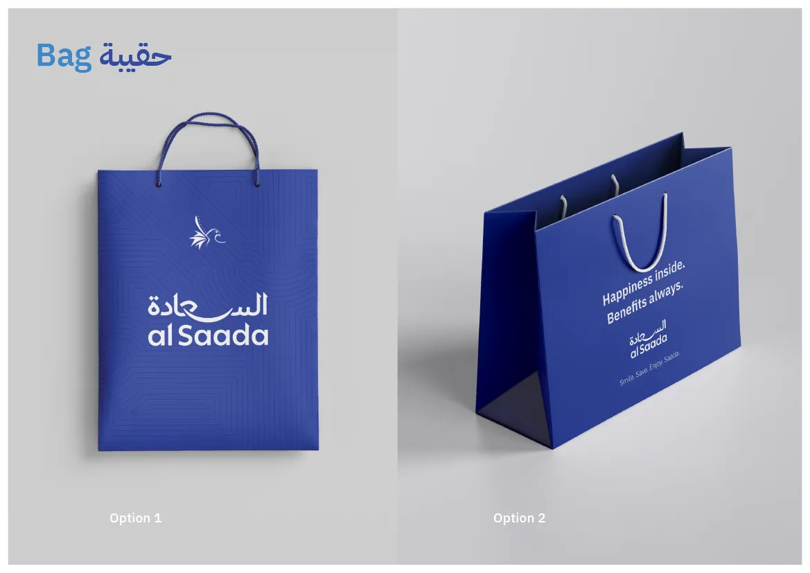
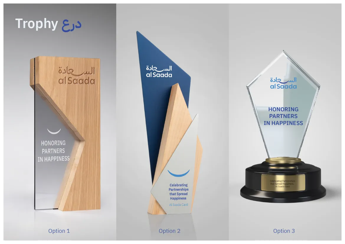
The system was defined across logo rules, bilingual typography, colour, pattern, membership cards, stationery, partner materials, packaging, certificates, signage, and recognition items.

Al Saada Cards featured image
Al Saada refreshed bilingual logo by Nihad Taisir

04 · Selected system

From guidelines to real applications

Selected pages from the identity toolkit show how the system moves from strategic principles to daily use. Open any image to view it at full size.

05 · Design outcome

A coherent identity prepared for long-term use

The completed system gives Al Saada a clearer Arabic typographic presence while preserving institutional familiarity. Its visual logic can scale across digital interfaces, printed materials, partner environments, and programme applications without losing recognition.

This is the design outcome of the assignment: a more cohesive and usable identity system, documented for consistent implementation.

Arabic
Custom logotype with a stronger leading presence
Bilingual
Balanced Arabic and English relationship
System
Documented rules for repeatable application

Arabic-first institutional branding

Building an identity for a public or cultural programme?

I help organisations build Arabic and bilingual identities that balance cultural relevance, institutional clarity, and real-world usability.

An Arabic-first brand identity refresh for Al Saada, developed for GDRFA Dubai to balance institutional authority, human warmth, and clarity across digital and physical applications.