
Academic Identity Exploration · Fujairah, UAE

University of Fujairah: an Arabic-first academic identity exploration

Following the formation of a unified University of Fujairah, this project explored how a new academic identity could balance institutional authority, local character, Arabic visual culture, and a forward-looking educational role.

Context
A unified university identity for a new institutional chapter
Sector
Higher Education · Public Institution · UAE
Role
Identity strategy, logo exploration, bilingual typography, and proposed guidelines
Status
Commissioned design exploration; not the university’s final adopted identity

Explore the design routes →

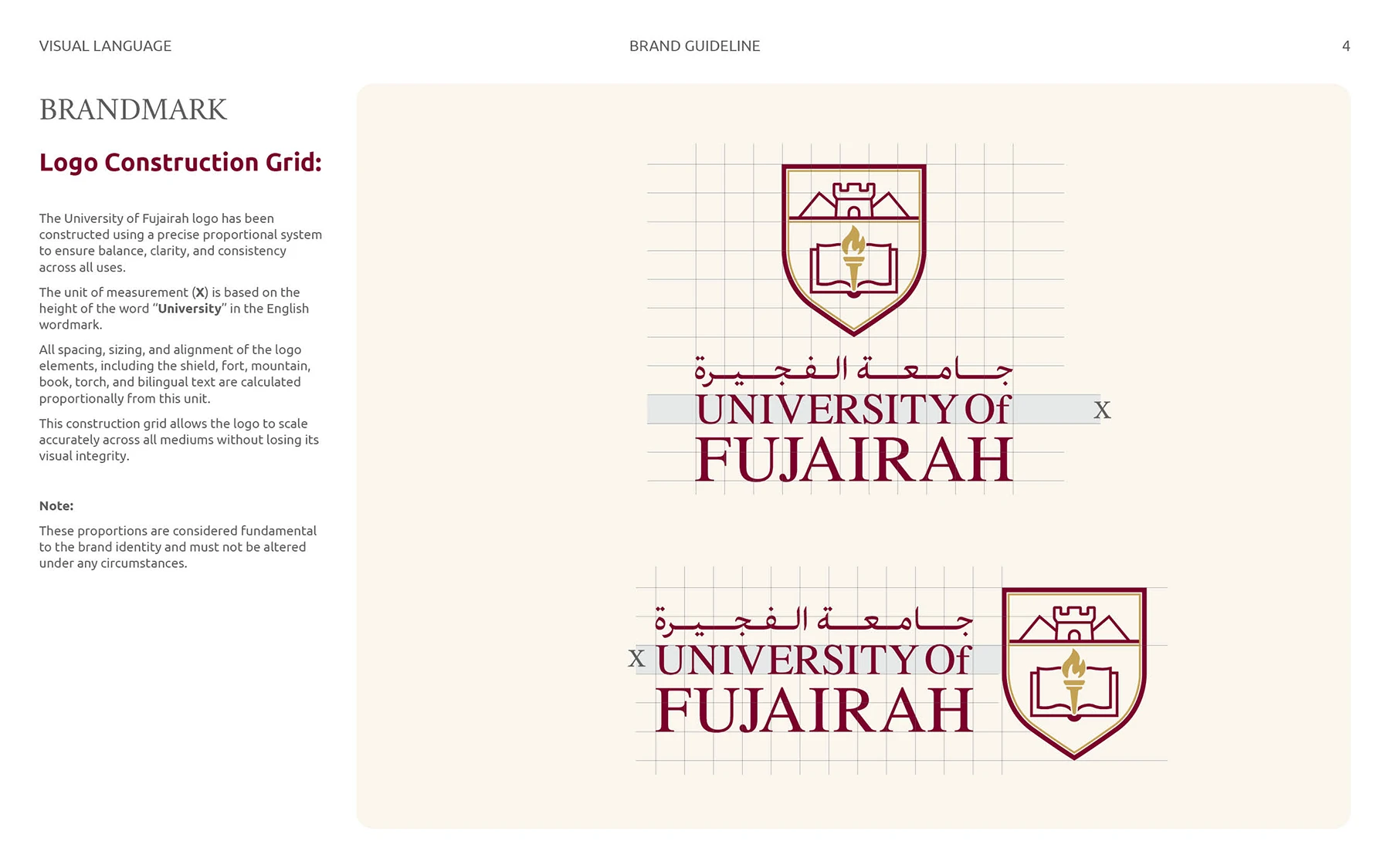
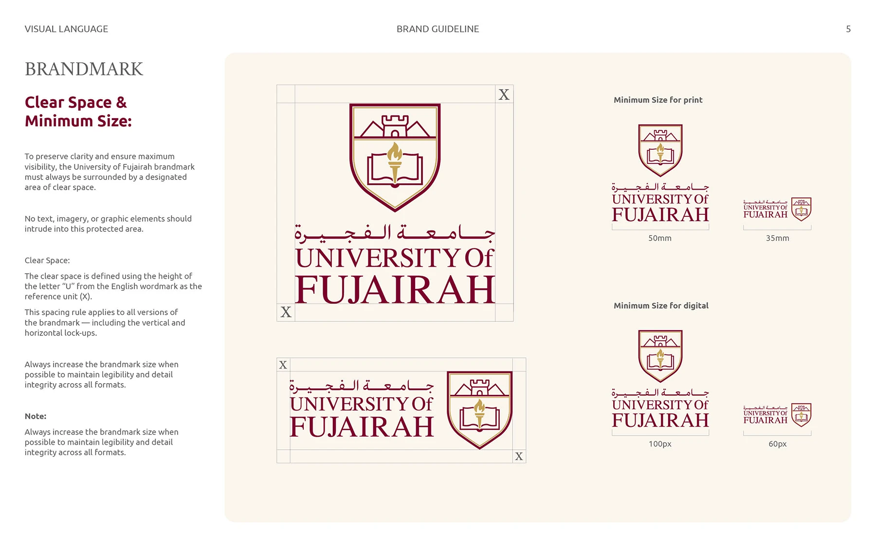
Brand guideline layout showing logo construction and proportions

01 · Brief and context

Creating a shared identity for a new academic chapter

Institutional context

In 2025, an Emiri Decree merged the University of Fujairah and the University of Science and Technology of Fujairah under the name University of Fujairah. The new entity needed an identity capable of carrying institutional continuity while signalling a more unified future.

The design challenge

The identity had to feel credible in an academic environment, distinctively connected to Fujairah, and equally considered in Arabic and English. It also needed enough clarity and flexibility to work across formal documents, digital platforms, signage, and university communications.

Explore Arabic branding and visual identity services →

Fujairah University Logo Design

02 · Design language

Academic authority, local meaning, and future readiness

Symbols with a purpose

The exploration began with a focused visual vocabulary: the book as knowledge, the torch as enlightenment, the shield as academic authority, arches as an architectural connection to Fujairah, the tree as rooted growth, and pixels as a sign of digital progress.

Rather than combining every symbol into one mark, each route tested a different balance between heritage, education, locality, and modernity.

Arabic
A leading visual voice, not a secondary translation
Locality
References to Fujairah’s landscape, fort architecture, and cultural memory
Academia
Recognisable signals of knowledge, authority, and continuity
Future
A system prepared for digital and physical university touchpoints

03 · Design routes

Five strategic answers to the same identity question

Each route emphasised a different aspect of the university’s character. Together, they made the strategic choices visible before one direction moved forward for refinement.

Route 01 · Selected for refinement

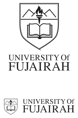
Classic academic emblem

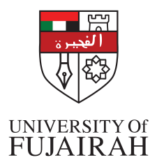
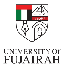
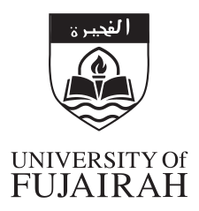
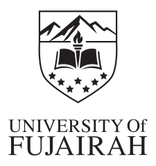
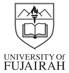
A shield established authority and continuity, while an open book, a torch, and Fujairah’s mountains connected learning with place. A refined serif wordmark reinforced the formal academic character.

Strength
Immediate academic recognition and institutional gravitas
Trade-off
A more traditional expression than the other routes
Logo design exploration showing multiple shield-based branding options

Route 02 · Heritage and progress

An architectural arch moving into pixels

A bold arch drew on Fujairah’s built heritage. An open book carried a subtle UF monogram, while a dissolving pixel edge introduced digital transformation and future-oriented learning.

Strength
A clear narrative linking cultural continuity with innovation
Trade-off
A more complex symbol requiring careful use at small sizes

Route 03 · Minimal growth

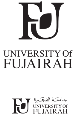
A UF monogram shaped by a living leaf

This route reduced the identity to a clean UF monogram with a leaf woven into the letterforms. The result positioned knowledge as a living process and the university as a place that nurtures development.

Strength
Simple, adaptable, and effective across digital applications
Trade-off
Less immediately connected to traditional academic symbolism
Minimalistic university logo concepts presented in black and white

Route 04 · Contemporary institution

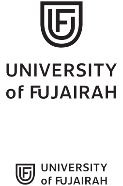
A modern monogram within a simplified shield

A contemporary UF monogram sat within a restrained shield outline. The direction retained a recognisable academic cue while prioritising clarity, confidence, and digital usability.

Strength
Modern, versatile, and easy to reproduce
Trade-off
A quieter connection to Fujairah’s specific cultural context

Route 05 · Knowledge and heritage

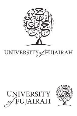
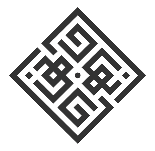
A Tree of Knowledge drawn from Arabic calligraphy

The words “جامعة الفجيرة” were shaped in Thuluth-inspired calligraphy to form a Tree of Knowledge. The route celebrated language and cultural memory while expressing rooted wisdom and continuous growth.

Strength
A distinctive Arabic-first story with strong cultural resonance
Trade-off
Greater complexity across bilingual and small-format applications
Modern Arabic calligraphy-inspired logo idea for a university brandmark

04 · Refinement

Developing the selected shield direction

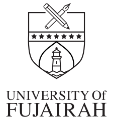
The first route was selected for further refinement because its academic and historical signals were the clearest. Variations tested the balance of the shield, book, torch, mountains, and bilingual name before a refined proposal was presented.

05 · Proposed identity system

From an emblem to a usable bilingual toolkit

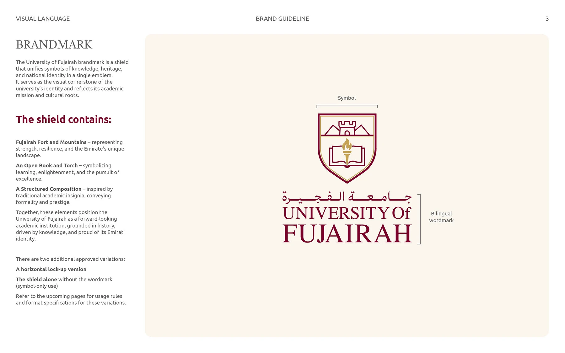
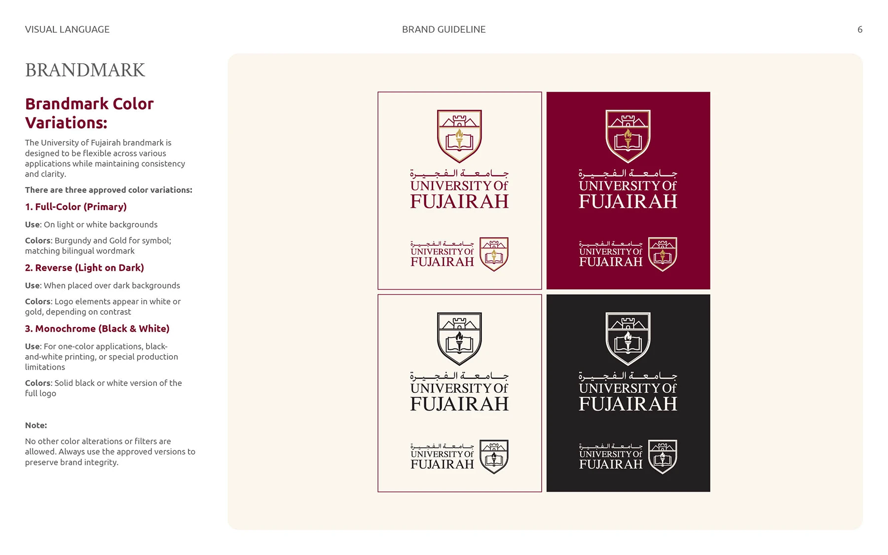
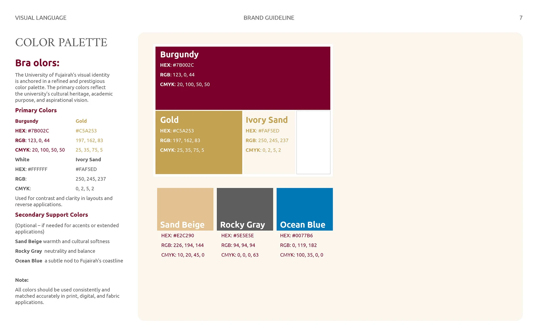
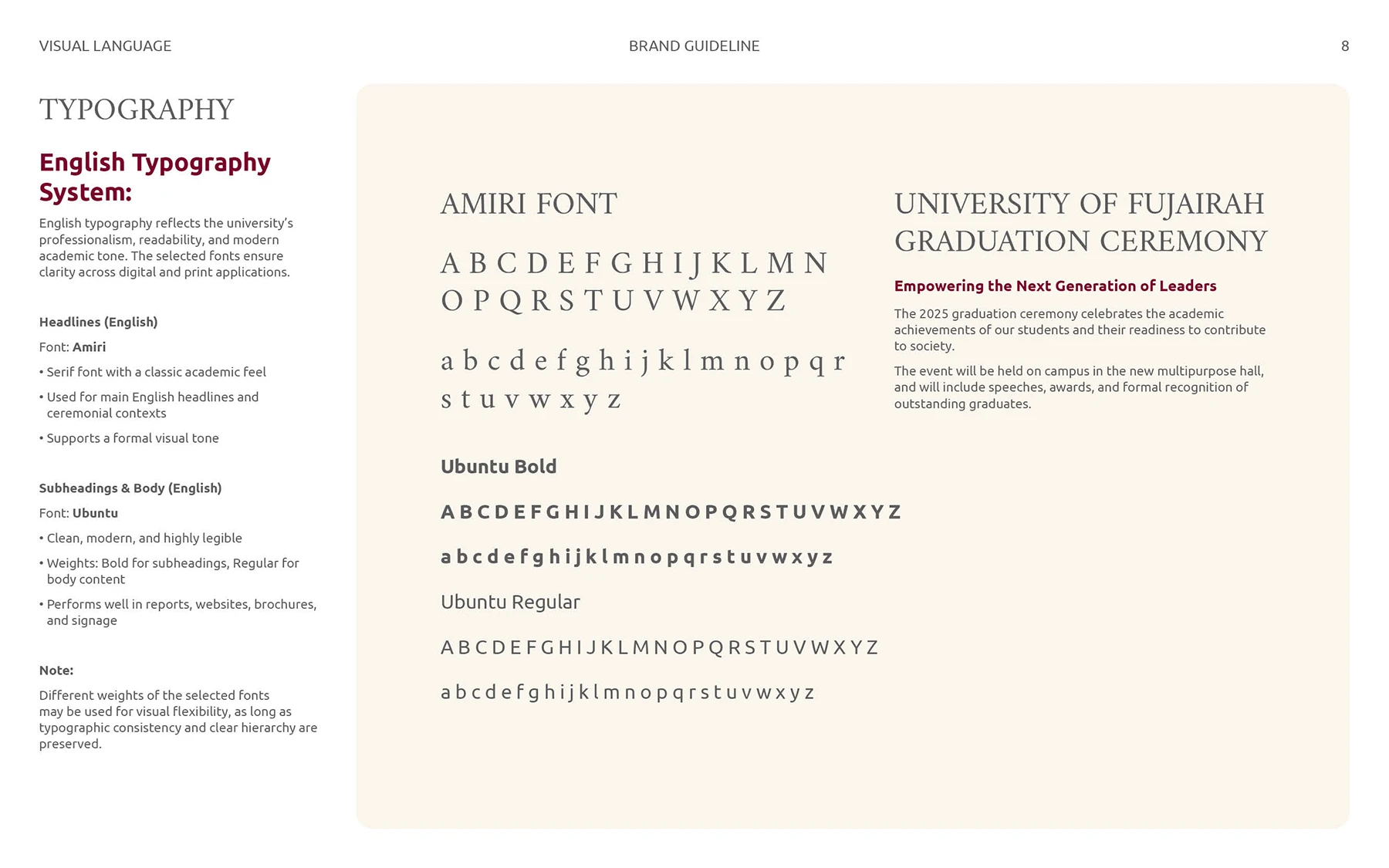
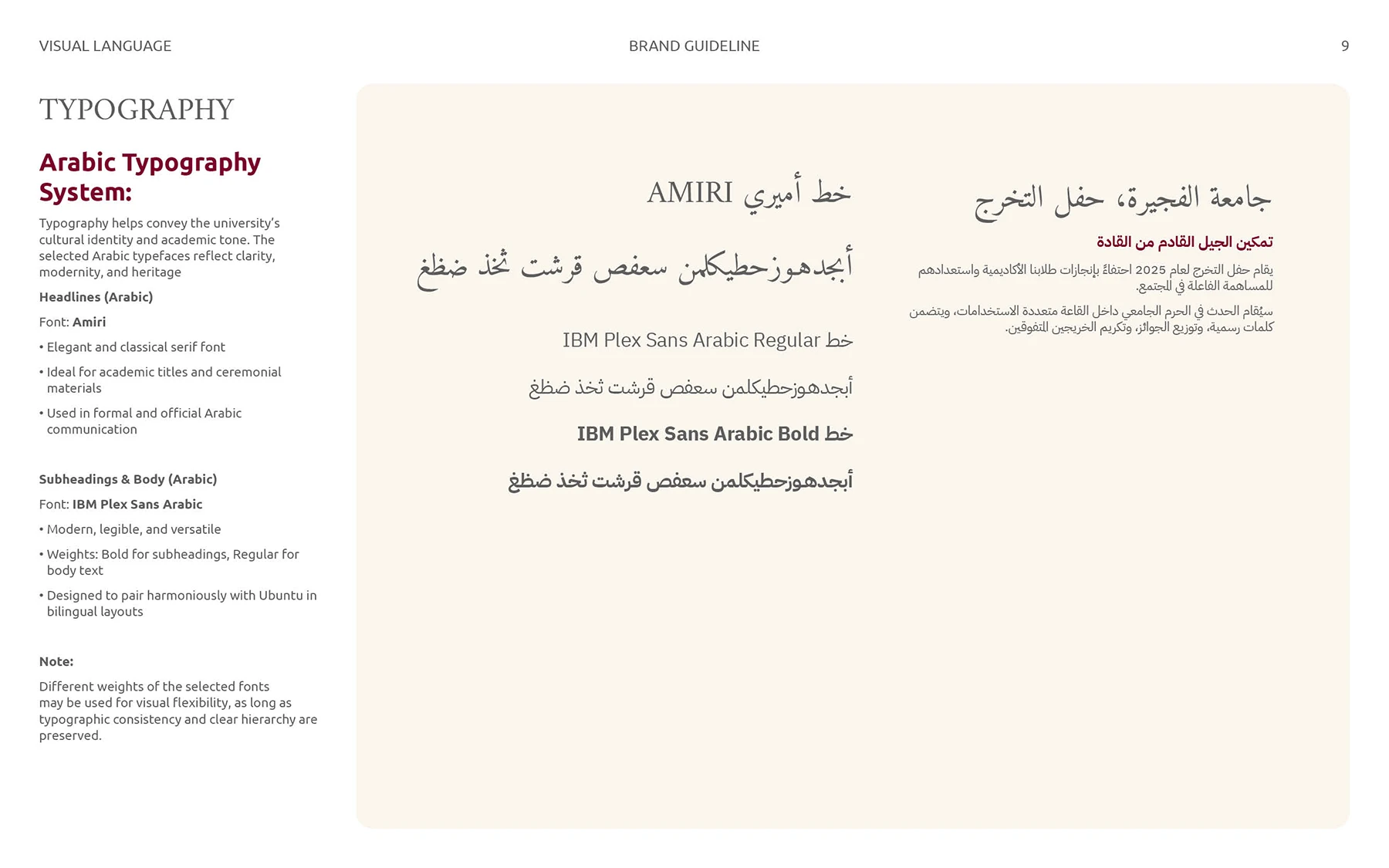
Selected pages from the proposed guidelines show how construction, colour, typography, and application rules were developed around the refined direction.

A system, not a standalone mark

The proposal considered the identity as a repeatable visual language. Logo rules, bilingual hierarchy, colour, and typography were developed together so the concept could remain consistent across formal and public-facing applications.

Read the project outcome →

06 · Supporting visual language

Building meaning through symbols and colour

Custom symbolic elements

A supporting icon family explored references to the Emirates, Fujairah’s landscape and heritage, education, and Arab-Islamic culture. These elements informed the wider visual language without overloading the primary mark.

Colour directions

Colour studies tested how the identity could move between academic formality, regional character, and contemporary visibility.

07 · Project outcome

A documented exploration, presented with clarity

The project produced five distinct strategic routes and a refined shield-based proposal supported by bilingual identity guidelines. It demonstrates the reasoning, concept development, and visual decisions involved in designing for a major academic institution.

Transparency note: the work shown here was developed by Nihad Taisir as part of the commissioned branding exploration. Although the shield route was selected for refinement during the process, this proposal was not the university’s final adopted identity.

Delivered
Five identity routes and one refined proposal
Explored
Arabic-first symbolism, bilingual hierarchy, colour, and typography
Shown
Selected process and proposed guideline material

Arabic-first institutional branding

Developing an identity for an academic or public institution?

I help organisations build Arabic and bilingual identities that balance cultural relevance, institutional clarity, and real-world usability.

Tags: Arabic Calligraphy / Logo Design