Learn Square Kufic Calligraphy: Letters, Grid and Composition
Square Kufic builds Arabic letters from horizontal and vertical strokes and right angles, usually on a square grid. The result can be a line, a band or a compact panel. A square outline alone is not enough: the letters still need a sound structure, correct connections and a route through which a reader can find the text. This guide separates documented historical examples from the practical choices I make when designing on a grid.
At a glance: Check the Arabic wording and letter connections first. Draw the letter skeleton, then adjust the spaces and dots. Judge the result at its intended size, without the construction grid. Giving strokes and neighbouring spaces similar widths is a useful starting exercise, not a universal law.
How does square Kufic differ from geometric Kufic?
I use geometric Kufic as a broad descriptive term for Arabic lettering organized by geometric forms; some examples also use diagonals. In its stricter sense, square Kufic works with horizontal and vertical directions and right angles. The terms maʿqelī and bannāʾī also occur in discussions of architectural lettering, but they do not map perfectly onto every modern square design. Encyclopaedia Iranica’s discussion of scripts describes maʿqelī with acute and obtuse angles as well as straight lines. Chessboard Kufic appears as a descriptive English name; I do not treat it as a fixed historical classification.
What can we establish about its beginnings?
The minaret of Masʿūd III at Ghazni, Afghanistan, has an inscription in square Kufic bearing the ruler’s name and titles. The monument is dated to his reign, 1099–1115 CE, in Roberta Giunta’s account of Ghazni, which refers to Ralph Pinder-Wilson’s study, pp. 90–91. It is an early documented example. It does not establish that square Kufic was invented at Ghazni or provide an independent year for the inscription.
Brick and glazed brick offered modular surfaces on which writing and pattern could be built together. Sheila Blair’s survey of Arabic inscriptions in Persia describes words formed with glazed bricks and the architectural practice sometimes called bannāʾī. The fit between a material and a letterform does not, by itself, prove a single material origin for the script. Square Kufic also travelled beyond brickwork: a marble tombstone from Yazd dated 753 AH / 1352 CE places a square Kufic composition at its centre. For a broader historical discussion, see my square Kufic reference article.
The eastern Radkan tower illustrates why dates must be handled carefully. A damaged word in its inscription has led to readings of 602 AH / 1205–1206 CE and 680 AH / 1281–1282 CE. In “The Madrasa at Zuzan,” p. 87, Blair explains why she favours the earlier reading while recording the alternative. Here the inscription is the evidence; the proposed date is a scholarly interpretation of damaged text.
Before drawing the grid, establish the text
Write the word or phrase normally. Check its letter order, dots, and which letters connect or break from the next letter. Then decide what the composition must do. A logo needs a different reading speed from a wall panel or an artwork intended for slow viewing. Record the intended display size: a counterspace that seems generous on a zoomed screen may vanish when printed or viewed from a distance.
Five parts of a square Kufic composition
- Grid unit. Choose a repeatable square for widths and heights, whether on graph paper or in vector software. Its physical size is a project choice.
- Letter skeleton. Keep the strokes that make each letter identifiable in its position within the word. Decoration comes after this structure.
- Space. Look at gaps between strokes, counters inside letters and separation between words. Empty areas are part of the reading.
- Connection. Preserve the letter’s joining behaviour and give the eye a plausible path through the word. A decorative extension can imply a join that Arabic does not have.
- Dots. Treat dots as distinguishing marks. Check them at the final size and in one colour, without relying on colour contrast alone.
For a first study, make a stroke and its adjacent gap roughly one grid unit wide. Then draw versions with a narrower and a wider gap. Compare the counter in a mīm or fāʾ and the spaces between words. The useful proportion depends on the letters and the application; equal black and white widths are not a rule that every historical example must obey.
How do letterforms change inside a word?
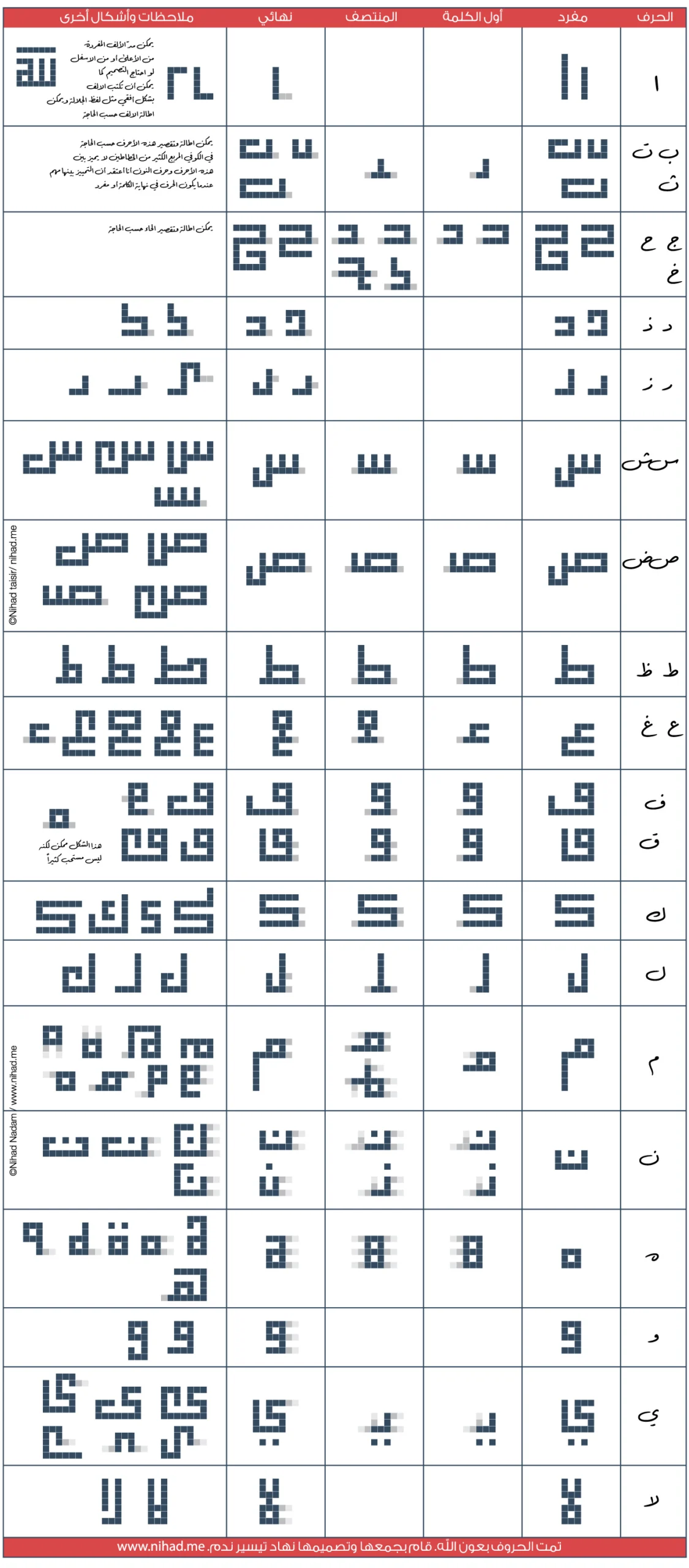
An Arabic letter does not have one square shape that works in every position. Alif, dāl, dhāl, rāʾ, zāy and wāw do not connect to the following letter on their left. Filling that break with an extra line may change the reading. For related shapes such as bāʾ, tāʾ and thāʾ, or ʿayn and ghayn, the dots and the underlying skeleton carry much of the distinction.
The letter tables on PDF pp. 12–13 of my Square Kufic Calligraphy Workbook show selected forms by position; p. 15 compares variations of bāʾ, tāʾ and thāʾ and their dots. These are examples from my contemporary design practice, not a catalogue of every possible historical form. The chart below brings selected alphabet forms together. Compare a letter on its own with its initial, medial and final appearances; a shape that looks convincing alone may fail after joining.
Exercise: compose the word bayt (بيت)
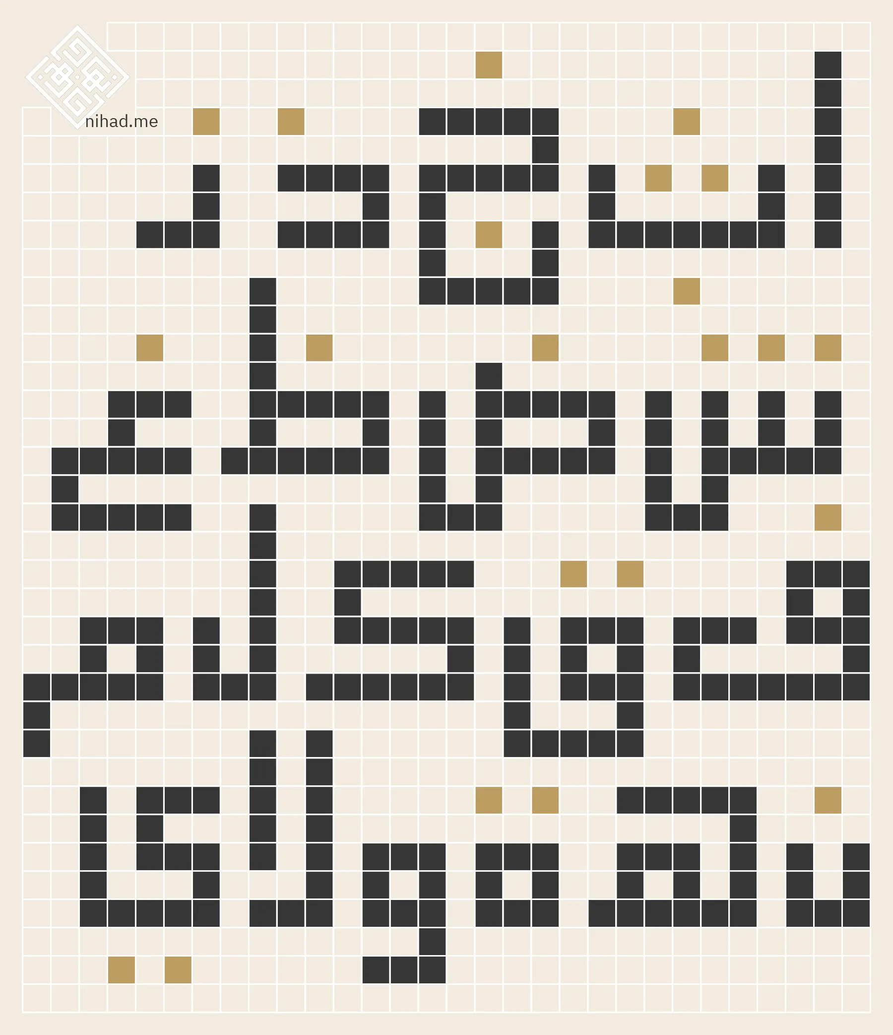
Write بيت (bayt, “house”) in ordinary Arabic first: bāʾ is initial, yāʾ medial and tāʾ final. Build their skeletons on one grid, keep the correct connections, and leave space that reveals each letter. Place the dots after the structure is clear.
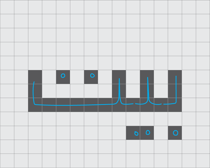
Draw two versions: a clear rectangular arrangement and a more compact one. Do not force the word into a square if doing so distorts its order or connections. Show both at the size at which they would actually be used, with the guide grid and ordinary spelling hidden. Ask someone who has not seen the process to read them, and note where they hesitate. If bāʾ is mistaken for tāʾ or the dots of yāʾ disappear into ornament, revise the letter and surrounding space before adding more decoration.
In my comparison drawing of the word Muḥammad (محمد), the changing counter of mīm shows how a small adjustment can affect the balance of a composition. This is a design analysis of my own drawings, not a fixed numeric rule.
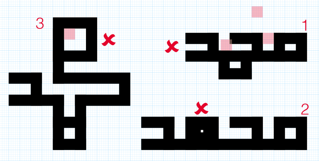
Balance comes after the word is sound
You can extend or shorten a stroke to balance the sides of a composition, provided the change still makes sense as part of the letter. Try turning a repeated arrangement through a quarter turn and back: has symmetry obscured its starting point or a necessary break? A readable rectangle may serve a logo better than a closed square that needs a long explanation. A contemplative artwork can ask for slower reading, but the phrase should also be available in ordinary text or a digital image description. These are contemporary design judgments, not claims about the intentions of every historical maker.
When does negative space become text?
In a marble mosaic at the Qalawun Complex in Cairo, dated 683–684 AH / 1284–1285 CE, Muḥammad appears four times around a central square while ʿAlī appears in the negative space. The Patterns of Cairo catalogue identifies the building, material, date and two readings. This is a specific example of empty space carrying a second text. It does not mean that every gap in a square Kufic design conceals a word.
In another composition in my workbook (PDF p. 32), arrows explain the route through a multi-line phrase. Mark the route on a draft of your own, remove the arrows, then see whether a new reader can still find the order of the words. This becomes especially useful when a design is rotated or repeated.
Which tools help?
Graph paper, a pencil and a second colour for dots are enough to begin. In vector software, use a regular grid and snapping, with the ordinary Arabic text, letter paths and dots on separate layers. Choose the grid unit for your intended output instead of treating a particular millimetre setting as a rule. Examine the finished design in print or in the medium where it will appear.
Frequently asked questions
Must the finished design be square?
No. It may be a band or rectangle if its letters follow the grid and right-angle construction. Let the text and its purpose determine the overall shape.
Must the stroke and the space have equal widths?
No. Similar widths make a manageable first study. Adjust the proportions for the letter shapes, medium and scale, and judge the result by balance and reading.
Can I omit the dots?
Some compositions omit or integrate them, but doing so can alter how a name or word is read. Test the intended phrase with readers unfamiliar with your drawing.
Is square Kufic a form of geometric Kufic?
Yes, in the practical terminology used here: square Kufic is a more specific construction within a broader family of geometric lettering. Historical and modern authors do not always draw the boundaries of these terms in the same place.
Sources and how they are used
- Roberta Giunta, “Ghazni ii. Monuments and Inscriptions,” Encyclopaedia Iranica, paragraph on Masʿūd III’s minaret, citing Pinder-Wilson, pp. 90–91: an early documented inscription, not a proven place of invention.
- Sheila S. Blair, “Epigraphy iii. Arabic Inscriptions in Persia,” Encyclopaedia Iranica, paragraphs on square Kufic, glazed brick and bannāʾī: the relationship of writing to architectural material.
- Sheila S. Blair, “The Madrasa at Zuzan,” Muqarnas 3 (1985), p. 87: alternative readings of the Radkan tower’s damaged date.
- “Calligraphy ii. Scripts,” Encyclopaedia Iranica, passages on Kufic and maʿqelī: terminology and the limits of easy reading.
- Patterns of Cairo, pattern 173, description and pattern ID card: the Muḥammad/ʿAlī reading, material, location and date at Qalawun.
- The Metropolitan Museum of Art, tombstone 35.120, object record: a dated Yazd example in marble.
- Nihad Taisir, Square Kufic Calligraphy Workbook, PDF pp. 12–15 and 32: selected letter forms and reading paths from my present-day practice. It is not used to date historical monuments.
For more history and terminology, see the square Kufic reference article. This lesson is also available in Arabic. For examples of finished applications, see my square Kufic design portfolio.
