Destination Branding Proposal · Dubai, UAE

The Gold Souk Dubai: three identity routes shaped by geometry, trade, and craft

This project explored how a contemporary identity for The Gold Souk Dubai could express the prestige of gold, the character of the destination, and the cultural knowledge embedded in its craft.

Project
Logo and visual identity exploration for The Gold Souk Dubai
Collab.
Quote Un Quote agency
Lead
Creative leadership by Shahbaz Zobairi
Role
Logo concept development, Arabic visual direction, and brand applications
Status
Proposal only · None of the three directions was selected or implemented
Explore the three routes →

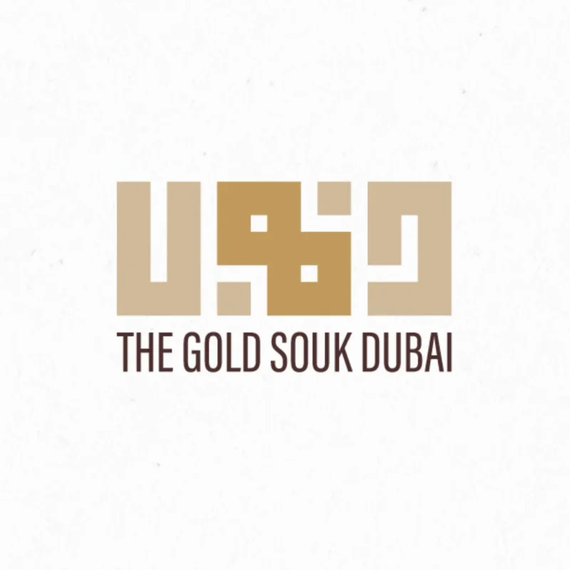
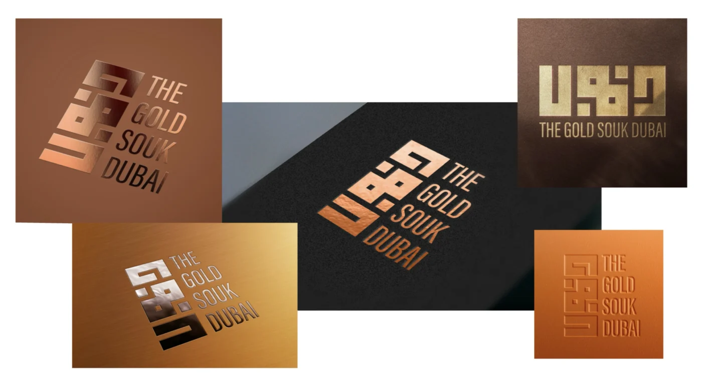
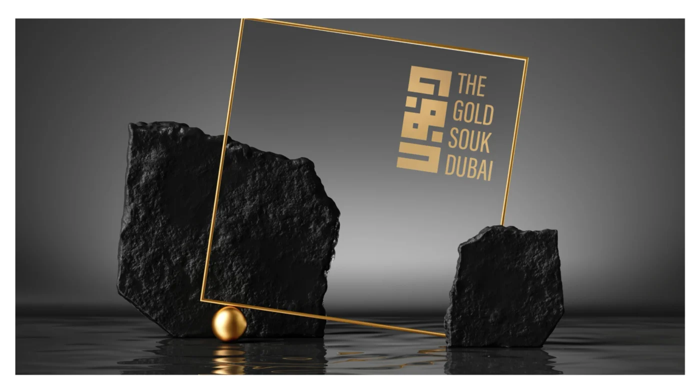
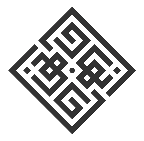
The Home of Gold logo concept for The Gold Souk Dubai, inspired by Arabic geometric art and traditional architecture

01 · Brief and challenge

A modern destination identity with roots in place and craft

Project brief

Developed in collaboration with Quote Un Quote agency and under the creative leadership of Shahbaz Zobairi, the assignment asked how The Gold Souk Dubai could be expressed as more than a retail destination.

The identity needed to connect luxury with authenticity, and contemporary appeal with the geometry, trade networks, calligraphic knowledge, and jewellery-making traditions associated with the souk.

The creative question

How can one destination feel prestigious and modern without losing the human craft and cultural memory that make it distinctive?

The Home of Gold logo concept for The Gold Souk Dubai, inspired by Arabic geometric art and traditional architecture

02 · Strategic territories

Three narratives, each grounded in a different truth

Geometry and place

Arabic geometric pattern and architectural rhythm position the souk as a recognisable home for gold.

Trade and connection

Faceted forms and connected pathways express movement, exchange, and the relationships behind the gold industry.

Calligraphy and craft

Arabic letterforms and jewellery-making techniques frame gold as a cultural art rather than a commodity alone.

Route 01 · The Home of Gold

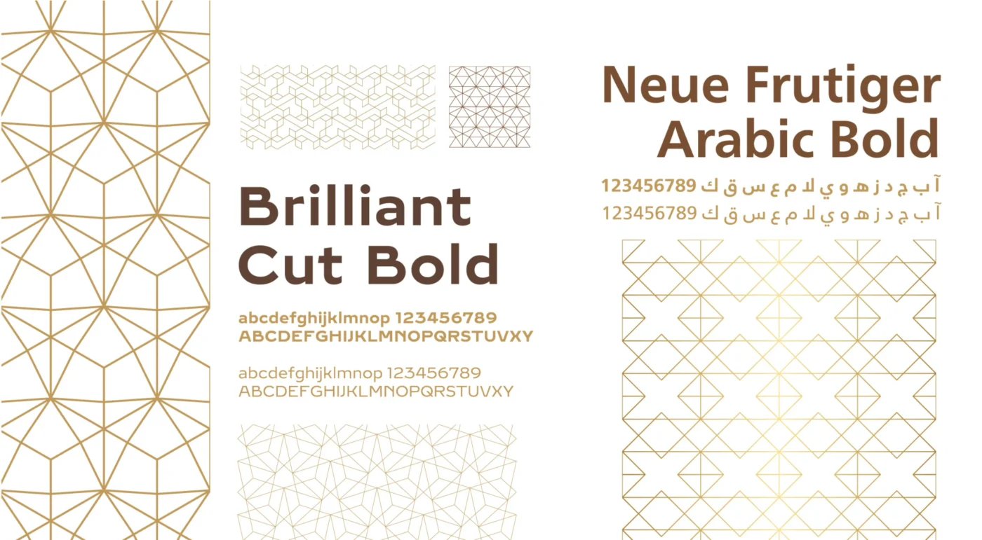
An identity built from Arabic geometric rhythm

Concept

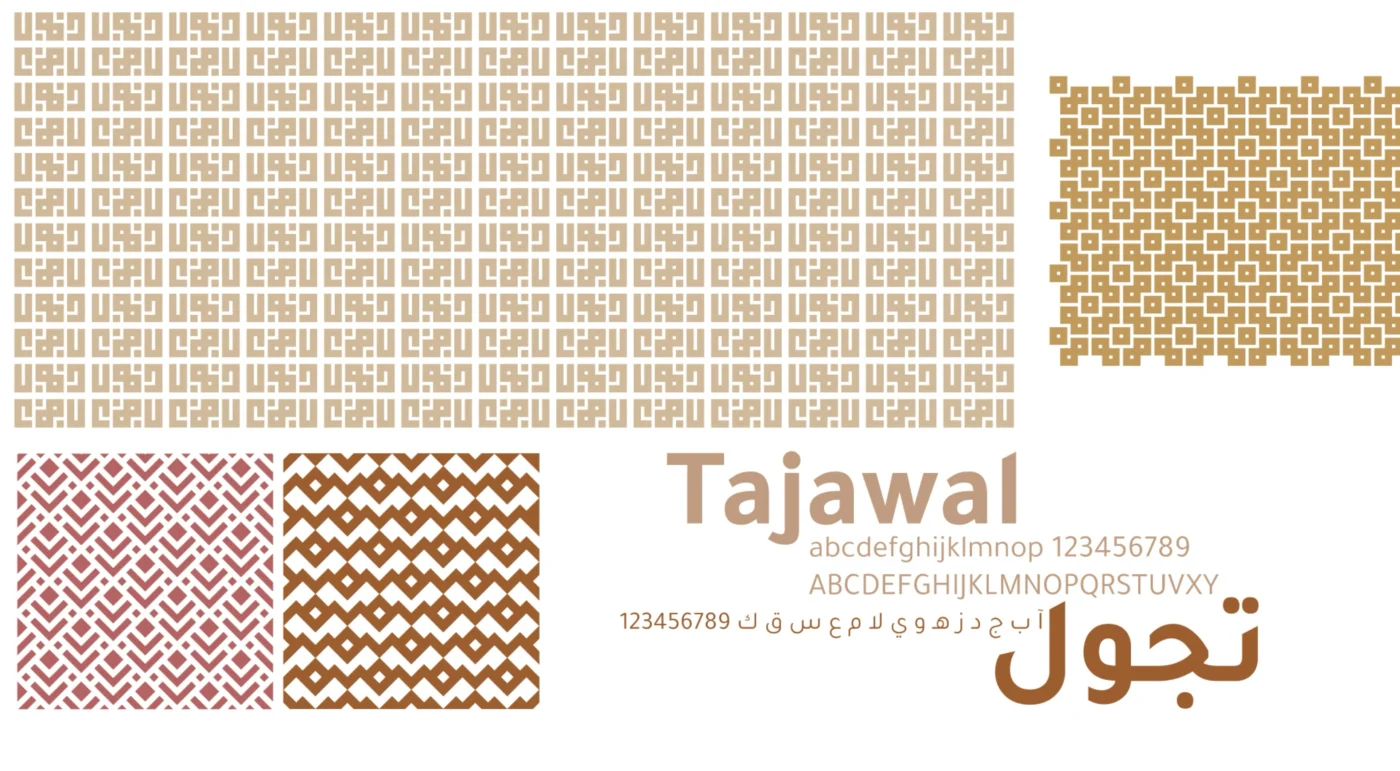
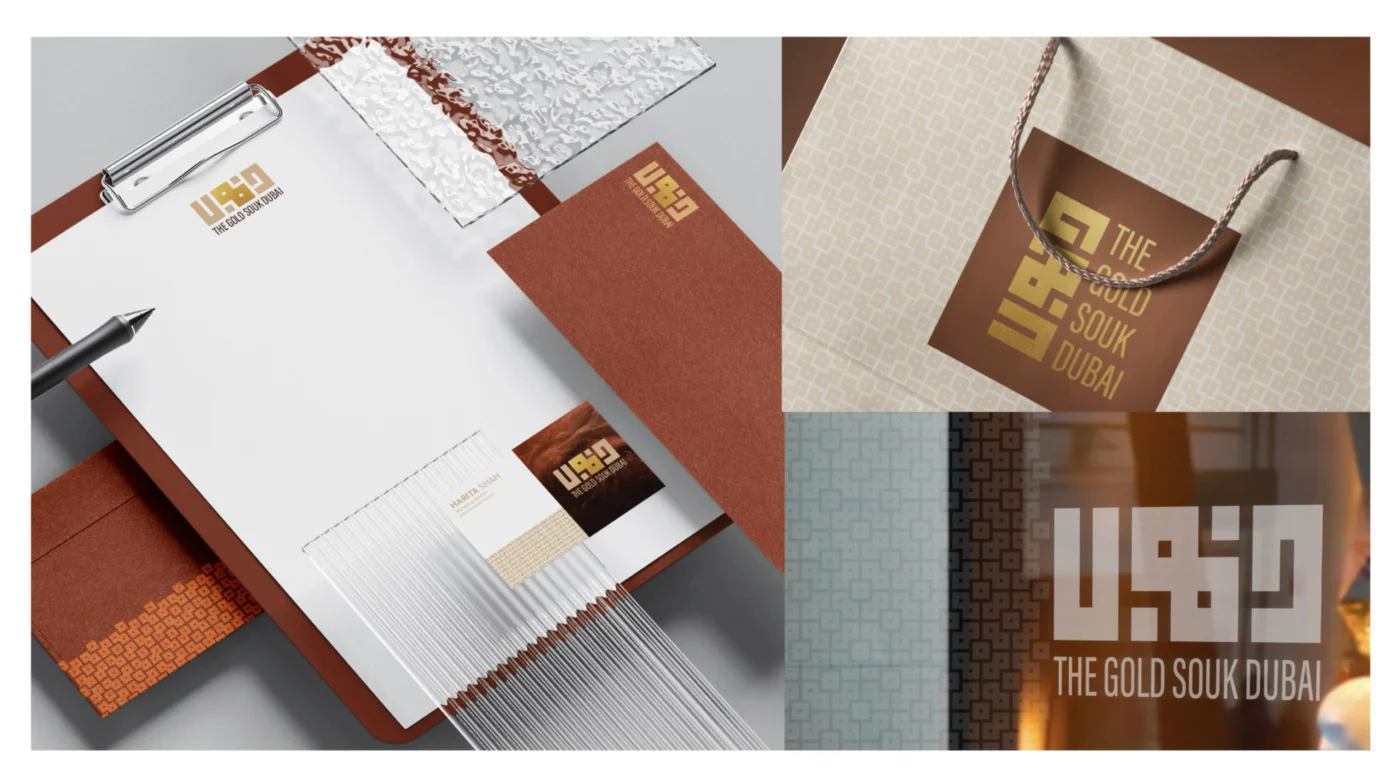
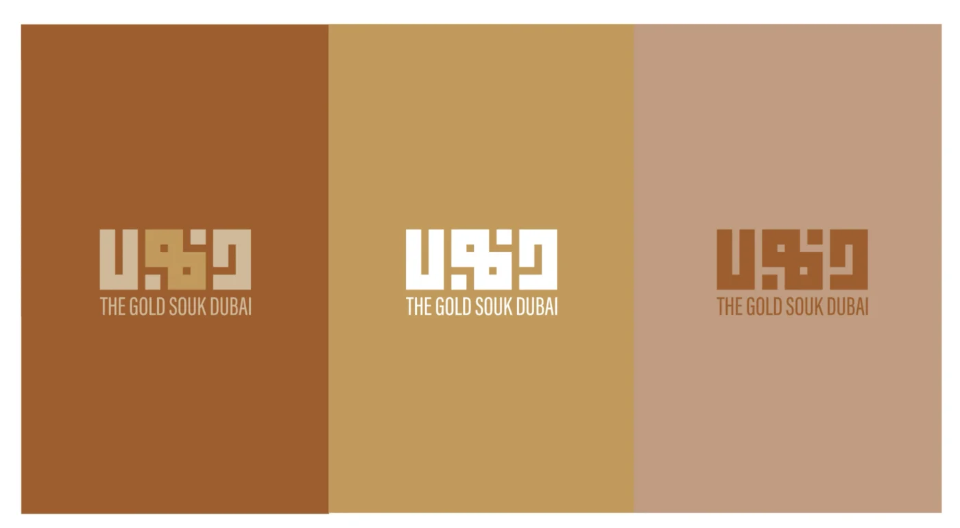
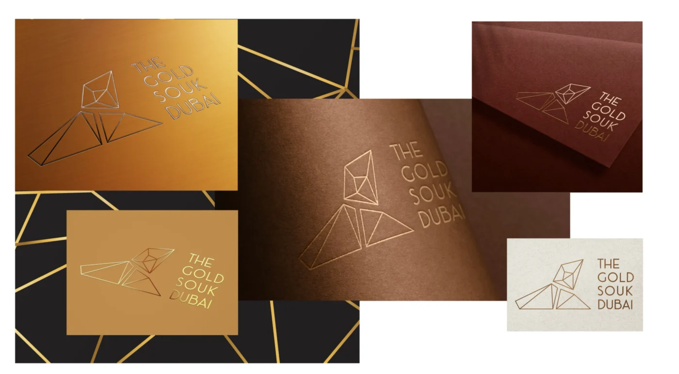
The first route used Arabic geometric artistry and architectural structure to present the souk as a symbolic home for gold. The mark balances a modular contemporary form with the memory of regional pattern-making.

Premise
The souk as the home and heart of Dubai’s gold trade
Device
Modular Arabic geometry and architectural proportion
Tone
Rooted, recognisable, and contemporary
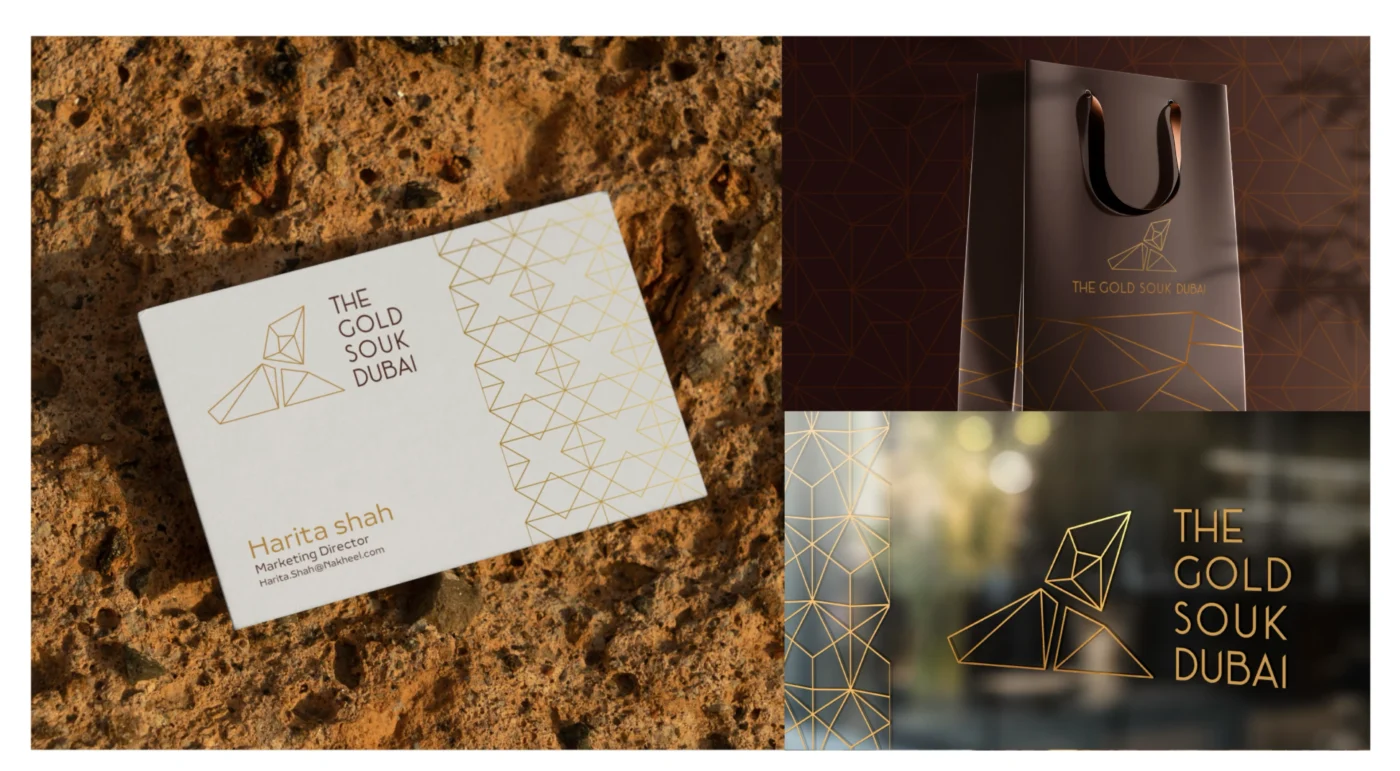
Gold Souk Dubai signage mockup featuring the Home of Gold logo with luxurious gold accents
Geometric pattern branding for The Gold Souk Dubai, reflecting the artistic symmetry of Arabic design
Premium packaging design for The Gold Souk Dubai, showcasing intricate Arabic-inspired patterns
Geometric pattern branding for The Gold Souk Dubai, reflecting the artistic symmetry of Arabic design
Premium packaging design for The Gold Souk Dubai, showcasing intricate Arabic-inspired patterns
Gold Souk Dubai signage mockup featuring the Home of Gold logo with luxurious gold accents

Route 02 · Precious Connections

A visual story of movement, exchange, and relationships

Concept

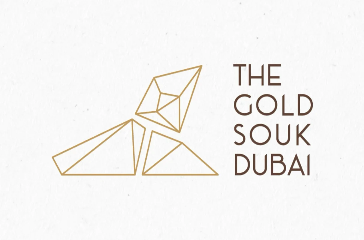
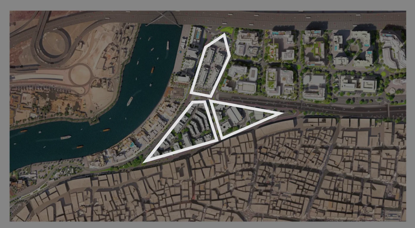
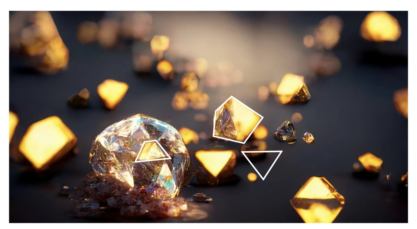
The second route drew from raw gold, faceted jewellery forms, and the destination’s masterplan. Interconnected shapes map the journey of visitors while reflecting the networks of makers, traders, and relationships that sustain the gold industry.

Premise
Gold as a network of people, journeys, and exchange
Device
Faceted geometry and interconnected pathways
Tone
Dynamic, premium, and experiential
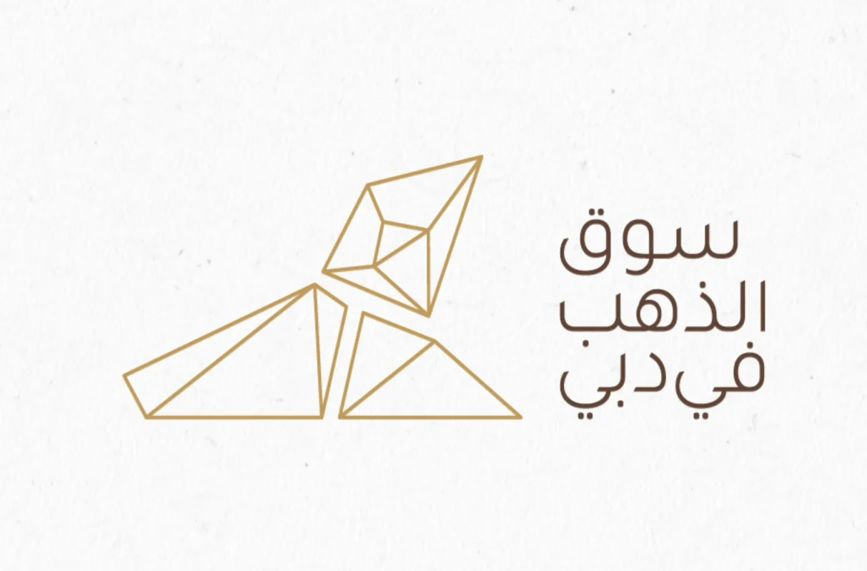
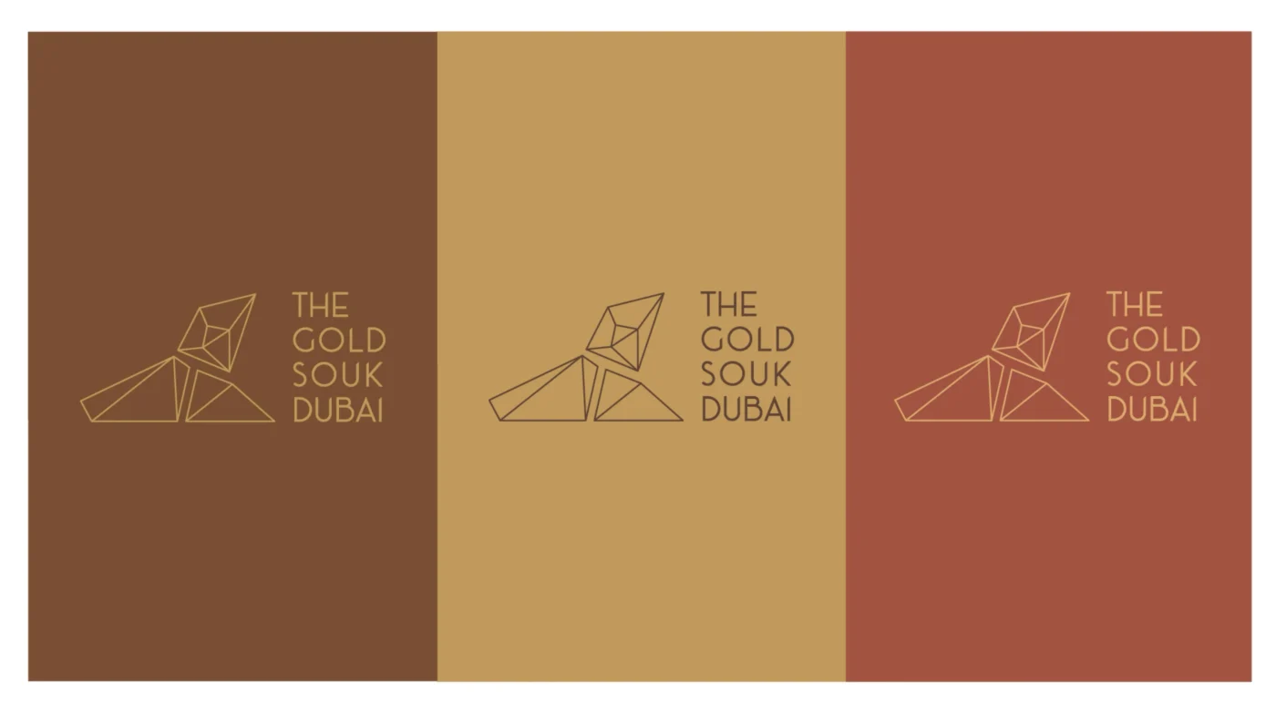
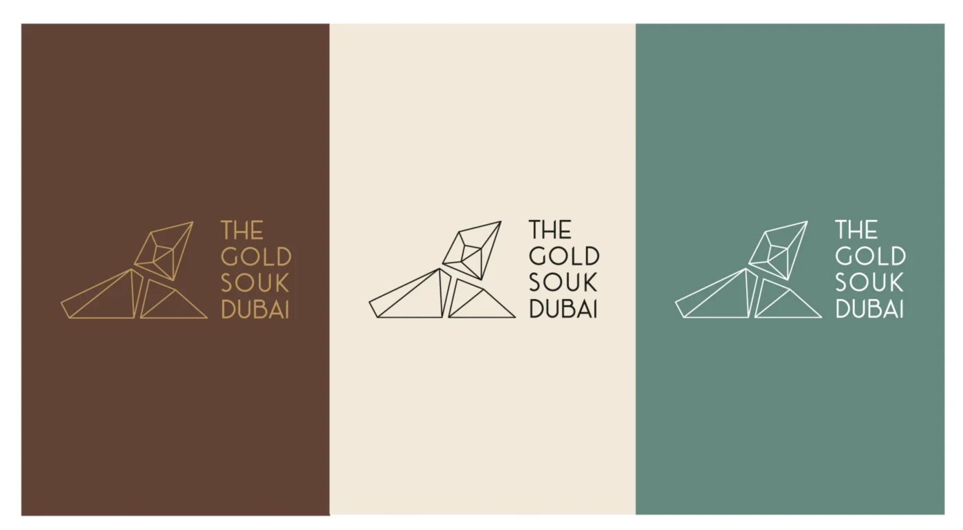
Precious Connections logo concept for The Gold Souk Dubai, inspired by trade, relationships, and cultural heritage
Visual representation of interconnected pathways in The Gold Souk Dubai, symbolizing trade and craftsmanship
Arabic Logo Precious Connections logo concept for The Gold Souk Dubai, inspired by trade, relationships, and cultural heritage
Luxury packaging design for The Gold Souk Dubai, emphasizing intricate line work and trade-inspired motifs
Branded storefront signage for The Gold Souk Dubai, incorporating the Precious Connections logo
Visual representation of interconnected pathways in The Gold Souk Dubai, symbolizing trade and craftsmanship

Route 03 · Crafted with Precision

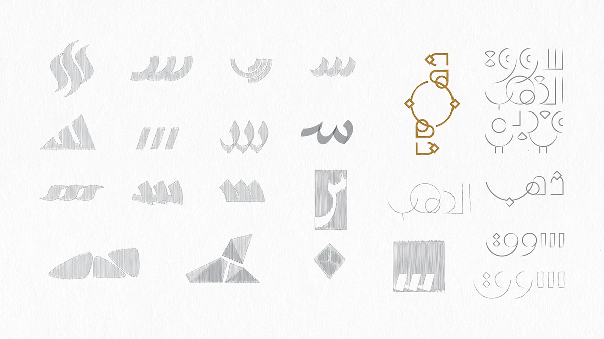
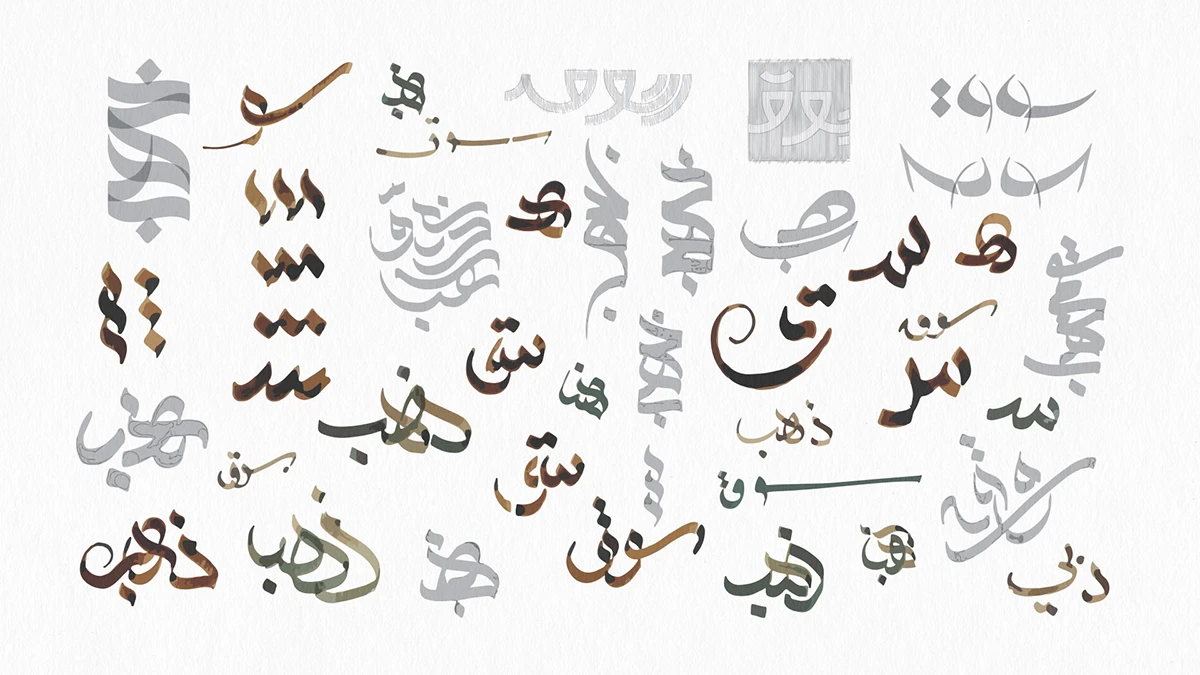
Arabic calligraphy interpreted through jewellery-making

Concept

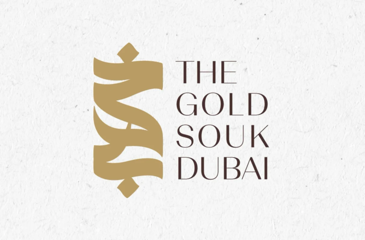
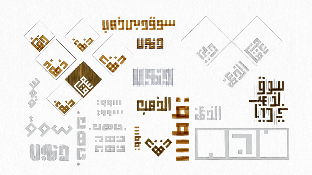
The third route fused Arabic calligraphy with the precision of handcrafted jewellery. Its letterforms evoke woven metal, ornament, and the disciplined movement of a maker’s hand—presenting gold as both material and cultural art.

Premise
Gold as artistry, knowledge, and crafted memory
Device
Custom Arabic calligraphic form with jewellery-like detailing
Tone
Expressive, cultural, and refined

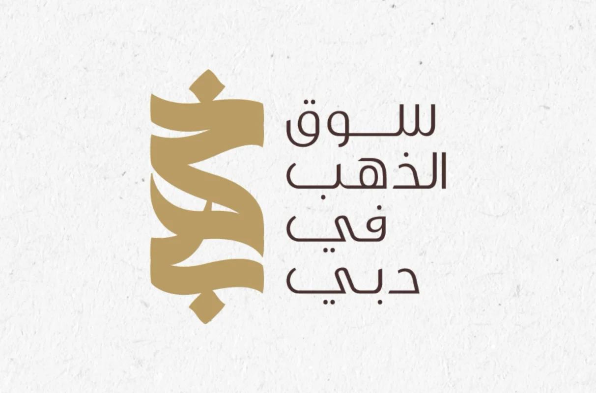
Crafted with Precision logo concept for The Gold Souk Dubai, merging Arabic calligraphy with fine jewelry craftsmanship
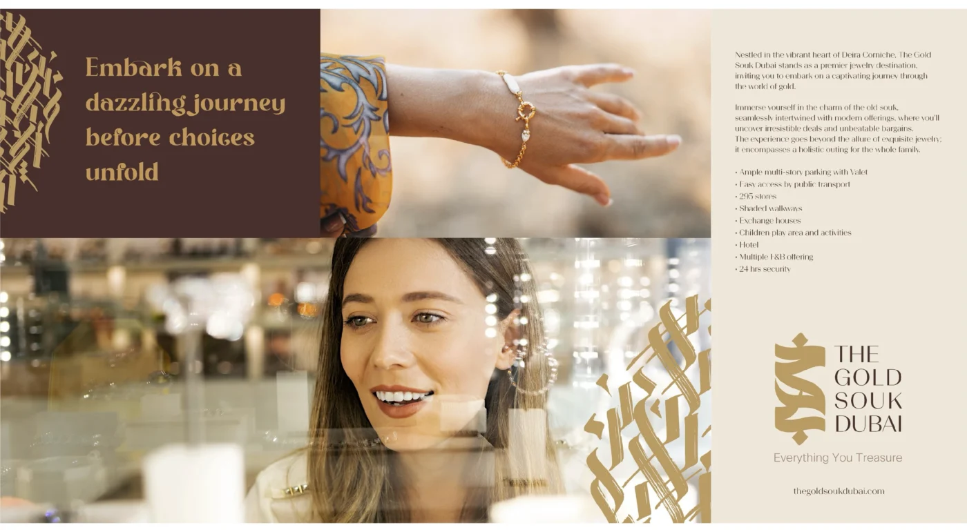
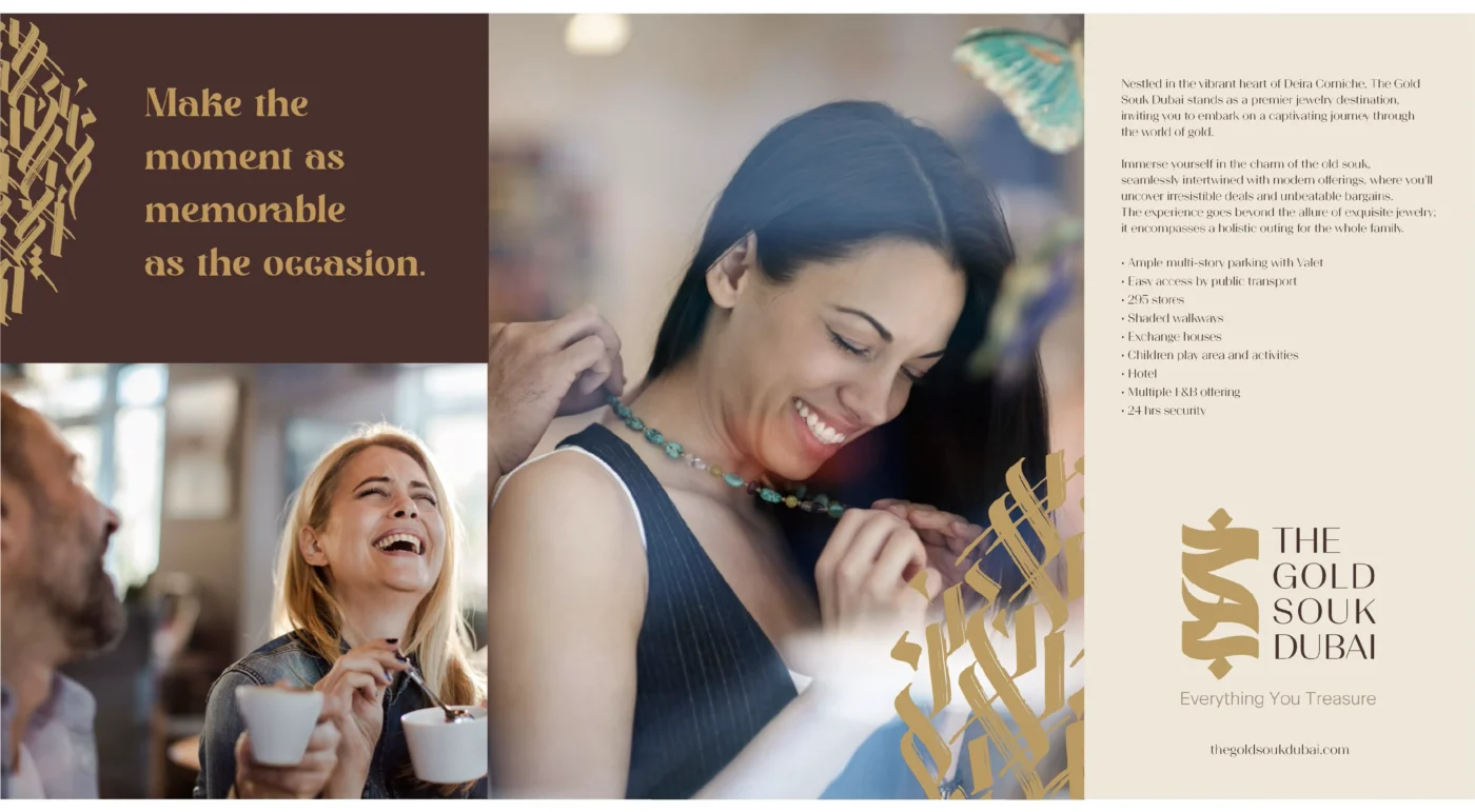
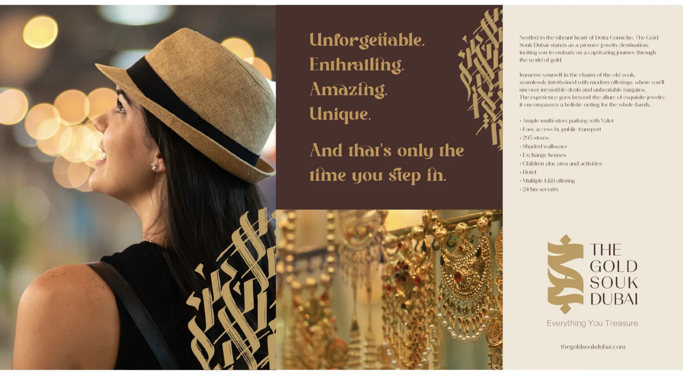
Luxury storefront branding for The Gold Souk Dubai, featuring the Crafted with Precision logo design
Elegant packaging design for The Gold Souk Dubai, inspired by traditional jewelry-making techniques Nihad Nadam
Elegant packaging design for The Gold Souk Dubai, inspired by traditional jewelry-making techniques Nihad Taisir
Elegant packaging design for The Gold Souk Dubai, inspired by traditional jewelry-making techniques

06 · Project outcome

Three proposals, one documented creative exploration

The project produced three distinct identity directions, each translating a different dimension of The Gold Souk Dubai into a visual system: geometric place-making, networks of trade, and calligraphic craft.

Transparency note: all three routes were developed as branding proposals. None of the directions was selected or implemented by the client. The work is presented here to document the strategic thinking, visual exploration, and creative process behind the proposal.
Created
Three logo and identity directions
Extended
Arabic and English marks, patterns, applications, and motion
Status
Proposal only · Not adopted or implemented
Arabic-first destination branding

Building a brand rooted in place, culture, and experience?

I help destinations and organisations turn cultural insight into distinctive Arabic and bilingual identity systems.