
Arabic-First Identity · Women’s Fashion

Haroof: turning Arabic letters into a refined fashion identity

Haroof—حروف—is a women’s fashion label inspired by the meaning, structure, and visual character of Arabic letters. The identity was developed as an Arabic-first system that feels refined, feminine, contemporary, and culturally rooted.

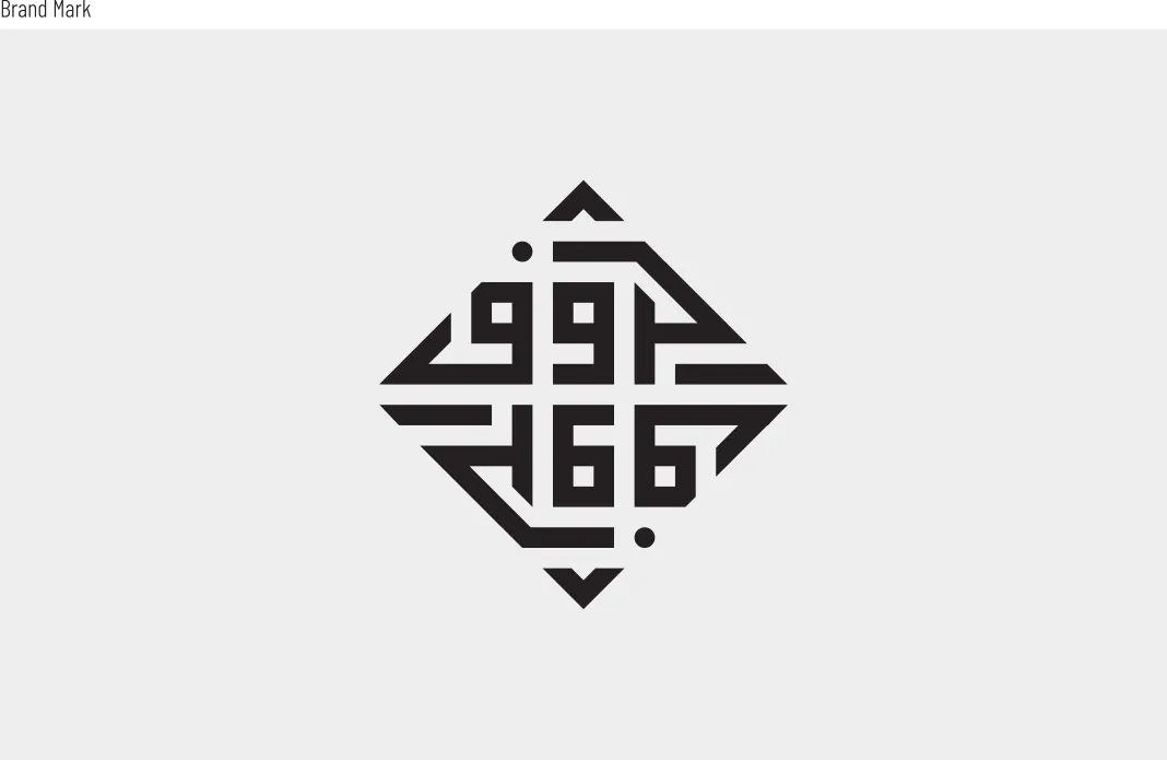
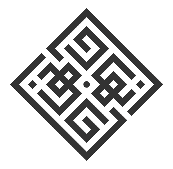
At its centre is a compact Square Kufic wordmark that transforms «حروف» into a distinctive geometric signature, supported by an English layer, a soft colour palette, and a flexible packaging system.
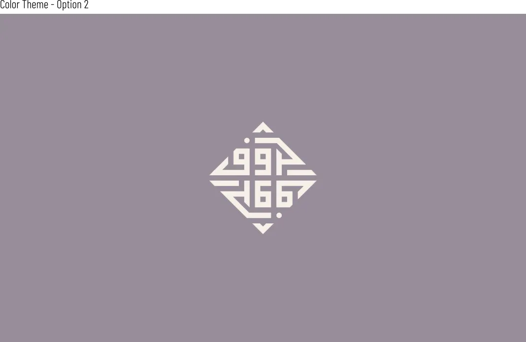
Light Haroof Square Kufic Arabic logo centred on a lavender background

Brand

Haroof · حروف

Women’s fashion label
Arabic-first visual identity

My role

Brand identity designer

Creative direction, Arabic logo design, supporting English lockup, colour system, packaging direction, and brand toolkit

Project status

Approved and launched

A complete identity system designed for labels, packaging, digital communication, and fashion applications

01 · The brief

Making Arabic lettering the foundation—not the decoration

The identity needed to position Haroof as a contemporary fashion label while keeping Arabic culture central to its visual language. The name created a direct opportunity: «حروف» could be treated simultaneously as language, structure, and pattern.

Rather than adding calligraphy as an ornamental layer, the design process explored how proportion, repetition, negative space, and geometric balance could turn the Arabic word itself into the brand’s primary asset.

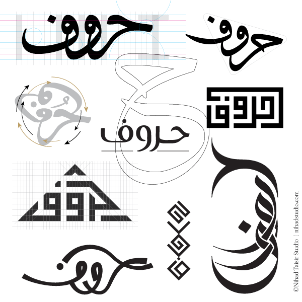
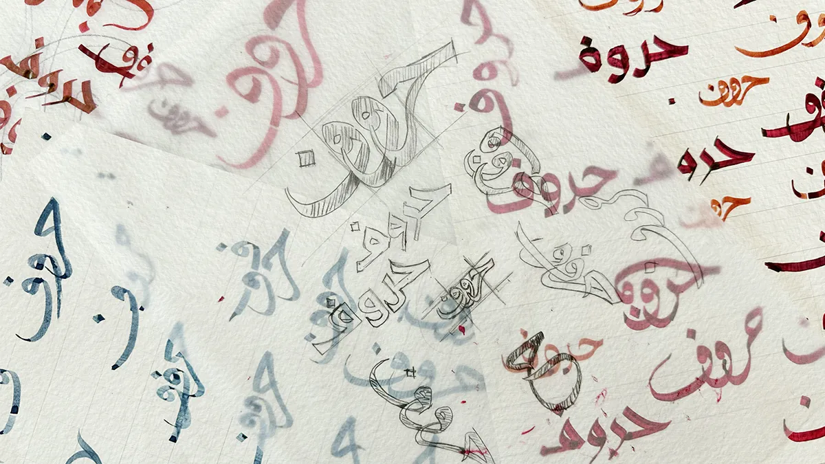
Hand-drawn Arabic lettering sketches exploring the Haroof fashion brand logo

02 · Concept development

From expressive lettering experiments to a disciplined Square Kufic mark

Early routes tested fluid, circular, vertical, and geometric interpretations of «حروف». The selected direction used a Square Kufic approach because it offered the strongest balance of cultural character, recognisable structure, and practical scalability.

Alternative Arabic calligraphy and geometric logo concepts developed for Haroof

Exploration

Multiple calligraphic routes tested movement, density, legibility, and the relationship between lettering and fashion.

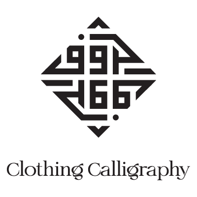
Final Haroof Square Kufic Arabic logo with Clothing Calligraphy signature

Selected direction

The approved diamond-shaped mark creates a compact Arabic signature paired with the supporting line “Clothing Calligraphy.”

03 · Construction and control

A geometric system designed to remain consistent at every scale

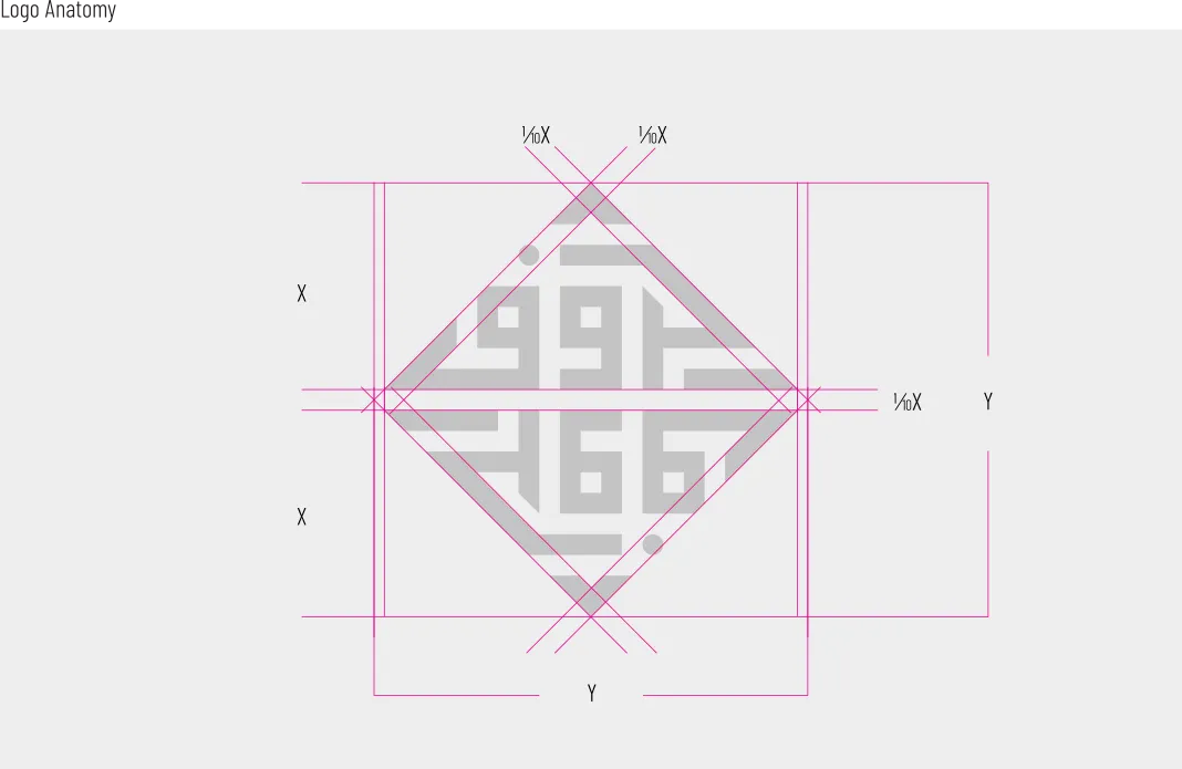
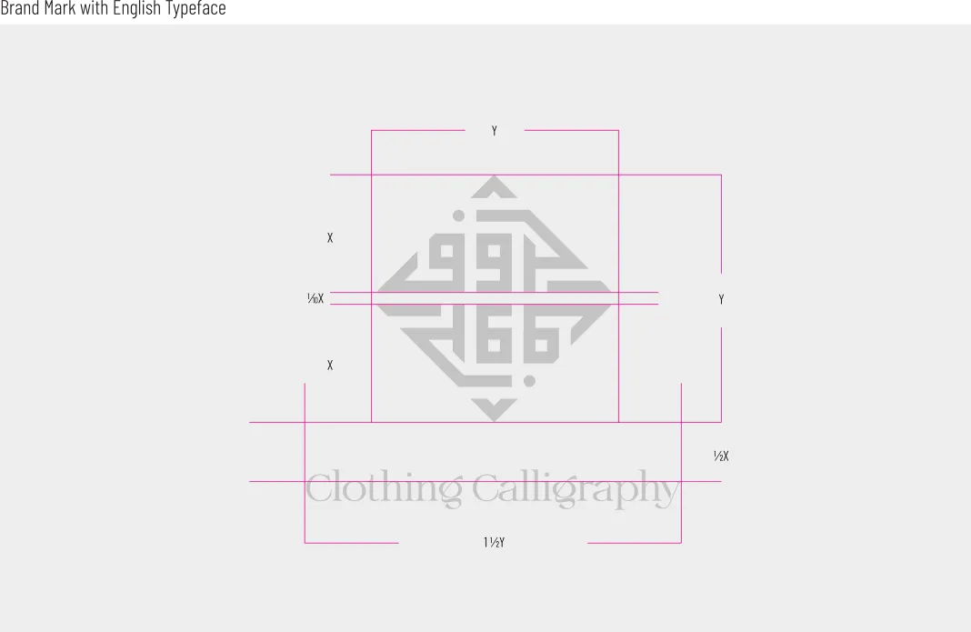
The Square Kufic composition was refined through measured relationships rather than visual approximation. Proportion, alignment, clear space, and the distance between the Arabic mark and English signature were documented to protect recognition across different applications.

Construction grid and proportions for the Haroof Square Kufic Arabic logo

Core proportions

The diamond construction establishes the balance and outer silhouette of the Arabic mark.

Proportion and spacing diagram for the Haroof Arabic and English logo lockup

Signature relationship

Spacing rules control the relationship between the Square Kufic logo and the supporting English layer.

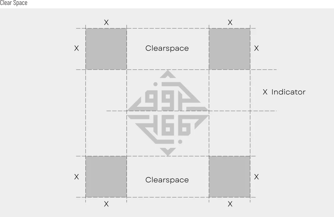
Clear-space diagram for the standalone Haroof Square Kufic logo

Symbol clear space

A consistent protection zone keeps the standalone Arabic mark visually distinct.

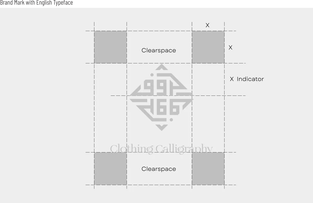
Clear-space diagram for the complete Haroof Arabic and English brand signature

Lockup clear space

The full bilingual signature receives additional space for clarity in retail and communication layouts.

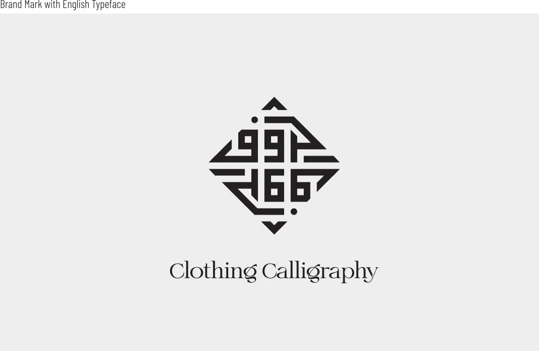
Haroof Square Kufic Arabic logo with Clothing Calligraphy English signature

04 · Brand signature

Arabic geometry balanced by an elegant fashion voice

The strong geometry of the Arabic logo is balanced by a high-contrast English type treatment. This contrast allows the system to feel structured without becoming rigid, and refined without losing its Arabic centre.

The phrase “Clothing Calligraphy” clarifies the brand idea while giving the identity an editorial tone suitable for fashion communication.

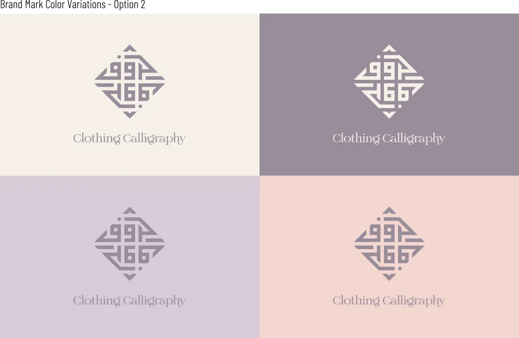
Haroof Arabic and English logo shown across four pastel brand colours

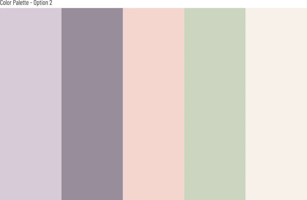
A soft, versatile palette

Muted lavender, warm blush, sage, cream, and a deeper grey-purple create a feminine system with enough contrast for packaging, digital layouts, and seasonal presentation.

Haroof colour palette with lavender, grey-purple, blush, sage, and cream

05 · Pattern and packaging

Extending the identity from a logo into a tactile fashion experience

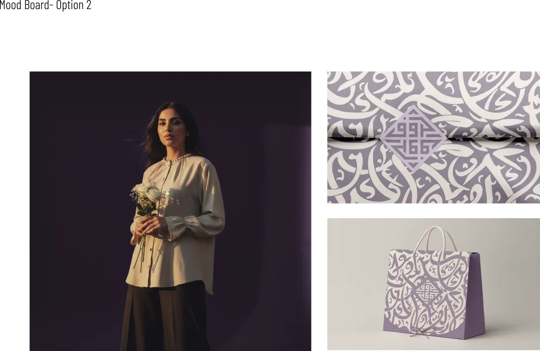
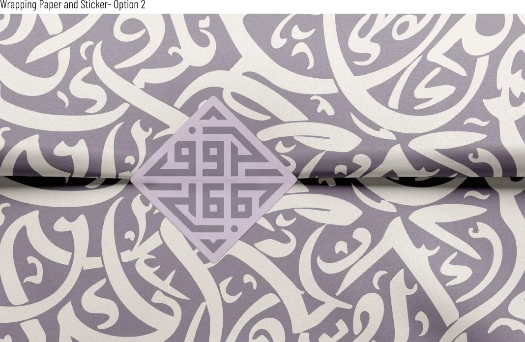
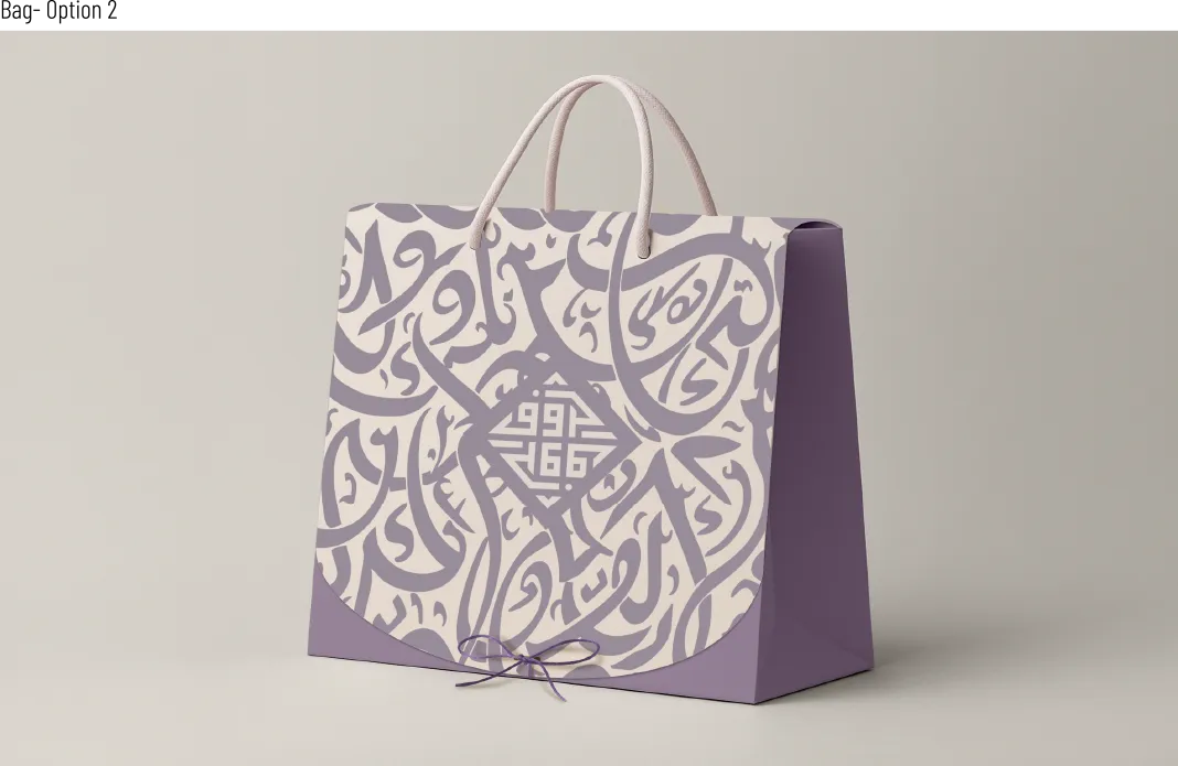
Expressive Arabic letterforms become a secondary pattern, allowing the restrained Square Kufic mark to sit within a richer visual field. The contrast between geometric logo and fluid lettering creates depth across tissue, wrapping, labels, and retail bags.

Haroof women’s fashion styling with Arabic patterned wrapping and branded bag

Fashion and retail context

The identity connects garment presentation, branded wrapping, and customer packaging within one coherent visual language.

Haroof Square Kufic label over a fluid Arabic letter pattern in lavender and cream

Arabic pattern system

Layered letterforms create an expressive field while the geometric Haroof mark remains the focal point.

Lavender Haroof fashion shopping bag with Arabic letter pattern and Square Kufic logo
Black Haroof Square Kufic Arabic logo centred on a light background

06 · The outcome

A complete Arabic-first system for a contemporary fashion label

The final identity gives Haroof more than a standalone logo. The Square Kufic mark establishes recognition; the English layer supports international clarity; and the colour, pattern, spacing, and packaging rules create a practical system for consistent brand expression.

The approved and launched toolkit allows the brand to move confidently between minimal labels and richer retail experiences without losing its Arabic character.

Project highlights

  • Custom Square Kufic Arabic wordmark
  • Supporting English fashion signature
  • Documented proportion and clear-space rules
  • Five-colour identity palette
  • Arabic pattern and packaging applications

Arabic-first fashion identity

Building a brand where Arabic language must shape the entire visual experience?

I develop Arabic-led identity systems that connect lettering, strategy, colour, and real brand applications into one coherent language.