Arabic Logo Design · Employee Wellbeing · UAE

Ghaf Benefits: turning a national symbol into a contemporary Arabic wordmark

Ghaf Benefits is a UAE-based employee wellbeing platform. The brief called for a bilingual identity that could communicate trust, care, and cultural relevance across digital products and professional environments.

I developed an Arabic-led logo inspired by the Ghaf tree—translating its resilience, generosity, and local significance into a distinctive typographic form.
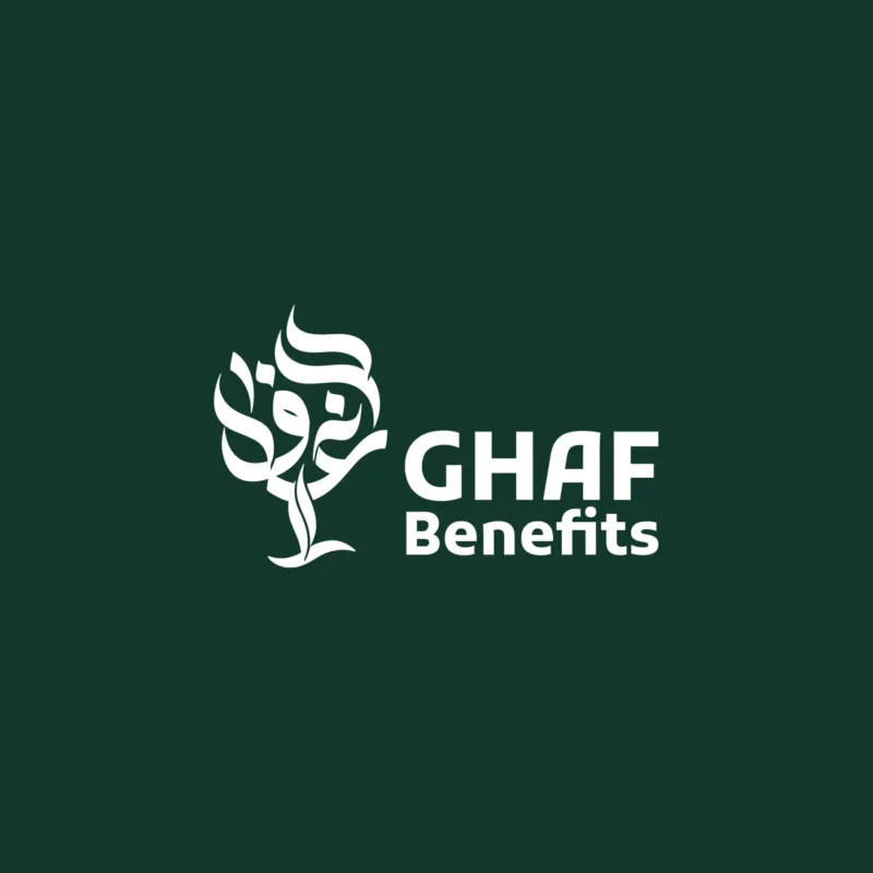
White Ghaf Benefits Arabic and English logo on a deep green background

Client

Ghaf Benefits

UAE employee wellbeing platform
Digital health and engagement

My role

Arabic logo designer

Visual direction, Arabic lettering, bilingual lockup, concept development, and presentation

Project status

Approved at the time

The identity was adopted during that stage of the company. Ghaf Benefits later moved in a different brand direction, and this is not its current logo.

01 · The challenge

Creating a culturally grounded identity without using a generic tree icon

The logo needed to feel modern enough for a digital wellbeing platform while carrying an unmistakable connection to the UAE. It also had to balance two scripts without making the Arabic expression secondary to the English name.

The central opportunity was to move beyond literal illustration: the Ghaf tree could become the organising idea for the lettering itself, allowing meaning and name to live in one recognisable form.

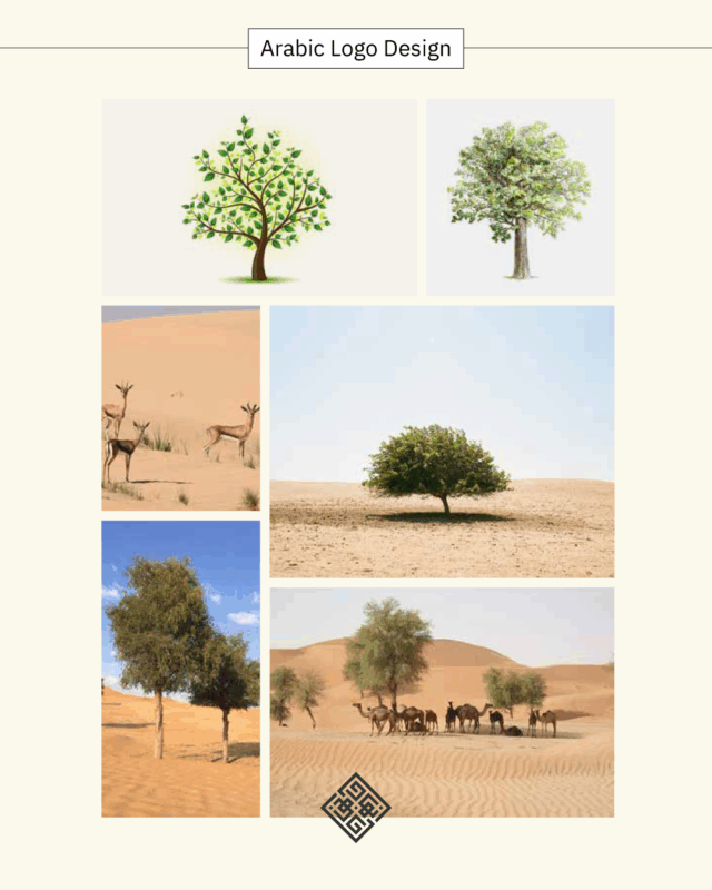
Ghaf tree imagery used as inspiration for the Ghaf Benefits Arabic logo
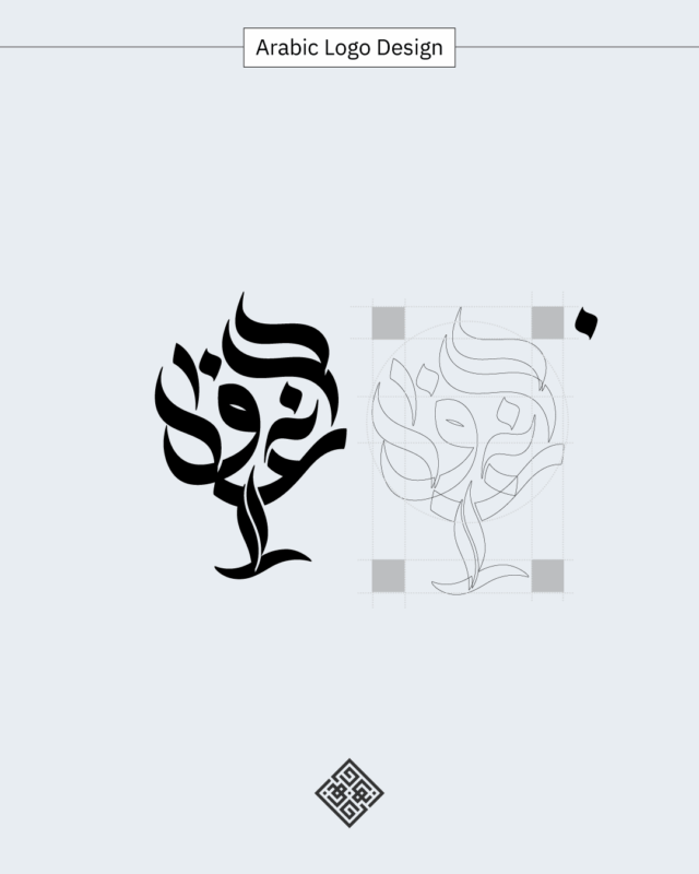
Construction study showing the Arabic Ghaf Benefits wordmark shaped as a tree

02 · The lettering concept

Building the tree from the Arabic name

The Arabic letters were shaped into a compact tree-like composition. Curved strokes suggest branches and leaves, while the descending form establishes a trunk and gives the mark a stable visual centre.

The construction study refined proportion, spacing, and silhouette so the calligraphic idea could remain clear at both presentation scale and smaller digital sizes.

Meaning in the form

The name and the Ghaf-tree reference become one visual idea rather than two separate symbols.

Humanist movement

Soft, organic curves support the values of care, wellbeing, and approachability.

Controlled silhouette

A compact outer shape gives the calligraphic mark recognition and practical scalability.

03 · Bilingual identity

Letting the Arabic mark lead the system

The Arabic symbol carries the cultural meaning and distinctive personality of the identity. The English name uses a direct, contemporary typographic treatment that supports the mark and keeps the platform legible for a broad professional audience.

Together, the two elements create a balanced bilingual lockup suited to presentations, interfaces, and business communication.

Ghaf Benefits bilingual Arabic and English logo on a warm sand background

04 · Colour adaptability

A restrained palette for professional and digital use

Deep green connects the identity to the Ghaf tree and the UAE landscape, while warm sand and neutral cream create a softer, more human expression. The mark also remains strong in a single dark colour.

Dark Ghaf Benefits bilingual logo on a neutral cream background
Dark Ghaf Benefits Arabic tree logo and English name on warm white
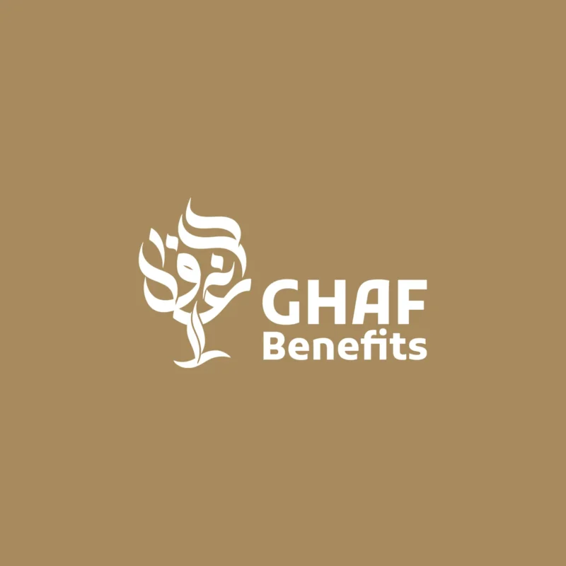
White Ghaf Benefits Arabic and English logo on a warm sand background

05 · Exploration and selection

Comparing different relationships between lettering and tree structure

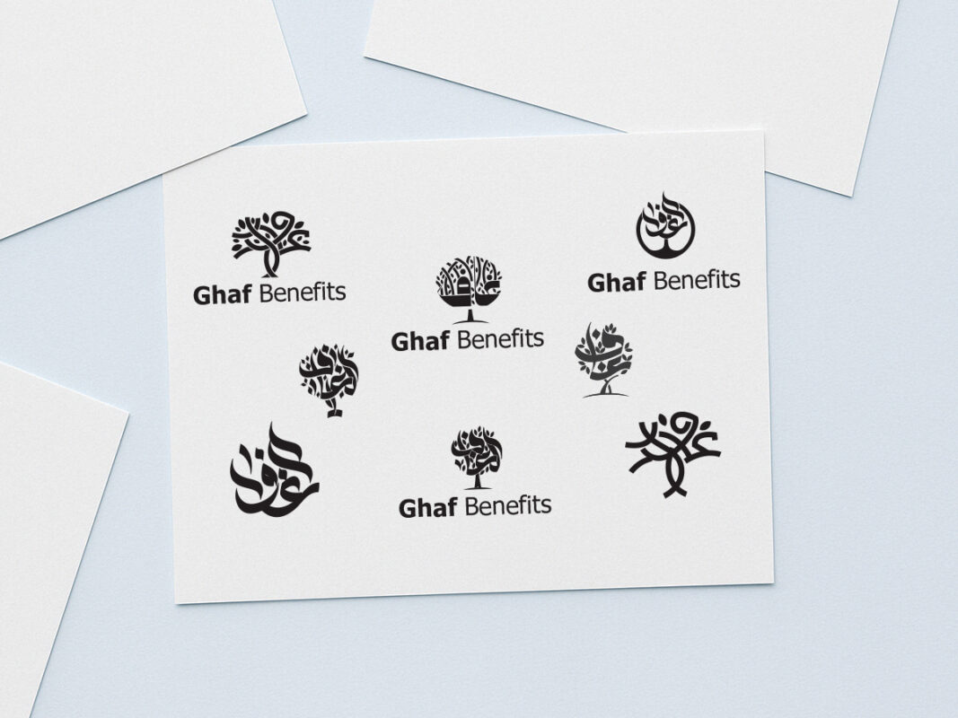
Several routes explored how far the Arabic name could be abstracted while remaining legible and relevant. The selected direction created the clearest balance between cultural expression, brand recognition, and digital usability.

Alternative Arabic calligraphic tree concepts explored for the Ghaf Benefits logo

Concept exploration

Alternative tree and lettering constructions tested density, rhythm, and the relationship with the English name.

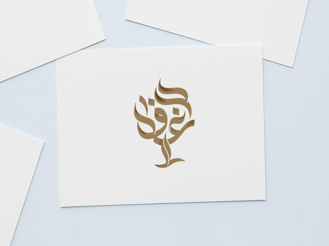
Selected gold Ghaf Benefits Arabic calligraphic tree mark on white stationery

Selected Arabic mark

The approved direction distilled the name into a confident calligraphic tree with a clear, memorable silhouette.

06 · Process in motion

From calligraphic construction to a usable identity

The development sequence shows how the initial cultural reference evolved through sketching, comparison, refinement, and bilingual composition. It is a useful example of treating Arabic lettering as a strategic identity tool rather than a decorative addition.

07 · The outcome

An approved identity direction—and a valuable study in culturally rooted logo design

The final concept gave Ghaf Benefits a clear Arabic-led presence for that stage of the business. It connected the company name, the national Ghaf-tree reference, and the values of resilience and care within one compact mark.

The company later evolved and moved toward a different visual direction, so this logo is no longer its current identity. The project remains a strong case study in custom Arabic lettering, bilingual hierarchy, and concept-led design.

Project highlights

  • Custom Arabic calligraphic mark
  • Ghaf-tree concept integrated into the lettering
  • Arabic-led bilingual hierarchy
  • Colour and single-colour logo variants
  • Approved identity direction, later superseded

Read about Arabic–English bilingual logo design

Arabic identity with cultural meaning

Building a bilingual brand that must feel locally rooted and internationally clear?

I develop Arabic-led identity systems that turn cultural insight, language, and strategic positioning into distinctive visual assets.