
Implemented Bilingual Identity · Restaurant Branding

Aşkım: a bilingual restaurant identity shaped through custom lettering

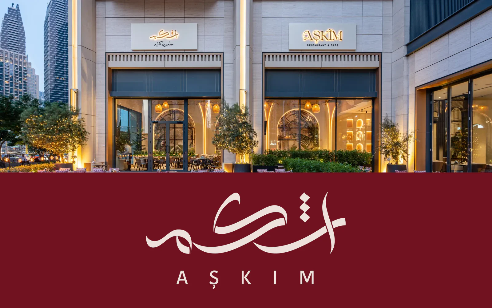
A refined Arabic and Latin wordmark created for a luxury Mediterranean restaurant in Dubai—balancing cultural character, contemporary clarity, and a warm hospitality presence.

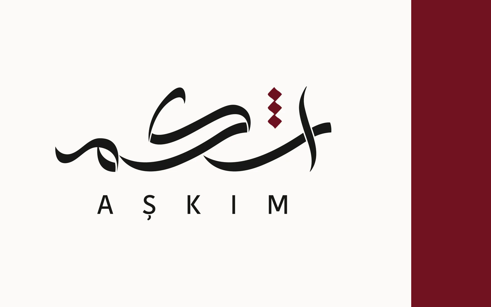
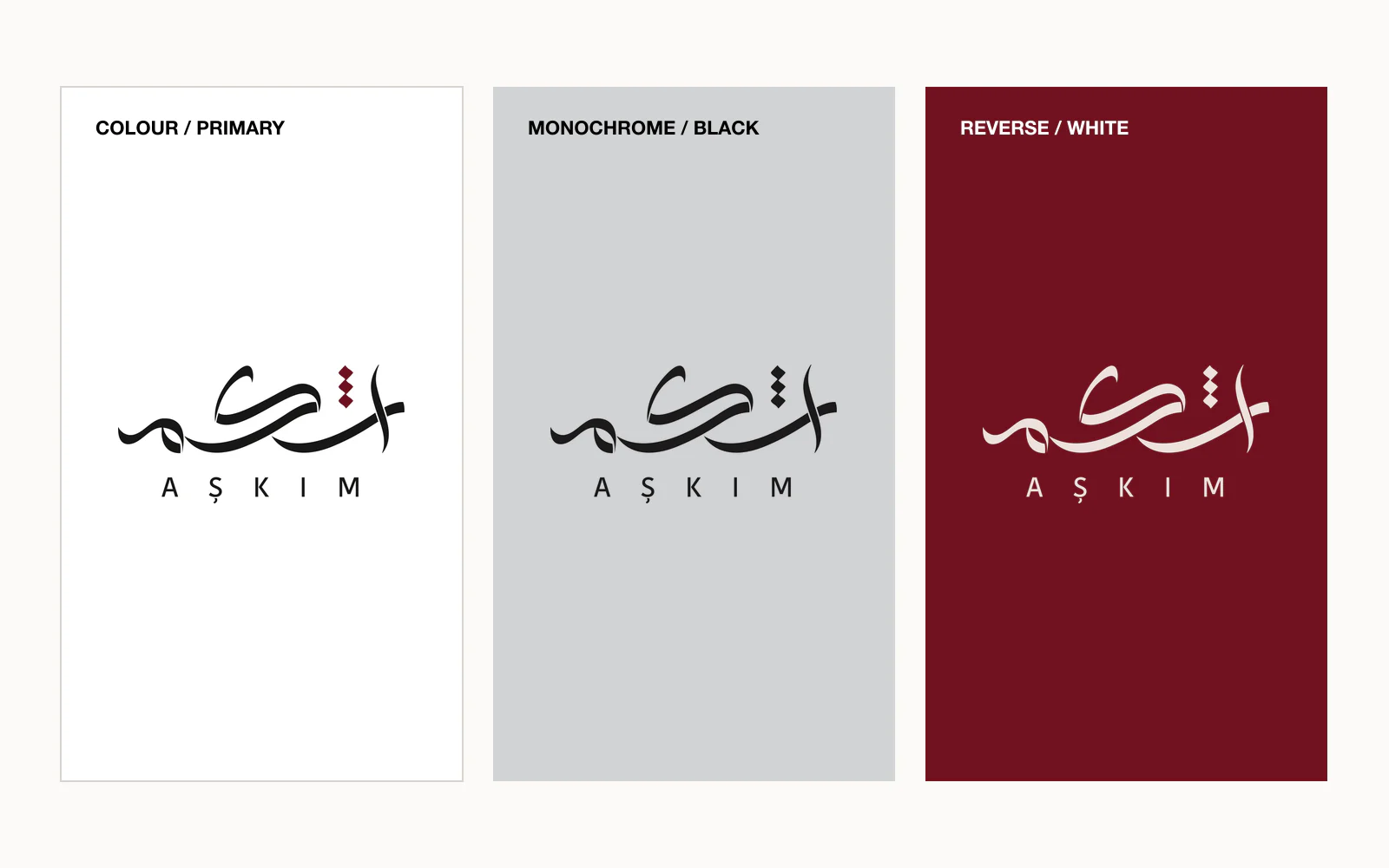
Aşkım Arabic and Latin restaurant logo
Client
Aşkım Restaurant
Market
Dubai, United Arab Emirates
Industry
Hospitality and Mediterranean dining
Role
Brand identity designer and Arabic lettering artist
Scope
Bilingual logo and visual identity system
Status
Approved and implemented

01 · Brief and challenge

Expressing Mediterranean warmth through a contemporary bilingual identity

Aşkım needed an identity that could introduce a premium dining experience while retaining the warmth, personality, and cultural character of the restaurant concept.

The central challenge was to connect two distinct typographic voices. The Arabic mark needed the movement and expression of hand-drawn lettering, while the Latin name needed to remain clear, modern, and immediately legible to an international Dubai audience.

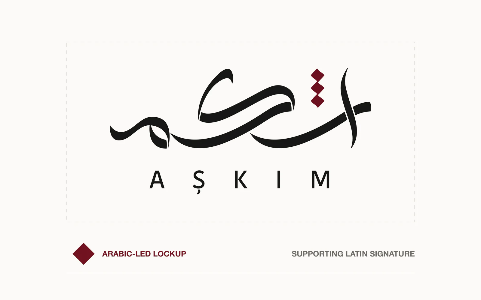
The result could not feel like two separate names placed together. Arabic and Latin had to operate as one composed wordmark with a shared rhythm, proportion, and visual hierarchy.

Aşkım bilingual logo spacing and clear-space system

02 · Lettering concept

Custom Arabic expression balanced by a restrained Latin signature

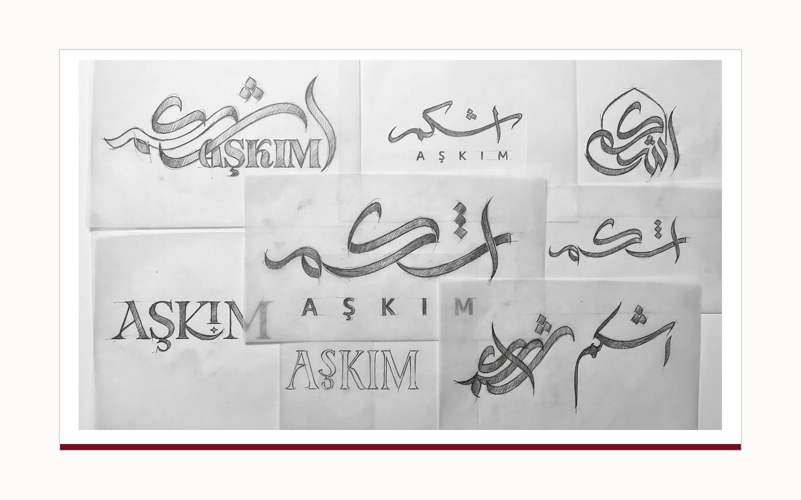
The identity was built around contrast: expressive Arabic lettering carries emotion and character, while the spaced Latin name provides structure, clarity, and a contemporary hospitality tone.

Arabic movement

Fluid, calligraphy-inspired strokes give the mark warmth and a sense of handcrafted individuality.

Bilingual balance

The Arabic and Latin forms were proportioned as one signature rather than treated as separate translations.

Distinctive detail

A burgundy geometric accent introduces a memorable focal point without competing with the lettering.

03 · Identity toolkit

A practical system for consistent restaurant communication

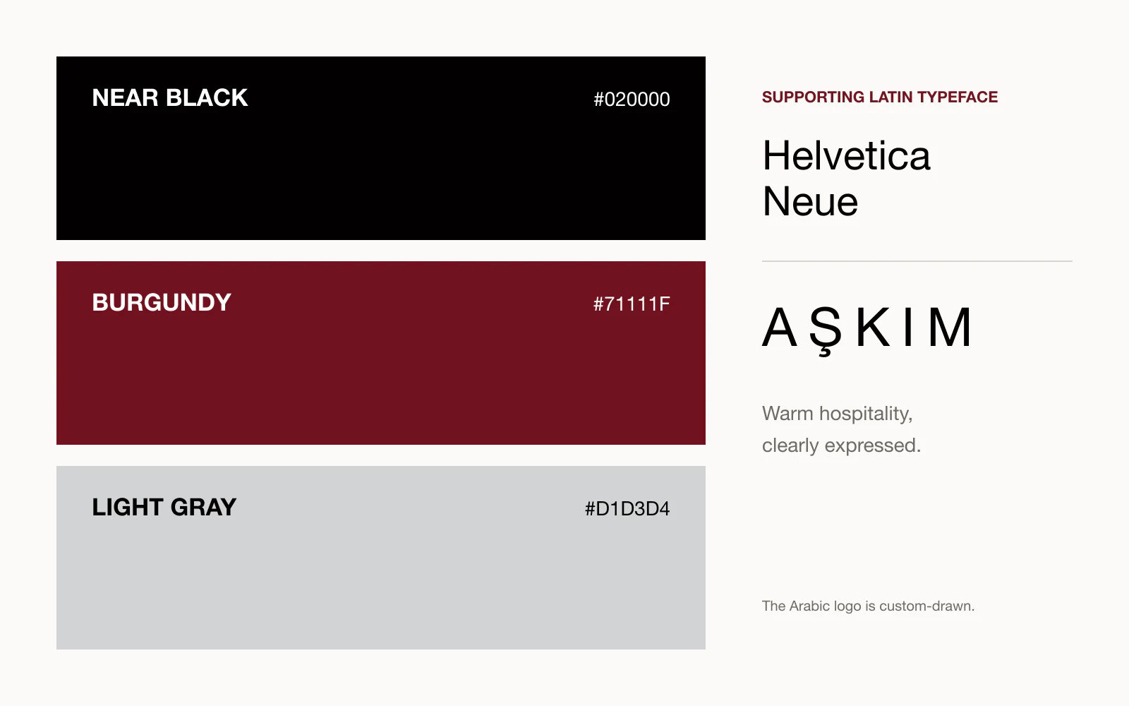
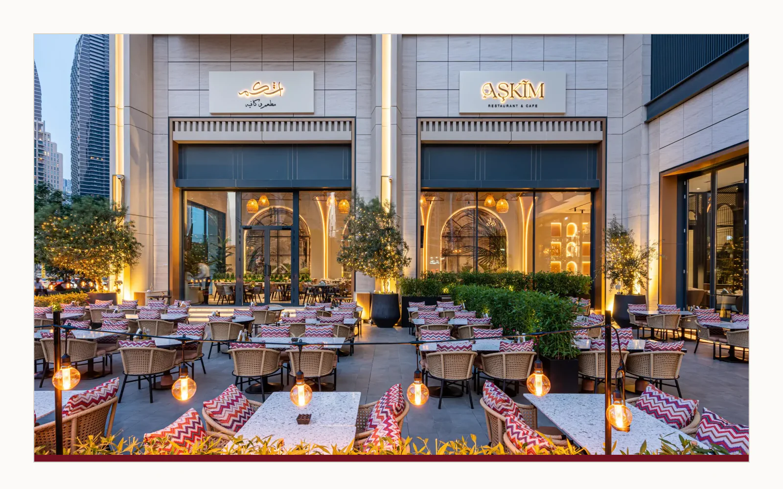
The final toolkit brings together the primary and secondary logo configurations, colour palette, supporting typefaces, and an example application—giving the implemented identity a clear foundation for future touchpoints.

Aşkım bilingual restaurant brand identity toolkit

04 · External recognition

Featured by DesignRush for its calligraphy-led visual character

DesignRush published a dedicated analysis of the Aşkım Restaurant logo and credited the design to Nihad Nadam. Its review highlighted the calligraphy-inspired script, flowing typography, and minimalist composition as the identity’s standout features.

This editorial recognition provides an independent perspective on the design craft without presenting unverified performance figures or describing the feature as an award.

Read the DesignRush feature →

Publisher
DesignRush
Published
17 September 2024
Credit
Logo designed by Nihad Nadam
Features
Calligraphy-inspired, flowing, minimalist

05 · Outcome

An implemented identity that speaks to local culture and international hospitality

The completed Aşkım system transforms a culturally specific name into a distinctive bilingual hospitality signature. Its Arabic lettering provides character and emotional warmth; the Latin typography provides accessibility and balance.

Together, the elements create a coherent identity designed for consistent use across restaurant communication while remaining recognisable in both Arabic and English contexts.

Language
Arabic and Latin
Character
Warm, refined, and contemporary
Application
Restaurant identity and communication

Arabic and bilingual brand identity

Need an identity that works naturally in Arabic and English?

I create bilingual identities and custom Arabic lettering systems that connect cultural character with clear international communication.