Arabic Calligraphy Logo · Handmade Oud Workshop

Inaq: shaping an Arabic word into the silhouette of an oud

Inaq—عناق—is a specialist workshop dedicated to making the oud by hand. The identity needed to express the craft, cultural depth, and intimate relationship between the maker, the musician, and the instrument.

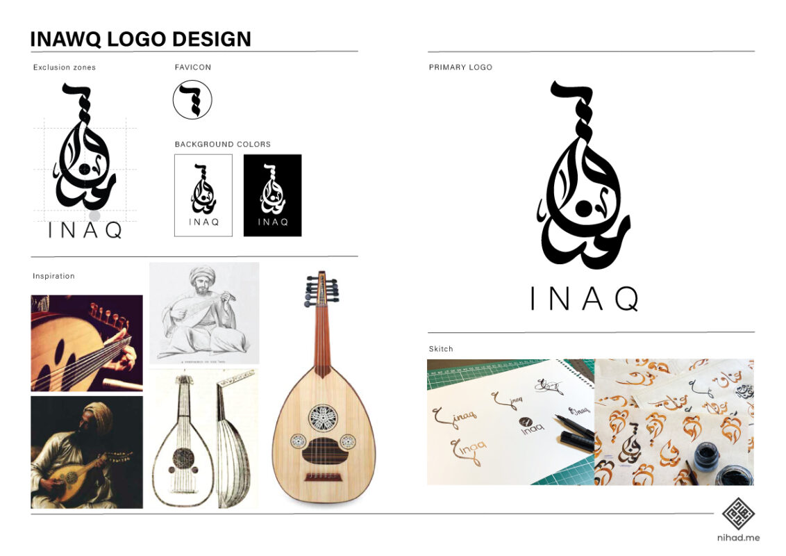
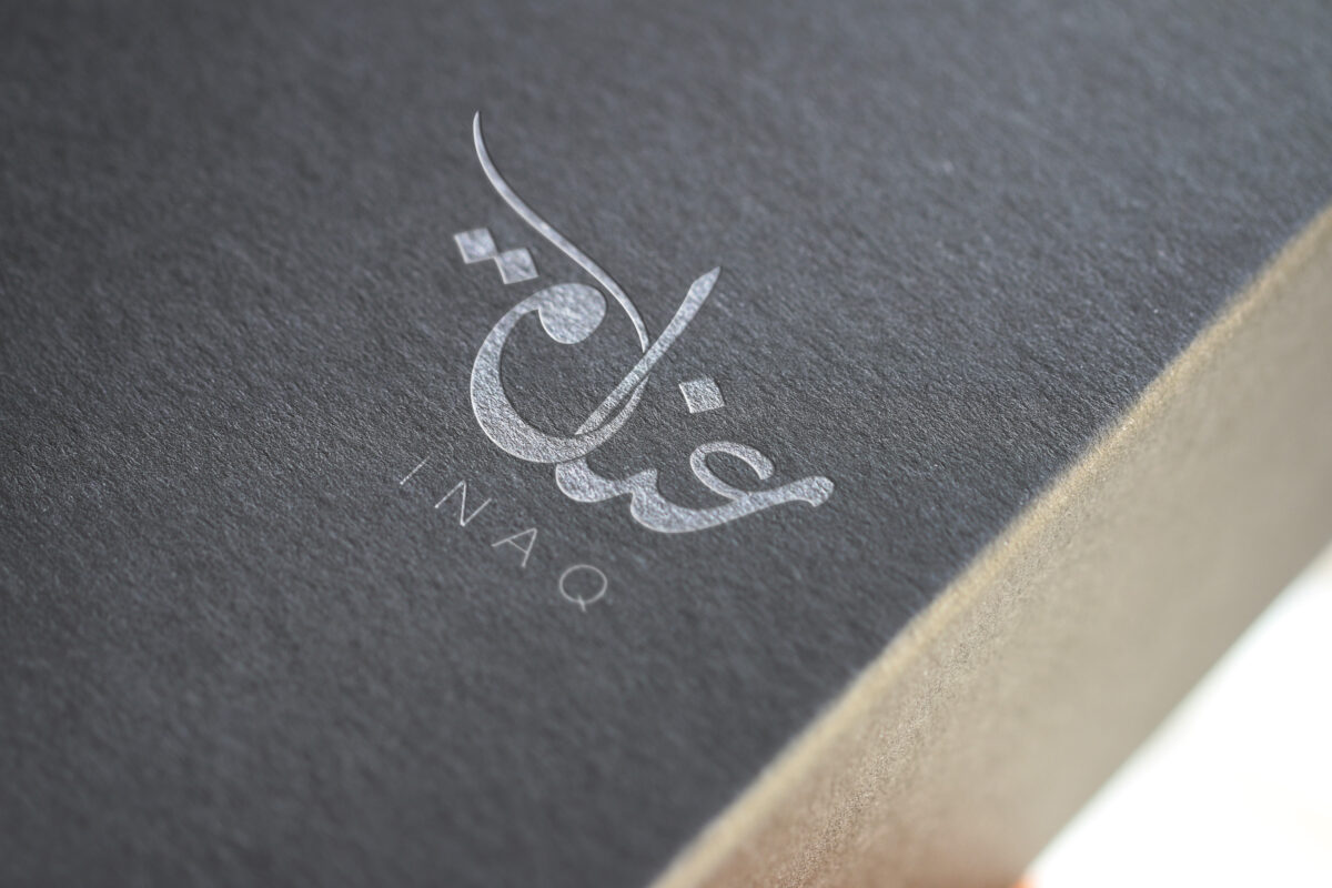
I designed the approved Arabic mark by composing the word «عناق» into the recognisable form of the oud itself, turning the name and the product into one distinctive visual signature.
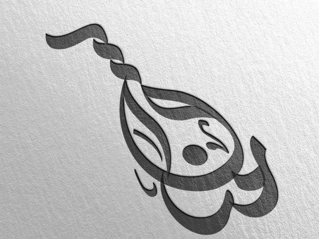
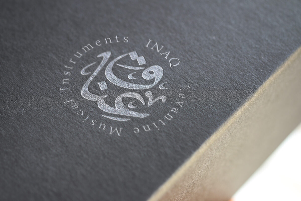
Approved Inaq Arabic calligraphy logo shaped as an oud and embossed on paper

Client

Inaq · عناق

Specialist workshop for handcrafted oud instruments

My role

Arabic logo designer

Concept development, Arabic calligraphy, custom lettering, Latin signature, and identity presentation

Project status

Approved and launched

The selected mark forms the Arabic word «عناق» in the shape of the oud

01 · The brief

An identity for an instrument shaped by hand and heard through emotion

An oud workshop is built on precision, material knowledge, patience, and musical sensitivity. The logo therefore needed to feel crafted rather than mechanically assembled, while remaining strong enough to function as a contemporary brand mark.

The design challenge was to connect the name with the instrument in a way that felt intrinsic—not by placing a word beside a generic oud icon, but by allowing Arabic lettering to become the instrument.

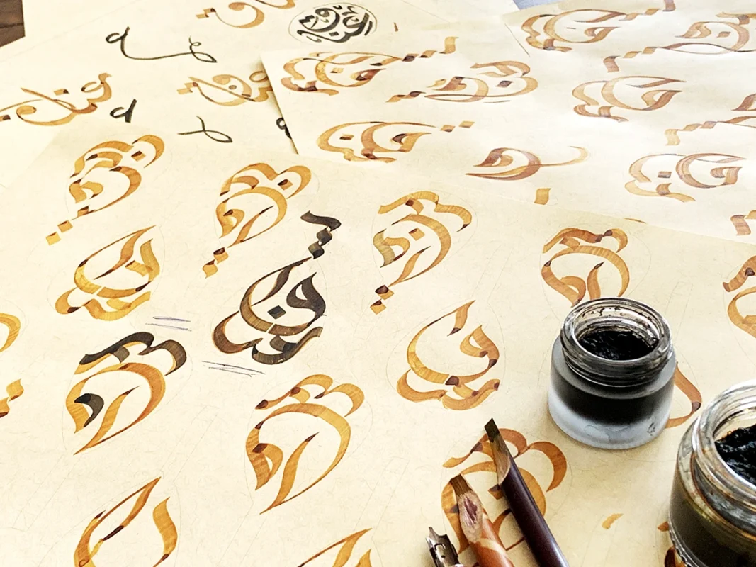
Hand-drawn Arabic calligraphy sketches exploring the word عناق as an oud
Inaq logo design board showing the approved Arabic oud-shaped mark and usage

02 · The approved concept

The word «عناق» becomes the oud

The approved design organises the Arabic letters into the pear-shaped body, neck, and pegbox of the instrument. The calligraphic strokes preserve the character of the word while building a compact silhouette that can be recognised before it is read.

The name also carries an emotional resonance: an oud is held close to the body as it is played. The resulting mark brings together language, object, craft, and the sense of an embrace within one idea.

Arabic-led form

The concept begins with the Arabic name; the instrument shape emerges from the lettering.

Recognisable silhouette

The vertical composition echoes the proportions of the oud and remains memorable at a glance.

Craft character

Organic stroke transitions retain the warmth and individuality associated with handmade work.

03 · Calligraphic exploration

Testing how the name could carry movement, balance, and musical character

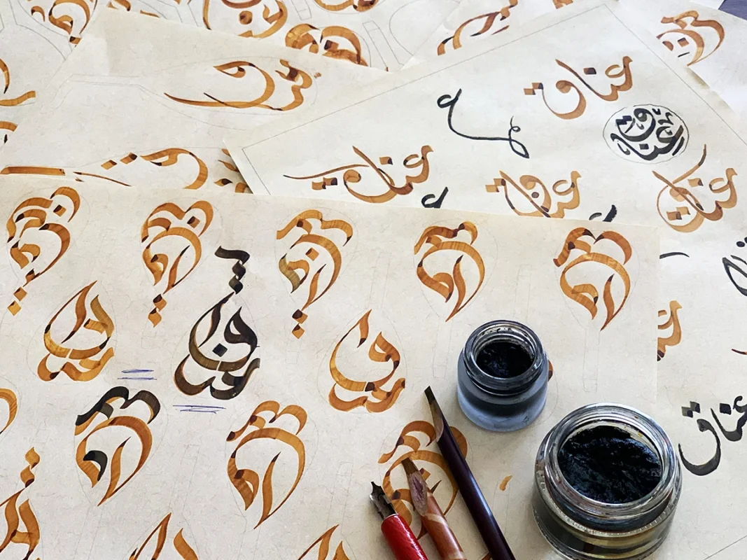
The process began with ink, pencil, and repeated handwritten studies. Different relationships between the four Arabic letters were tested before the composition was refined into a coherent instrument-shaped mark.

Close-up of ink sketches developing the Arabic word عناق into an oud shape

Ink iterations

Repeated brush and pen studies explored weight, rhythm, connection, and the overall body of the symbol.

Arabic lettering variations for the Inaq handmade oud workshop logo

Letter relationships

Early sketches tested readability and how each letter could contribute to the oud silhouette.

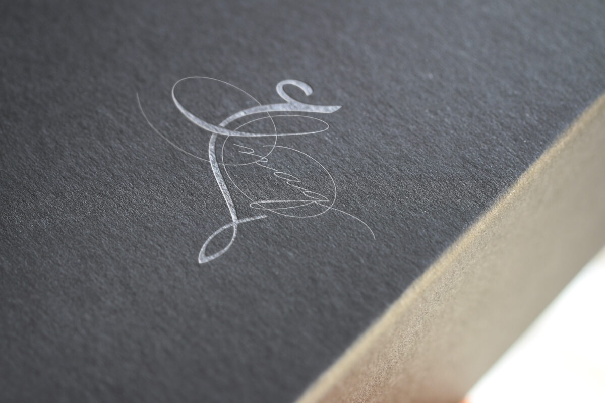
Hand-drawn Arabic and Latin Inaq logo sketches on white paper
Notebook of Arabic and Latin logo concepts for the Inaq oud workshop

04 · Bilingual development

Finding the right relationship between the Arabic mark and the Latin name

The Latin signature was explored as a supporting element rather than the visual centre. This allowed the Arabic calligraphy to carry the cultural and conceptual meaning while preserving practical recognition for multilingual audiences.

05 · Alternative directions

Exploring different interpretations before selecting the strongest mark

Several calligraphic routes were presented during development. Each explored a different balance of ornament, readability, movement, and musical reference. These alternatives were not selected; the approved oud-shaped wordmark offered the clearest relationship between the workshop, its name, and its craft.

Unselected linear calligraphy concept explored for the Inaq oud workshop
Unselected circular Arabic calligraphy logo concept for Inaq
Unselected expressive Arabic lettering concept for the Inaq oud workshop

06 · The outcome

A logo where name, instrument, and handmade craft speak as one

The final identity gives Inaq a mark that belongs specifically to an oud-making workshop. It does not simply depict the product; it uses Arabic calligraphy to embody it.

The approved and launched design can work as a complete vertical signature, a compact symbol, or a single-colour maker’s mark—making it suitable for printed materials, workshop communication, instrument documentation, and crafted applications.

Project highlights

  • Custom lettering for the Arabic word «عناق»
  • Arabic word shaped into an oud silhouette
  • Hand-drawn calligraphic development
  • Supporting Latin name signature
  • Approved and launched identity

Read about Arabic–English bilingual logo design

Arabic identity shaped by craft

Creating a culturally distinctive mark for a maker, product, or specialist brand?

I develop Arabic-led identities that transform language, material culture, and a brand’s defining idea into memorable visual systems.