
Custom Arabic Lettering · Bilingual Logo · Lebanese Restaurant

A hand-drawn Arabic restaurant signature shaped for everyday use

Abou Rony is a Lebanese restaurant in JVC, Dubai. The assignment was to create a distinctive Arabic-led logo that could carry the warmth and sociability of Lebanese hospitality while remaining clear across signage, print, packaging concepts, and digital use.

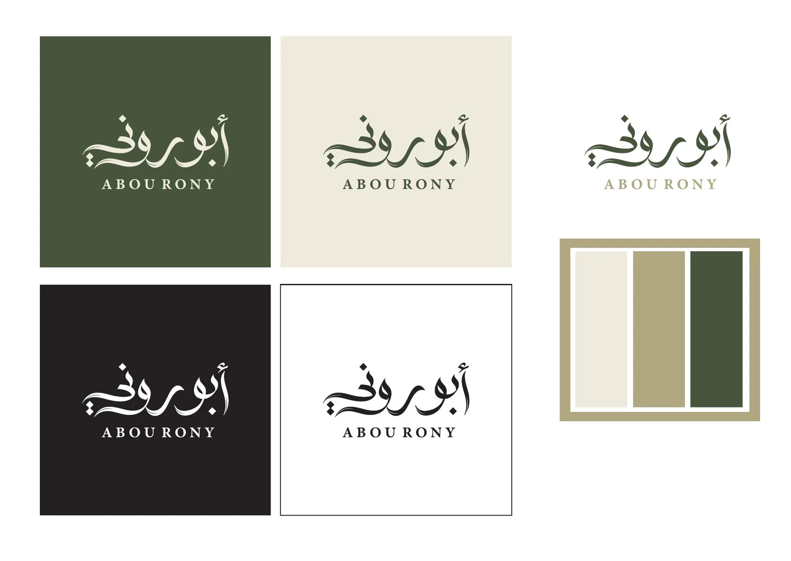
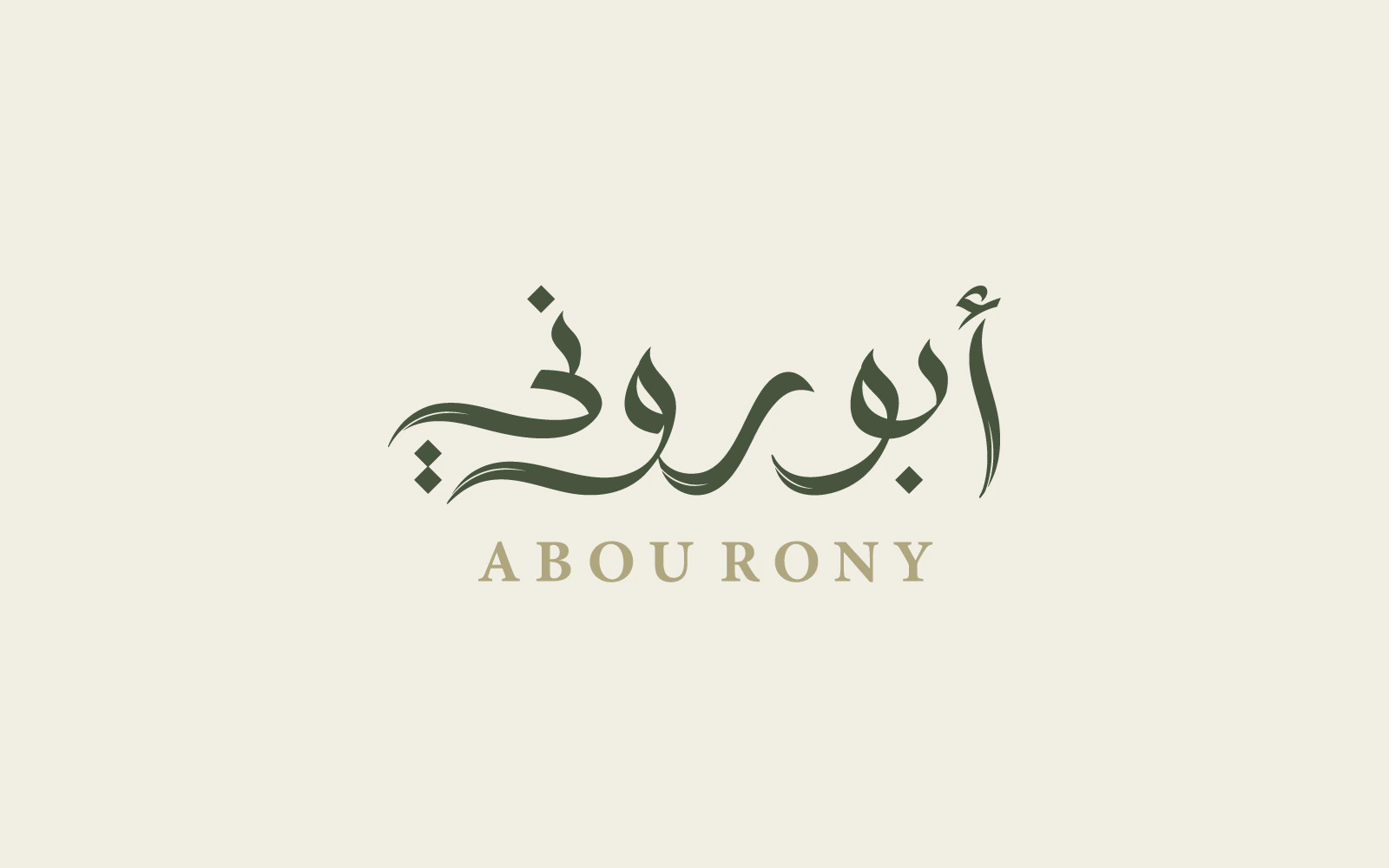
The final lockup places custom Arabic lettering at the centre and uses the Latin name as a supporting identifier. Approved colour directions and measured proportions give the restaurant a recognisable mark that can be reproduced consistently.
Abou Rony custom Arabic wordmark with supporting Latin name on a warm cream background.
Client
Abou Rony Restaurant
Location
JVC, Dubai, United Arab Emirates
Sector
Lebanese restaurant · Hospitality
Scope
Logo design · Custom Arabic lettering · Bilingual lockup
Scripts
Arabic and Latin
Colour
Forest Green · Warm Khaki
Status
Approved and currently in use
Design
Nihad Taisir Nadam

01 · The assignment

Translate the warmth of Lebanese hospitality into a recognisable name

Abou Rony is built around generous food, familiar flavours, and the social character associated with Beirut. The logo needed to suggest that warmth without relying on nostalgic ornament or a generic restaurant symbol.

It also had to work as an everyday signature: expressive enough to be remembered on a shopfront, but controlled enough for smaller formats and a multilingual Dubai audience.

Arabic role
Character, rhythm, and recognition
Latin role
Name identification for a wider audience
Practical need
One coherent mark across physical and digital use

02 · From sketch to mark

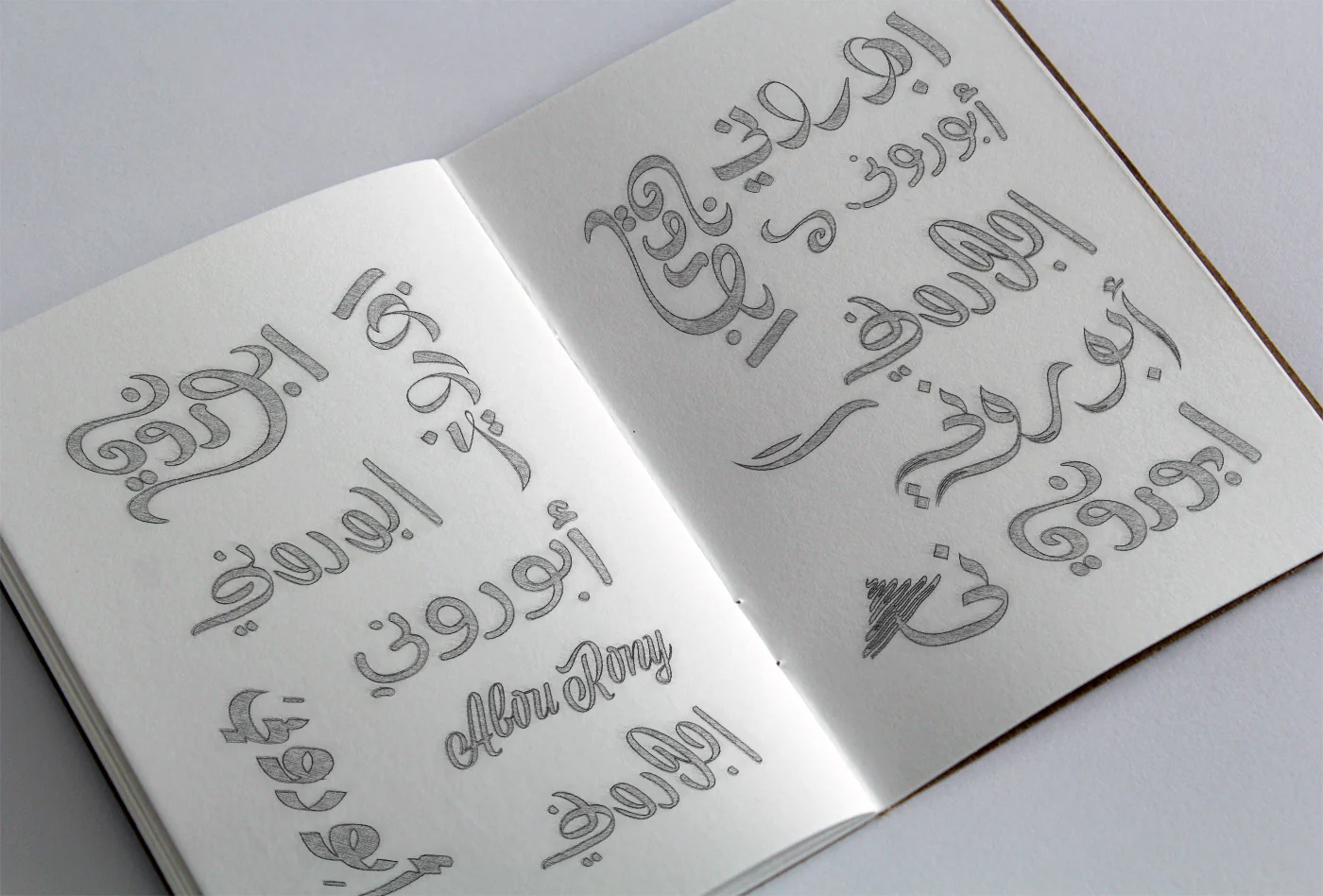
The final direction began with hand-drawn Arabic studies

The process started on paper, testing different structures, joins, stroke relationships, and overall silhouettes for the Arabic name. Promising directions were then selected and refined digitally alongside the Latin signature and colour studies.

This comparison stage allowed the final mark to be chosen for its balance of warmth, legibility, and individual character rather than being built from a ready-made Arabic typeface.

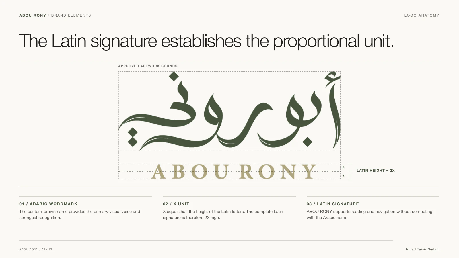
Abou Rony logo construction showing the Latin signature as two X units high.

03 · The final mark

A measured relationship between Arabic expression and Latin clarity

The Arabic wordmark carries the identity’s main voice through connected forms and a broad, welcoming rhythm. The Latin name sits below as a quieter identifier, supporting recognition without competing with the Arabic drawing.

The construction study records the intended relationship between the two scripts. The Latin signature is two X units high, where X equals half the height of the Latin letters. The Arabic dots are visual details, not the measurement unit.

04 · Approved colours

Forest Green and Warm Khaki give the mark freshness and warmth

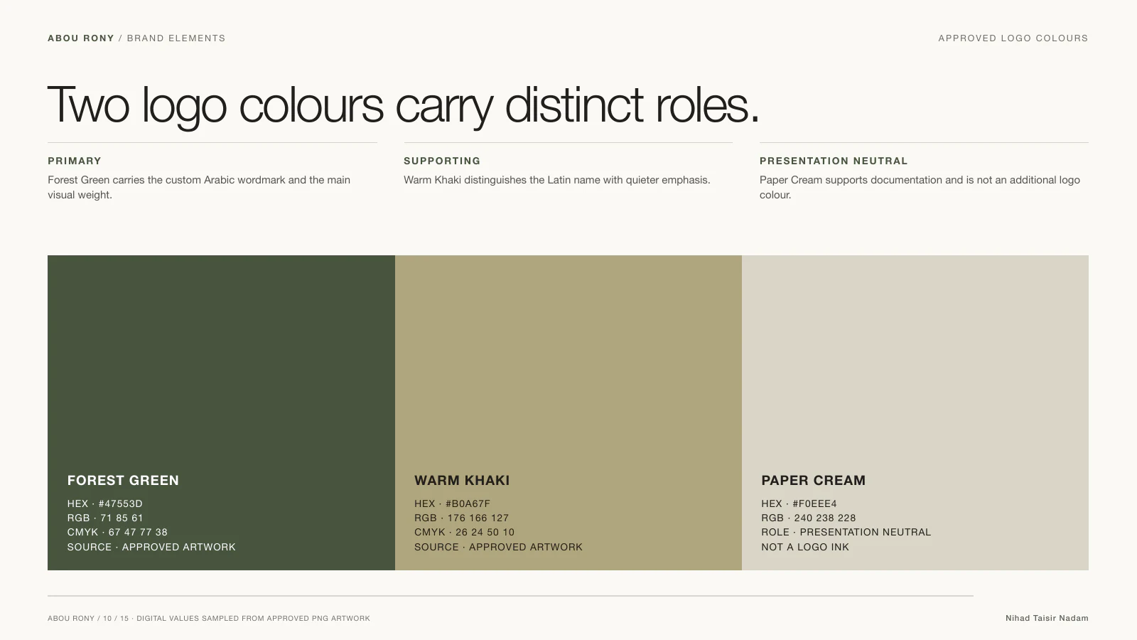
The approved colour directions balance a grounded restaurant character with clear contrast. Forest Green gives the logo a mature, natural presence, while Warm Khaki introduces a hospitable, food-adjacent warmth without turning the mark into a decorative motif.

Approved Forest Green and Warm Khaki colours for the Abou Rony logo.

05 · The logo in use

The bilingual mark is visible in the restaurant today

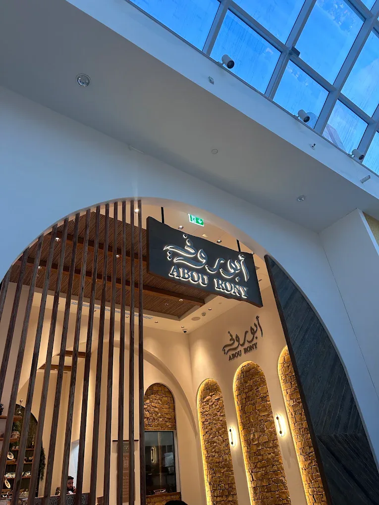
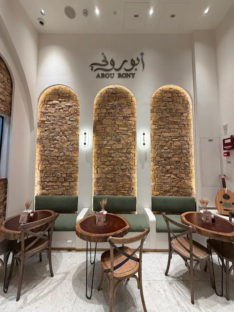
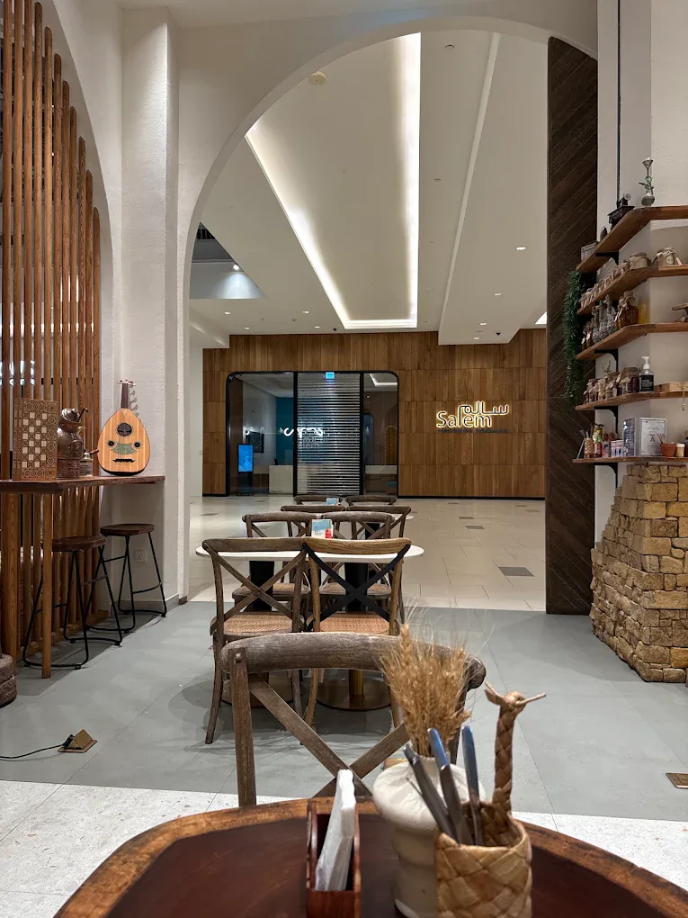
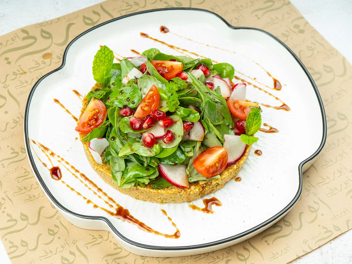
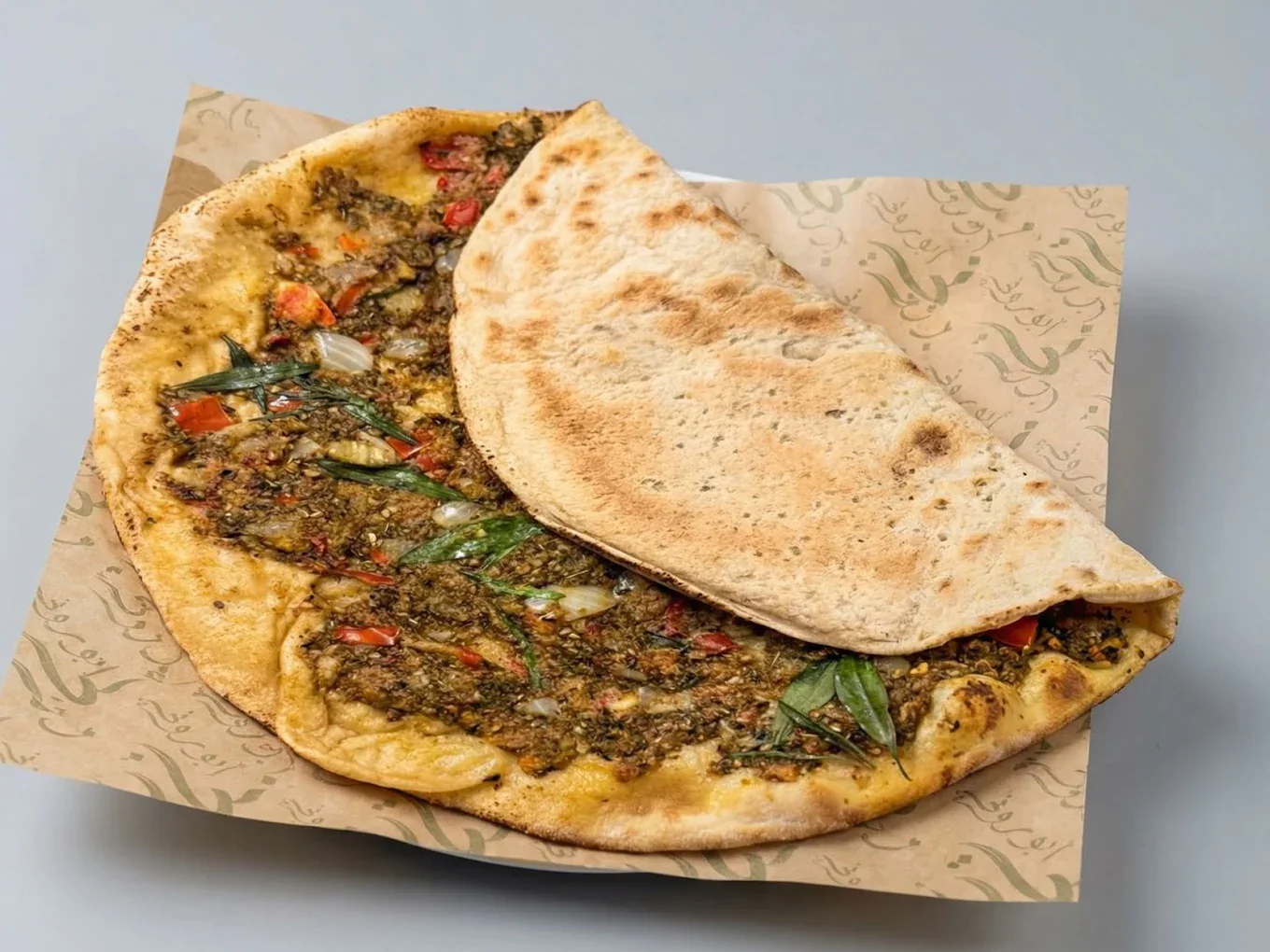
Current photography shows the Abou Rony logo on the restaurant entrance and interior wall, confirming that the approved mark moved from artwork into active use. Additional photographs place the logo within the wider restaurant and food context in which customers encounter the brand.

Visit the Abou Rony website →

06 · Concept applications

Testing how the mark could extend into takeaway moments

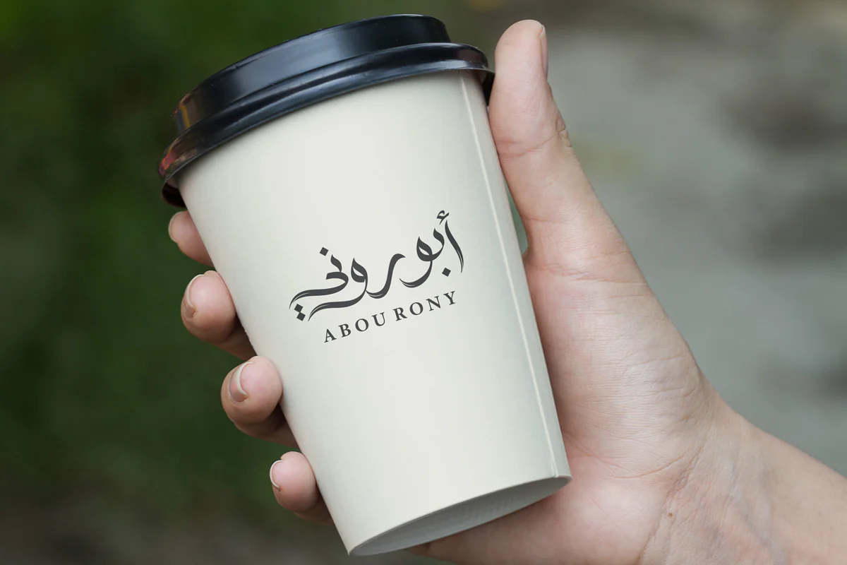
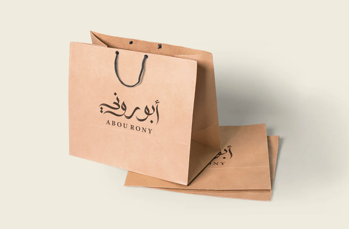
The following mockups explore how the logo and approved colours could work on a takeaway cup and kraft bags. They are presentation concepts used to evaluate scale, contrast, and placement—not evidence that the packaging was manufactured or adopted by the restaurant.

07 · Outcome

A focused Arabic-led mark with proof of real use

Abou Rony demonstrates how a restaurant name can gain a memorable Arabic voice without sacrificing bilingual clarity. The custom lettering gives the mark its warmth and personality; the Latin signature supports identification; and the construction and colour decisions make the lockup practical to reproduce.

The strongest evidence is the logo’s presence in the restaurant itself. It remains recognisable across exterior and interior settings while retaining the Arabic-led hierarchy established during the design process.

Design
Nihad Taisir Nadam
Deliverable
Custom Arabic-led bilingual logo
Evidence
Logo documented in current restaurant use
Concepts
Cup and bag mockups clearly separated from implementation

Arabic restaurant and hospitality branding

Building a hospitality brand that needs a distinctive Arabic voice?

I design Arabic-led logos and bilingual identity systems that connect cultural character with clear hierarchy and practical use—from the first sketch to a mark that can live confidently in the customer experience.